Dylhan Phong
Versatile Game Designer with experiences in Level and Narrative
Hey I’m Dylhan !I am currently looking for work as Game Designer or Level or Narrative due to my versatility and experiences.I finished my Master’s degree in Game Design at CNAM-ENJMIN in Angoulême, France.When designing, I tend to take a user-centric approach and think of ways to link interactions with the story and the intentions. I want to think of ways to tell stories beyond words through gameplay, worldbuilding and well-thought-out features.I like to gather people around an original or unusual idea to work on it as a team on a high-level aspect then iterate on it continuously while testing the different features.I have a Bachelor in History and I was able work in archives, get workshops on how museums were designed in Norway. Through all that, I’ve acquired an eye for the design of spaces, problem solving skills, a drive to always learn more but also how to work collaboratively.I am particularly interested in conveying humanist values through video games and tackle subjects such as social justice, ecology and more.If my profile caught your interest, please get in touch! I would love to exchange about designs with you.
If you need to be quick, you can click on the folder you're interested in.
But I recommend looking at the projects because I tend to put on a focus on complementarity.
Experiences
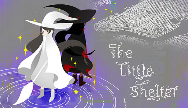
The Little Shelter
Game & Narrative & Level Designer
OCT 2024 - DEC 2025 | FEB 2025 - MAY 2025
2D Narrative platformer
Unity | PC
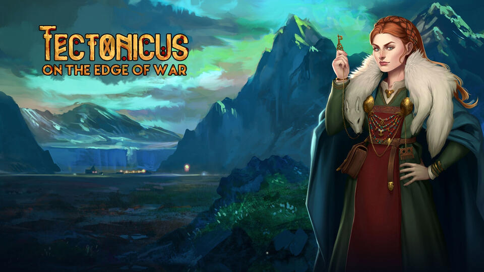
Tectonicus : On the Edge of War
Versatile Game Designer
JULY 2024 - JAN 2025
Collectible Card Game
Unity | PC
Unannounced project
JAN 2024 - JUNE 2024
Game & Narrative & Level Designer on AA project on Unreal
Under NDA
Games & Interactive Projects
What's the tea
Game Designer & Level Designer
Open World Narrative Exploration Game
2022 - 4 months | Unreal | Team of 9
Filling Fighting
Game Designer
Versus Game 1v1
2022 - 3 months | Unity | Team of 6
Miscellenneaous Game &
Level & Narrative Design Doc
Jams, Prototypes and other experimental projects in solo
In group
4 months
Unreal, Git, Perforce, Notion
Team of 9
What's the tea is a vertical slice developed in four months during my second year at CNAM-ENJMIN.
Pitch
"Stressed by your life , you decide to take some “vacation” to visit your aunt for the first time. She's old and doesn't get out anymore She welcomes you and gift you a scrapbook and her old bike to go on your own little mundane adventure and document your journey.
You can fill it with everything you might find from tea leaves to gorgeous views and also the lives of the inhabitants.
So that at the end of each day, you will bring a breath of fresh air into her home with gossips and beautiful environnements"
What’s the tea is a relaxing exploration game on a teapot bicycle in which you collect teas, meet quirky inhabitants and ride through an island to live a journey to be remembered.
Gameplay Video
Responsibilities
On this project, I worked closely with another game designer and I was in charge of:
Game Design
As a game designer, my missions with my duo were:- Set up a first benchmark for myself and the team to share a common language- Brainstormed and formalized the pillars of experiences and intentions with the team- Formalized the mechanics and gameplay loops
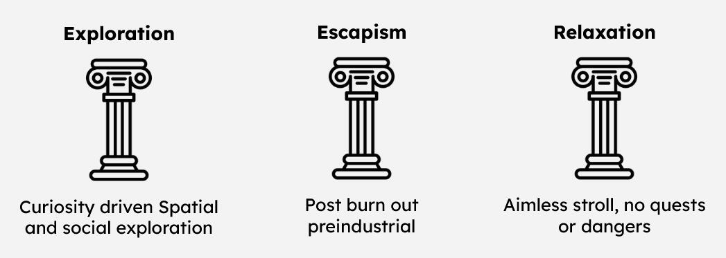
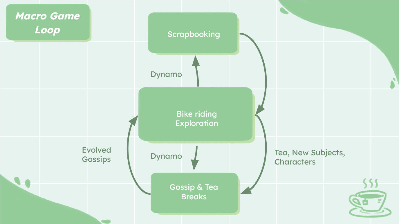
I also took the initative to make a one page document of the project for the team and ourselves to stay in the same direction.
Level Design
As a Level designer, my missions were:- Transform our intentions into level design elements- Creation of different biomes and subjects of discussions, characters and mood tied to those places- Iterative work on the design an open world map on paper and in engine for playtests.- Design of landmarks, point of interests and paths and vistas- Placement of the NPC, collectibles that makes sense in our world
Then I used all the elements I had to construct a rough first bubble plan to then make in blockout.
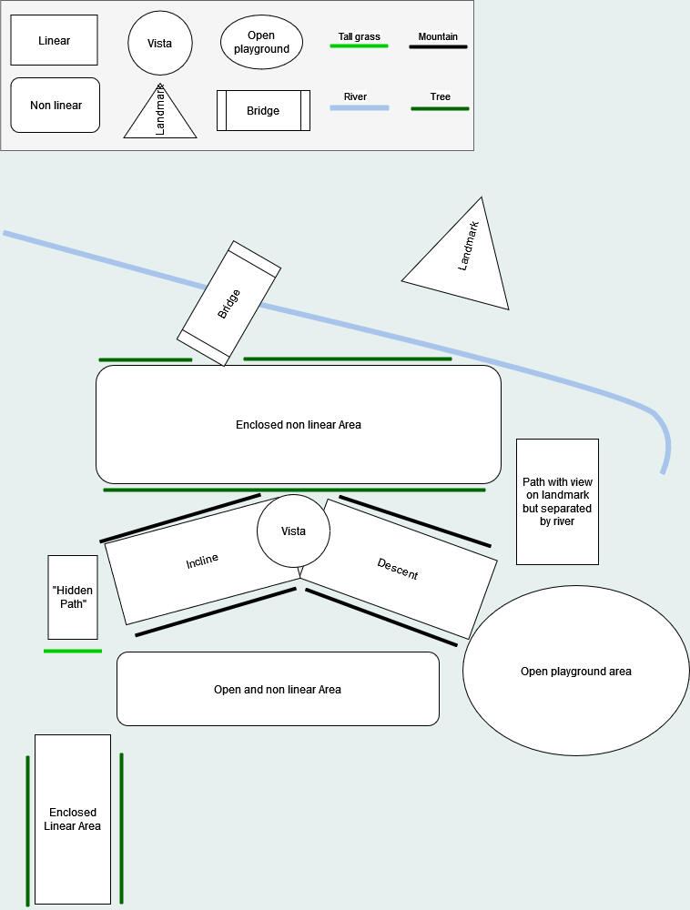
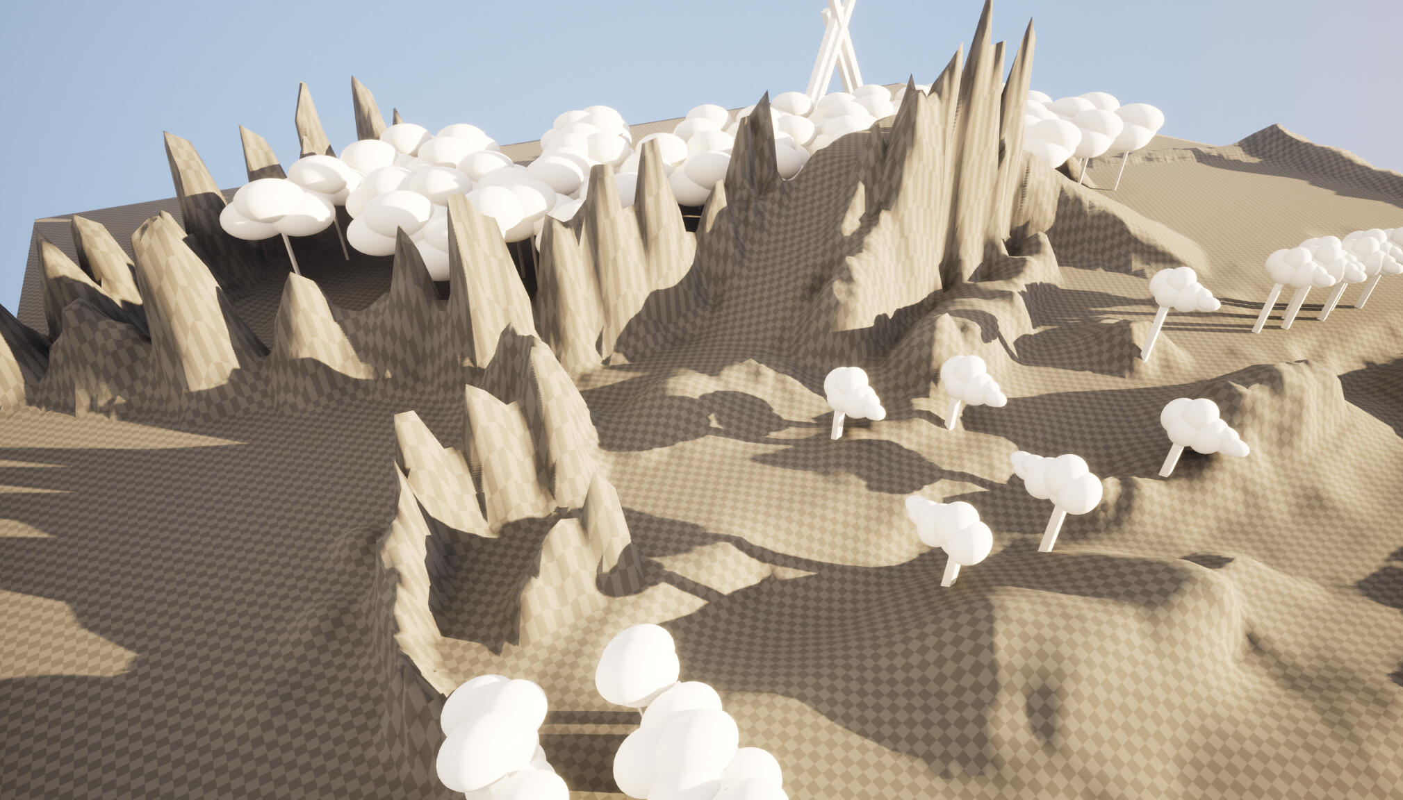
First rough version for a playtest
But what proved the most useful to me was a lot of back and forth between rough sketches on paper to blockout.
Then I would try them and pick what I liked about them and throw the rest away. Our game relying a lot on feelings and line of sights, I could focus on that when drawing and playtesting.
There were many many more, I would sketch constantly to get rid of any blockage and flush out all the bad ideas and keep the interesting and fun part. I should have also used graph paper also


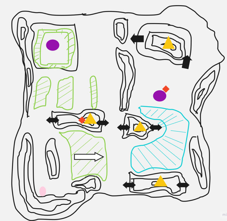
Documents for the vertical slice to iterate on line of sights and exploration flow.

Biome Chart for the full game
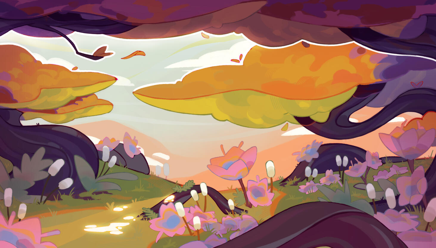
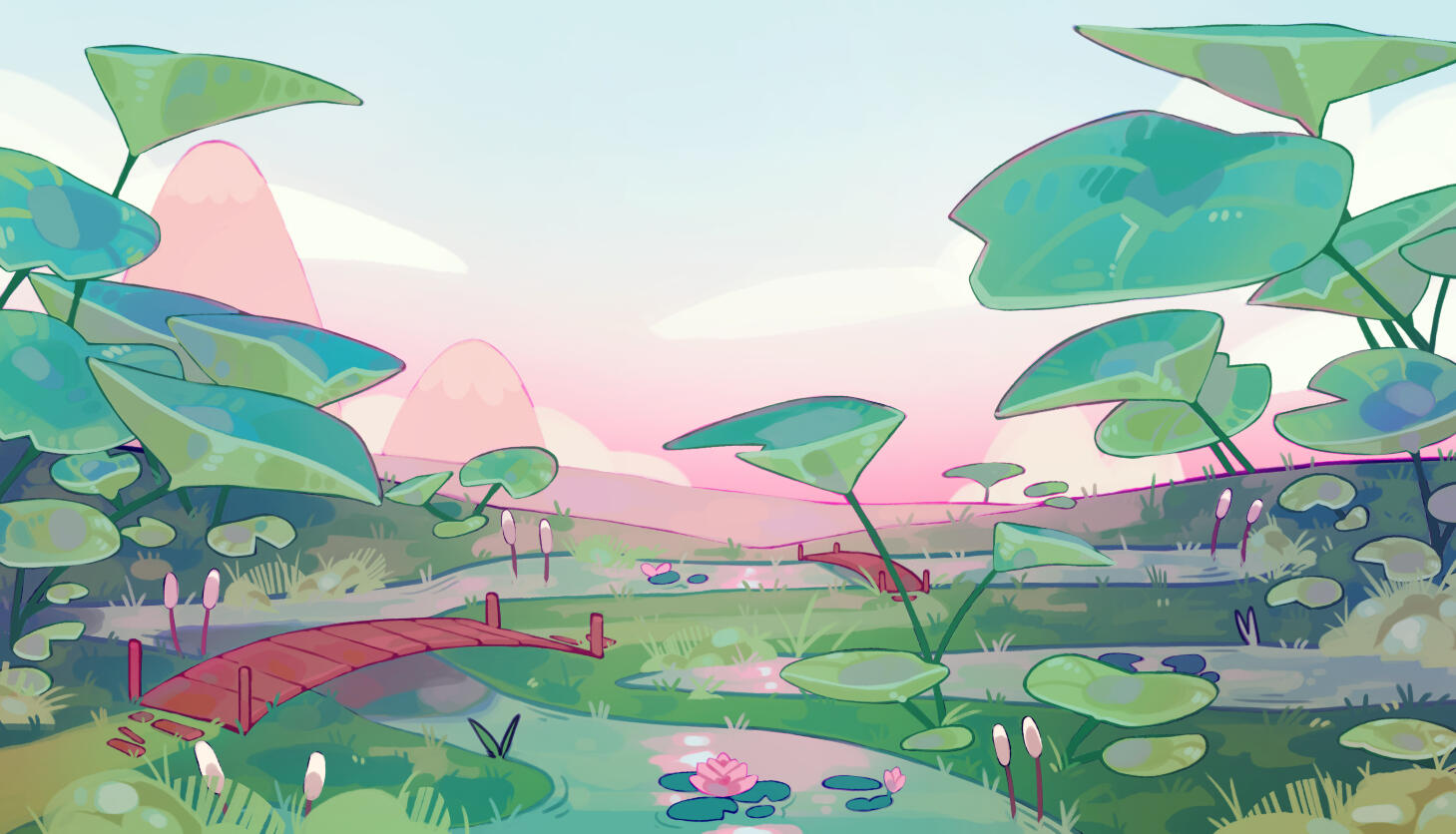
Two concepts of biomes made by our concept artist that were turned into 4 different zones in the level design for the vertical slice.
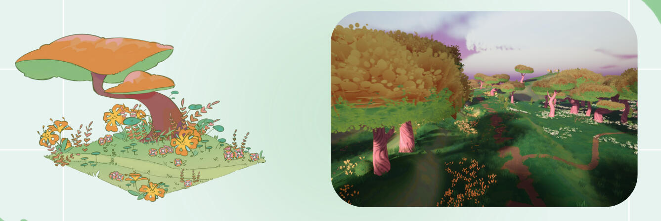
In that zone, we wanted to give the players choices by having 3 different paths possible.
Some being more visible than the others and play with the concept of desire paths.
But still highlight a main path by using tea flowers that are collectibles

Playing with gigantism by using giant nenuphars that makes the players feel small and back to childhood
Reinforce the childlike fun of wandering around on the bicycle with bumps and puddles

Showcase Intimacy in two forms:
A covered area with a pond with the most intimacy flowers near it that lets the player wander around trees and fireflies
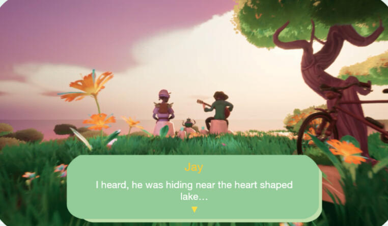
And one more open in a field that lets the player into the intimacy of Jay when they see him from a far playing the guitar in his thoughts
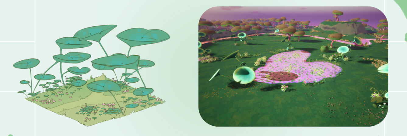
Called "Drama among the tranquility".
By using a single calm stream of water.
And a heart shaped pond where people can open their hearts or just feel their feelings.
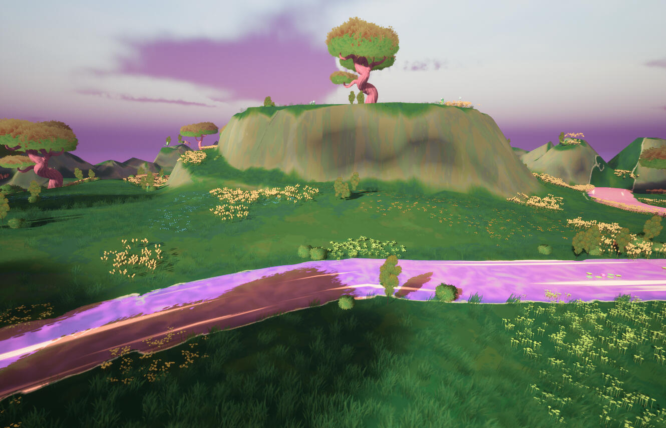

The level design was constructed around landmarks made to be visible from afar but also meant to be explored in different directions to enhance that open world aspect of going on a stroll on your bicycle.
An intention I had was also to avoid a too much guided exploration like going from point A to point B.
That's why, collectibles, point of interests and characters were placed more often on the path to a landmark to distract the players than on a landmark.
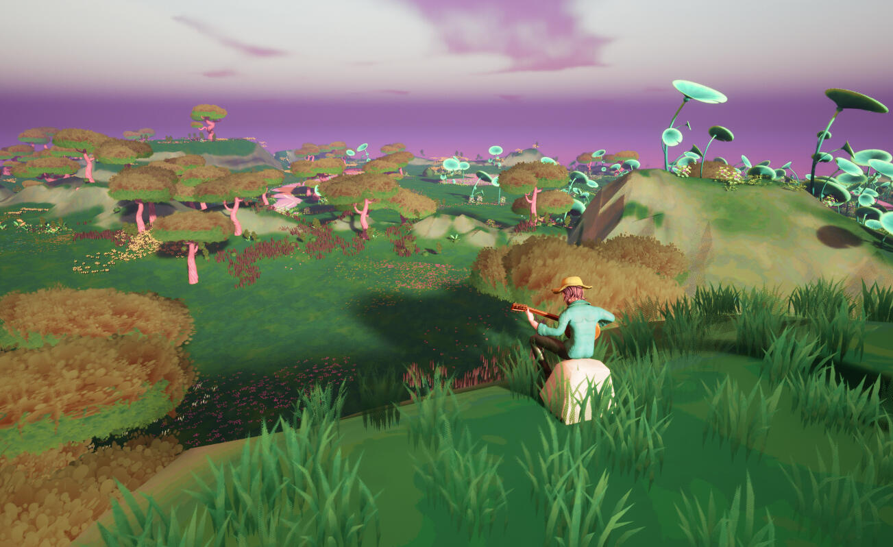
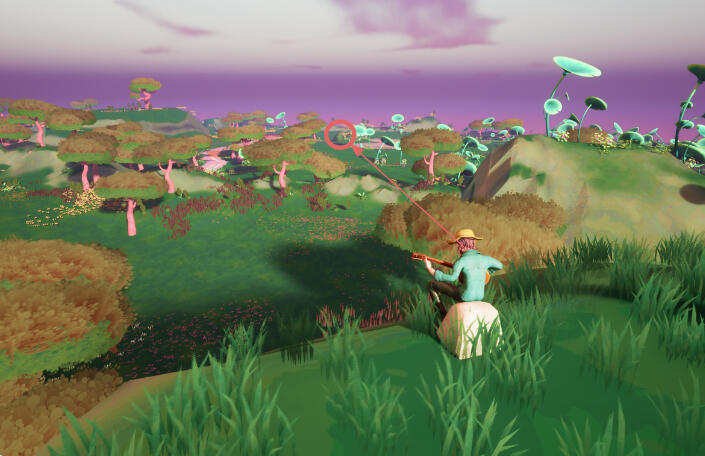
Vistas were also designed, they are meant for the players to enjoy a view.
But also in that one we can see Jay is sitting on a rock that is showing a direct view towards our other character to visually portray their relationship in the way they are placed in the world.

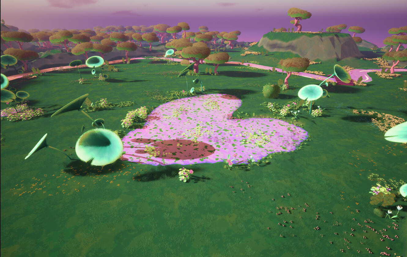
Another level design tool we used are Point of Interest such as a pond and a heart shaped lake that the characters can mention so it can be used when writing a dialog to guide the player towards a direction without giving them a quest.
System Design
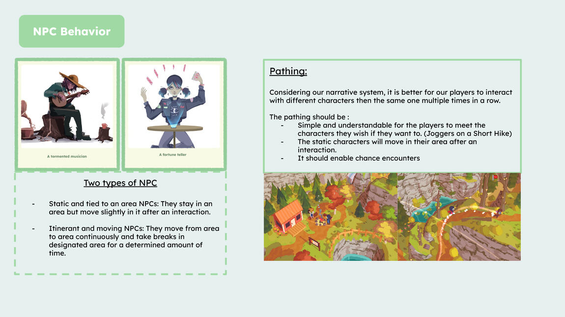
As a system designer, my missions were:- Designing the behavior of the NPC- Designing a progression system
Documentation made to communicate on the NPC Behavior.
Documentation made to communicate on the progression system
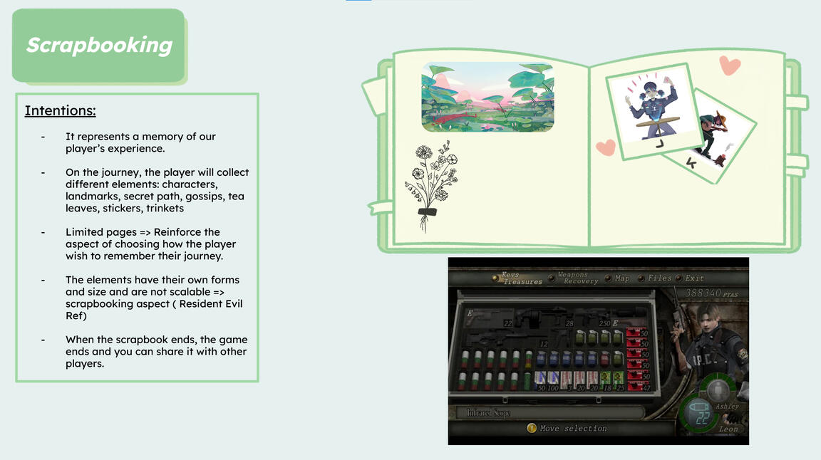
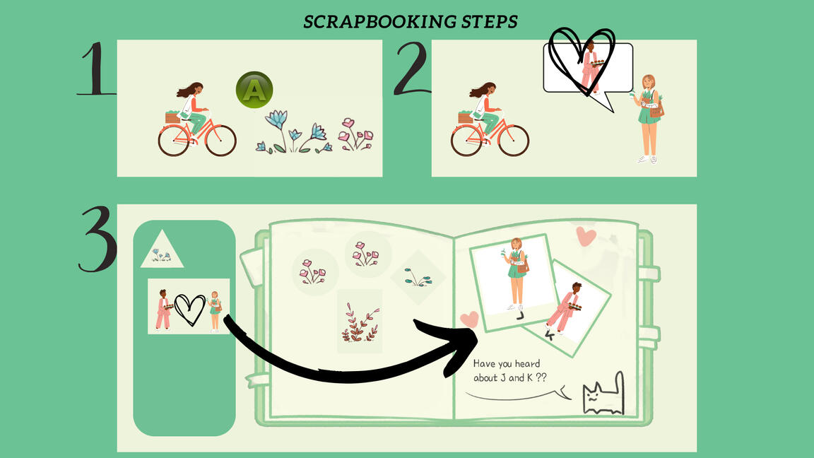
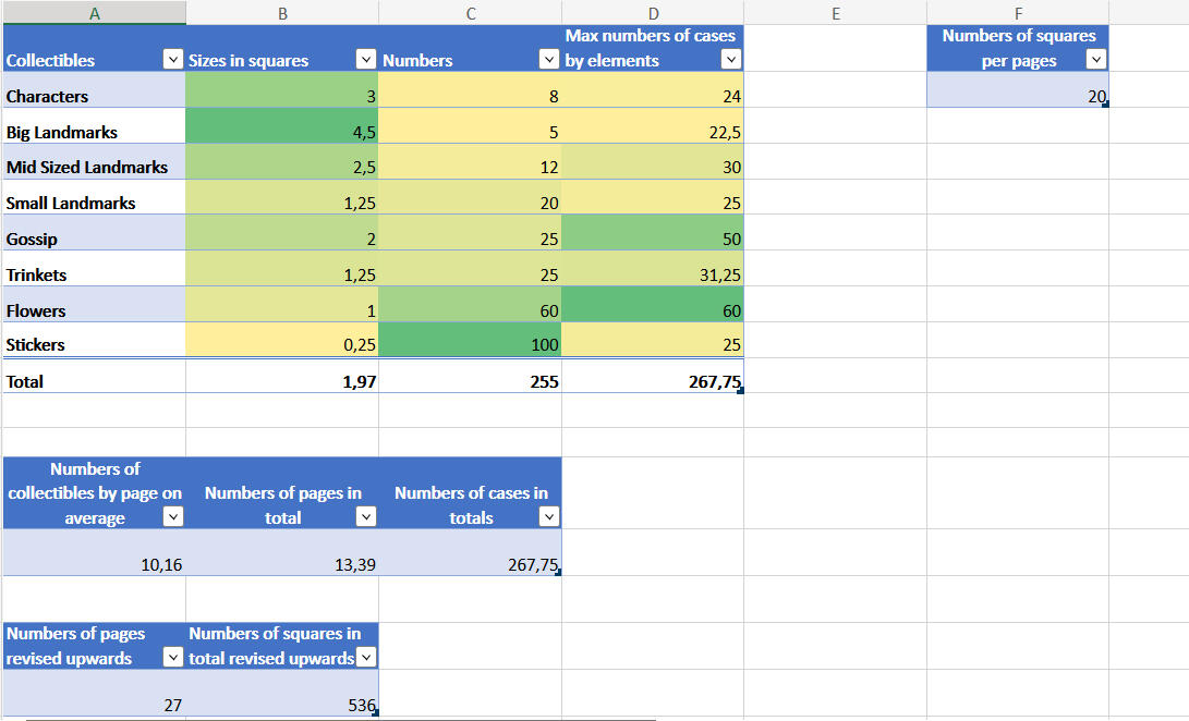
An excel was made to determine how many of each collectibles would be needed for the scrapbook/progression system.It was revised upwards because, the player would tend to not take the maximal space available and would rather spreadthe collectibles and carefully create a page.As you only need one elements to complete a page if wanted, it's okay to have more that necessary.
Extra on Narrative Design
Our game being narrative driven, a lot of work including the level design and more were tied to the narrative design.
We've worked together with Leo at the beginning of the production on worldbuilding and brainstorming characters and subjects of discussions and such.


Collaboratively with the sound designer and game artists, I've established level design references and mood and characters/discussions tied to hose places.
I also made characters sheets meant to be iterated during the production for Steve and our main character who is more of an avatar but needed to be fleshed out still.


Based on a first dialog system designed by Leo and myself. He iterated on it with a paper prototype to get feedbacks from me on it and do playtests with our UX/UR.
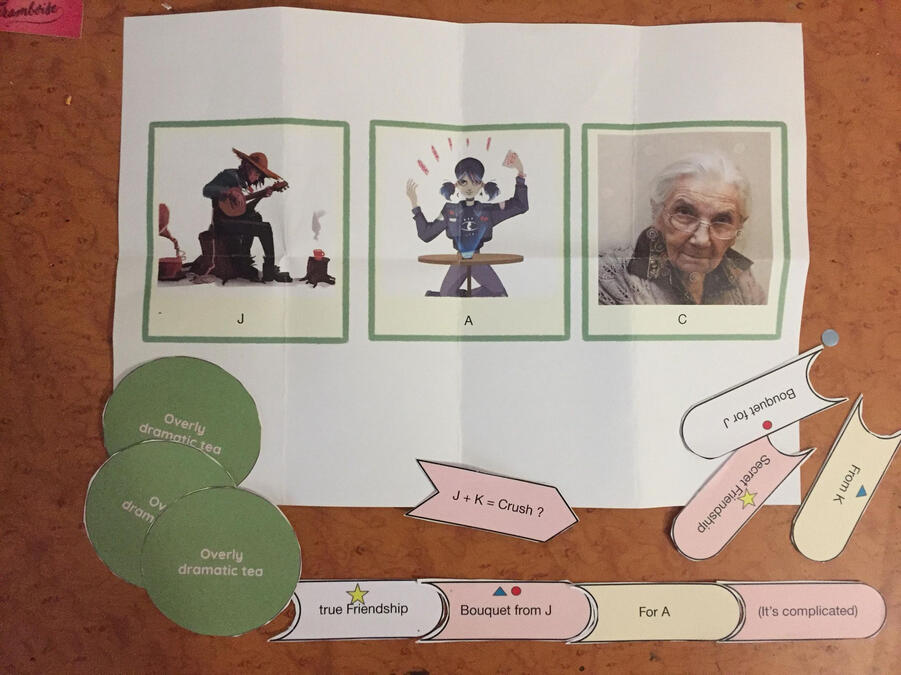
It works like a string of discussion


We start off with a subject of discussion that we can find while exploring or when talking with another character to start a conversation with a character.
To that, we add a tea to share a cup and chitchat. At the end of the dialog, we are rewarded with a subject complementing our first subject. That we can piece together to further complete.
We have different types of teas, most of the time they add flavors and nuances to dialogs but sometimes they create branching dialog.
My version of a string of discussion
Based on the "biome chart" I designed and the characters we imagined. I designed and written a narrative path from the gossip system made by Leo. It all begins with a protein powder we found and end with new informations on the relationships between the inhabitants.
The protein powder also enables discussions on body image and masculinity.


A version was made on Twine but it doesn't really fit in with our intentions of having multiple short stories rather than a big one and also focus on the transmission and evolution of information and personal perspective.
3 months
Unity, Git, Notion, Jira
Team of 6
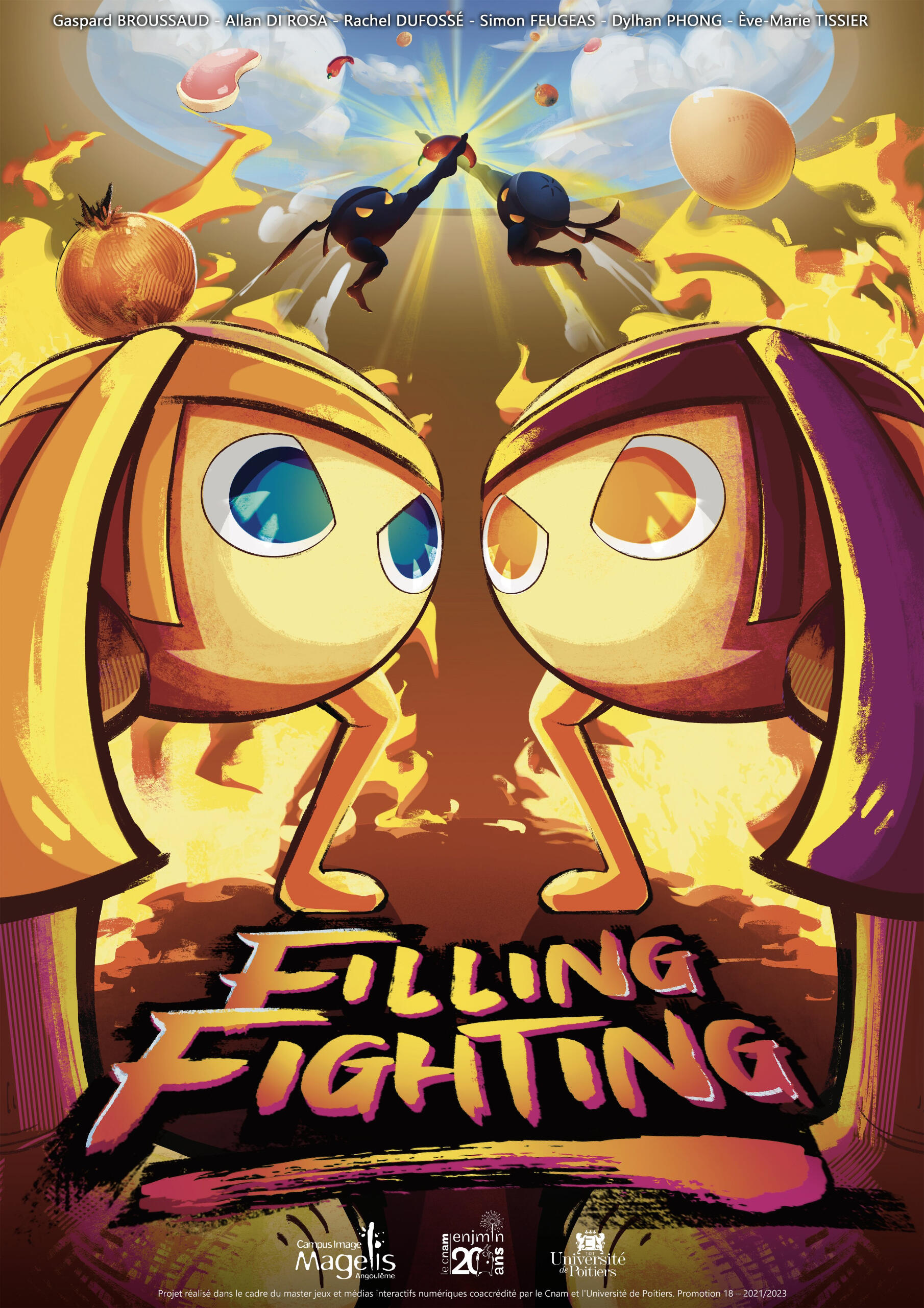
Filling Fighting is a student project developed in three months during my first year at CNAM-ENJMIN.

Pitch
A 1v1 versus game in which you play Sepak Takraw, a mix between volleyball and soccer.But there's a catch ! The ball is food and you both are an empty bao dough stuck in a steamer.Use your head but above all your big muscular legs to toss food at your opponent to make them slip and fill... before they do !
Responsibilities
As the only game designer on the project, I had the opportunity to work in close collaboration with each member of my team:· Designing and iterating on 3C's, mechanics, gameplay, rules, physics.- Establish metrics to rationalize a level in close collaboration with my programmer- Tight collaboration with my UX/UR and programmer to push accessibility forward with a one button one joystick gameplay- Work in collaboration with my artist to do mocap with a martial artist· Writing a Game Design Document.· Pitch and worldbuilding.· Communication and conveying the intention and design to the team
Game Design
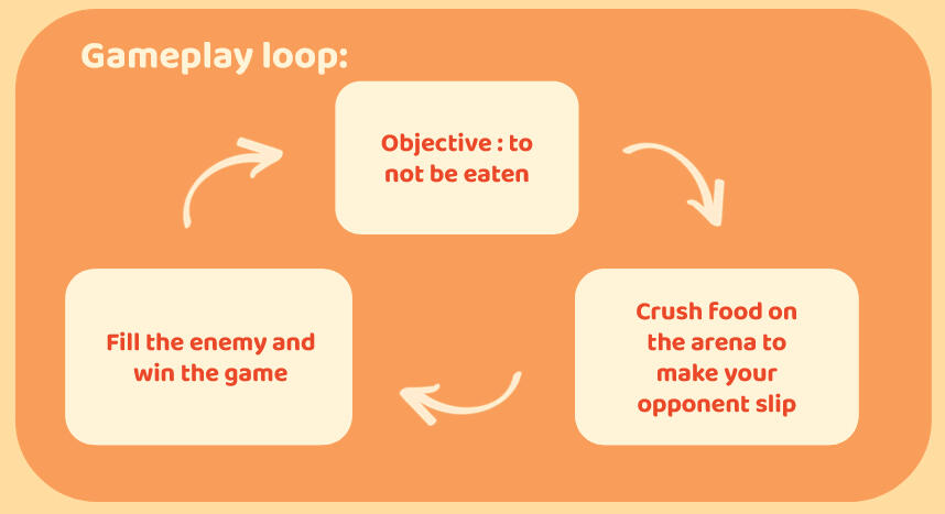

Your objective as a bao is to not to be eaten and stay empty from any sort of food. To do so, you will have to crush food on the opposite of the arena to make your opponent slip by filling a slippery gauge and then fill him. After you fill them 3 times with food, you will win the game.
Rational Design/ Rational Level Design

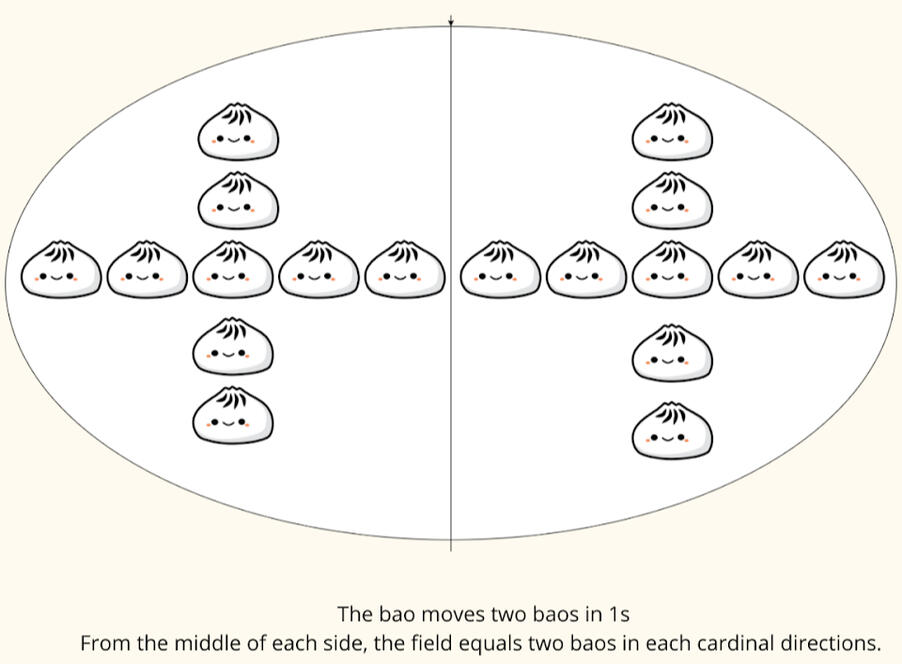
Filling Fighting being a versus game, a lot of it comes down to reflexes and precise controls. So I've worked in close collaboration with a programmer to encompass that intention:- A script was made to precisely make the bao moves in the desired direction for 1s and measure the distance traveled.- From the middle of the field, the character has to be able to reach each side in 1s.- Where the ball lands is decided by having more or less catchable areas depending on the position of the one smashing and the direction stick.
Close collaboration with an UX/UR
and programmer on accessibility
Tight collaborative and iterative work of iteration through the whole project to find a good mix between a versus and and an accessible game.
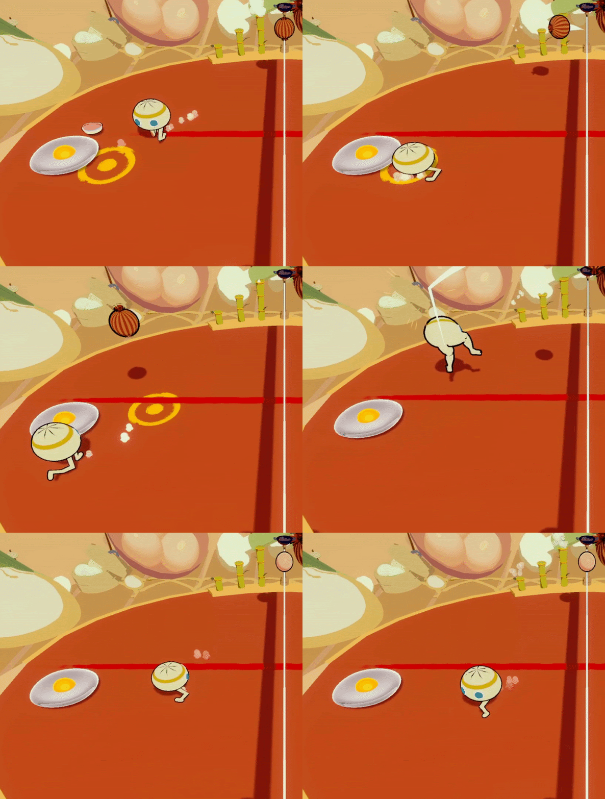
One of the pillars of our intended experience was for the game to be accessible and playable by the most players:
- The game is playable with only one button and one joystick- Remaping wherever for players with one hand, an example among many to play.- Every action such as jumping and smashing would be on one button.- Did a quick graphic for the programmer then worked in tandem on it to precisely set a distance between the player and the ball for it to either jump or smash.
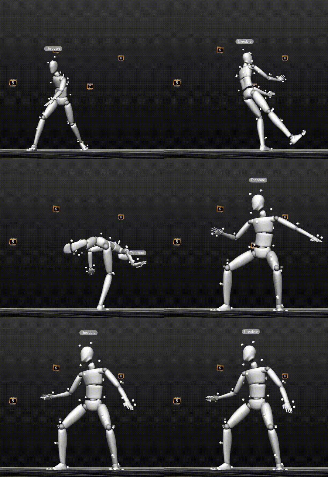
Mocap with a martial artist
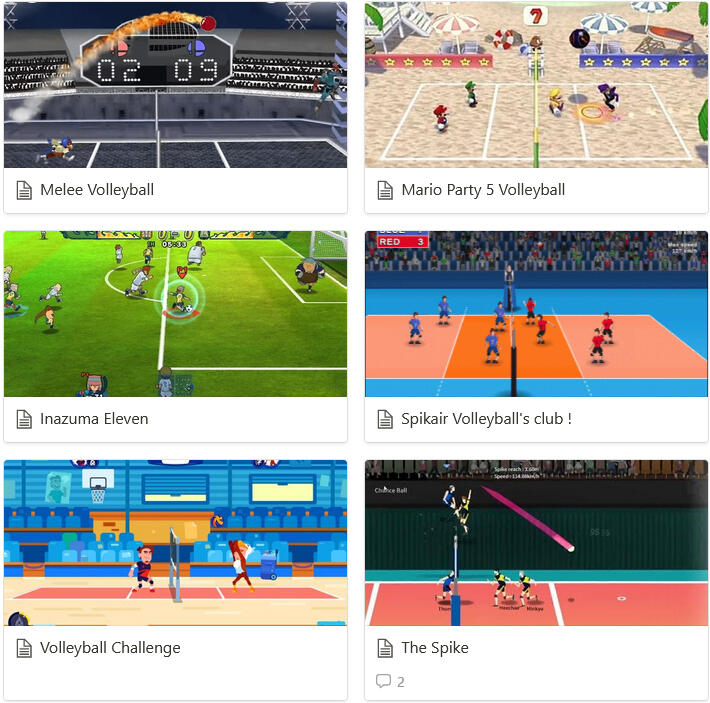
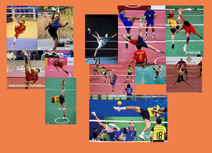
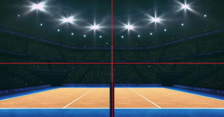
Benchmark specifically on volleyball and football in video games but not only, how they work and their rules.
References for the martial artist and recreate moves in MOCAP.
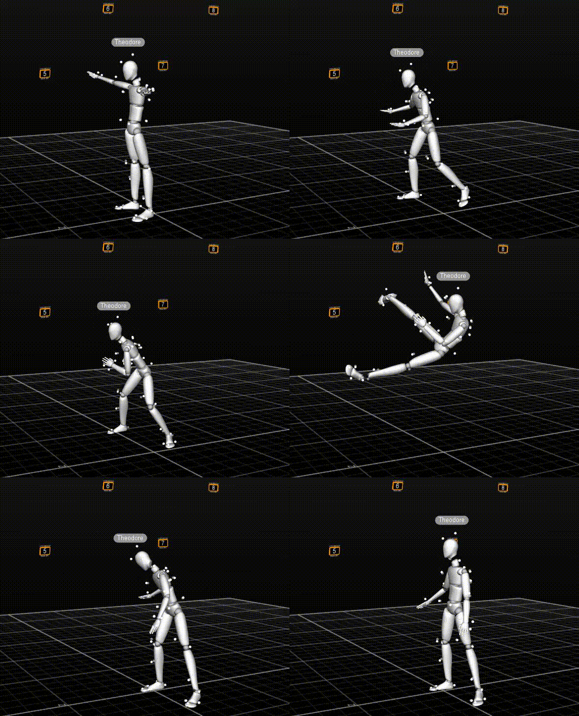
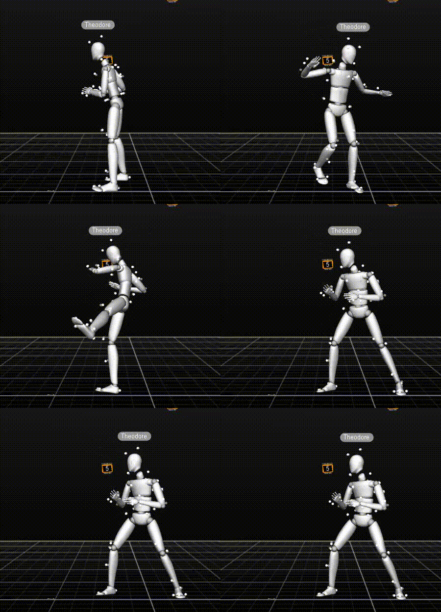
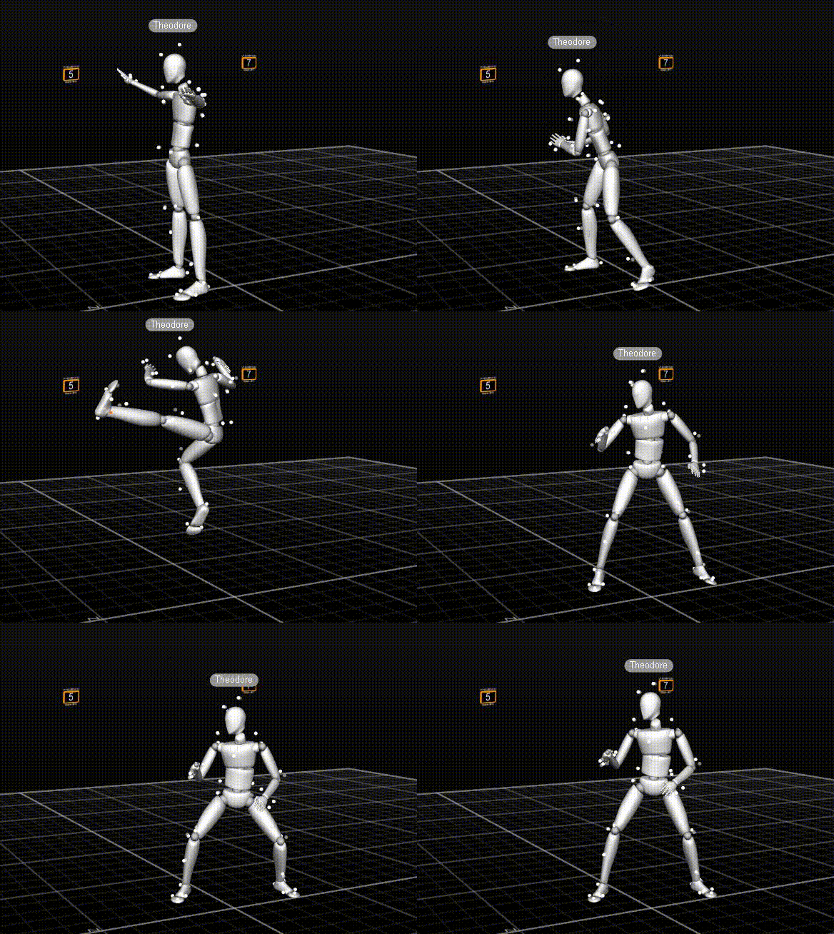
What if I'm the train
What if I'm the train was made in 1 day for the GMTK Game Jam 2023 in solo, with the theme "Roles Reversed"
I decided to put the player more as a creator of situations for dialogues between characters instead of choosing the dialogues while knowing perfectly what they will lead to:
The player chooses characters and intersection for the train to go and creates situation for dialogues.
So how do we create situations for dialogues ?

As I said we are a sort of train system deciding which passengers will sit together and which intersection the train will take.The passenger will have two characteristics which will have an impact on the dialogue you'll be getting at the end : The age and one character trait.
To get a dialogue you have to pick two passengers and then choose a direction for the train to go to which will act as a modifier.The narrative system is broken down in themes which can be up to three subjects and the subjects are divided in two dialogues possible. The final choice of dialogue is decided by the intersection taken.

From the theme, we get three subjects possible, one is decided on by the traits of the characters.
Then the dialogue is determined by the direction taken.To focus on short stories, touch upon different subjects and point of views and not overcomplicate the system.
It has been decided to not add each new passengers on the train into the conversation.
It could also make the conversation grow stale instead a new theme will be decided upon.
However we could add variation by having more than two passengers talking or having subjects needing three traits and give the passengers two traits instead.

In the jam and given time, it was implemented this way on Bitsy.
Improvement Axis
Explicit more the traits of the characters in the writings to give a more explicit clue on which route is taken.
Game Design Documents
Untitled Roguelike

Level Design Documents
What's the tea
"Stressed by your life , you decide to take some “vacation” to visit your aunt for the first time. She's old and doesn't get out anymore She welcomes you and gift you a scrapbook and her old bike to go on your own little mundane adventure and document your journey.
You can fill it with everything you might find from tea leaves to gorgeous views and also the lives of the inhabitants.
So that at the end of each day, you will bring a breath of fresh air into her home with gossips and beautiful environnements"
What’s the tea is a relaxing exploration game on a teapot bicycle in which you collect teas, meet quirky inhabitants and ride through an island to live a journey to be remembered.
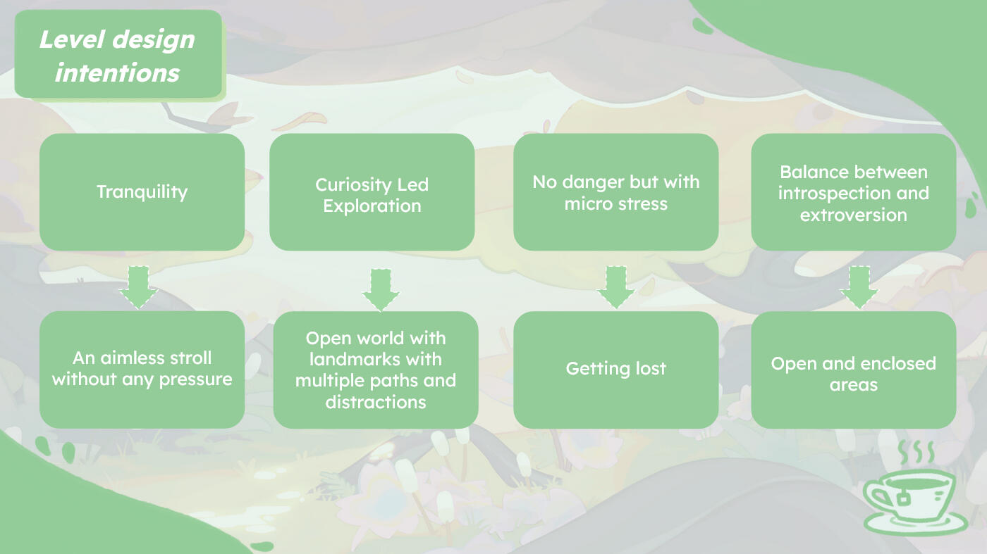
As a Level designer, my missions were:- Transform our intentions into level design elements- Creation of different biomes and subjects of discussions, characters and mood tied to those places- Iterative work on the design an open world map on paper and in engine for playtests.- Design of landmarks, point of interests and paths and vistas- Placement of the NPC, collectibles that makes sense in our world

We established intentions for our game as a whole that I turned into level design elements. Then I used all the elements I had to construct a rough first bubble plan to then make in blockout.


First rough version for a playtest
to test the controller
But what proved the most useful to me was a lot of back and forth between rough sketches on paper to blockout.
Then I would try them and pick what I liked about them and throw the rest away. Our game relying a lot on feelings and line of sights, I could focus on that when drawing and playtesting.
There were many many more, I would sketch constantly to get rid of any blockage and flush out all the bad ideas and keep the interesting and fun part. I should have also used graph paper also
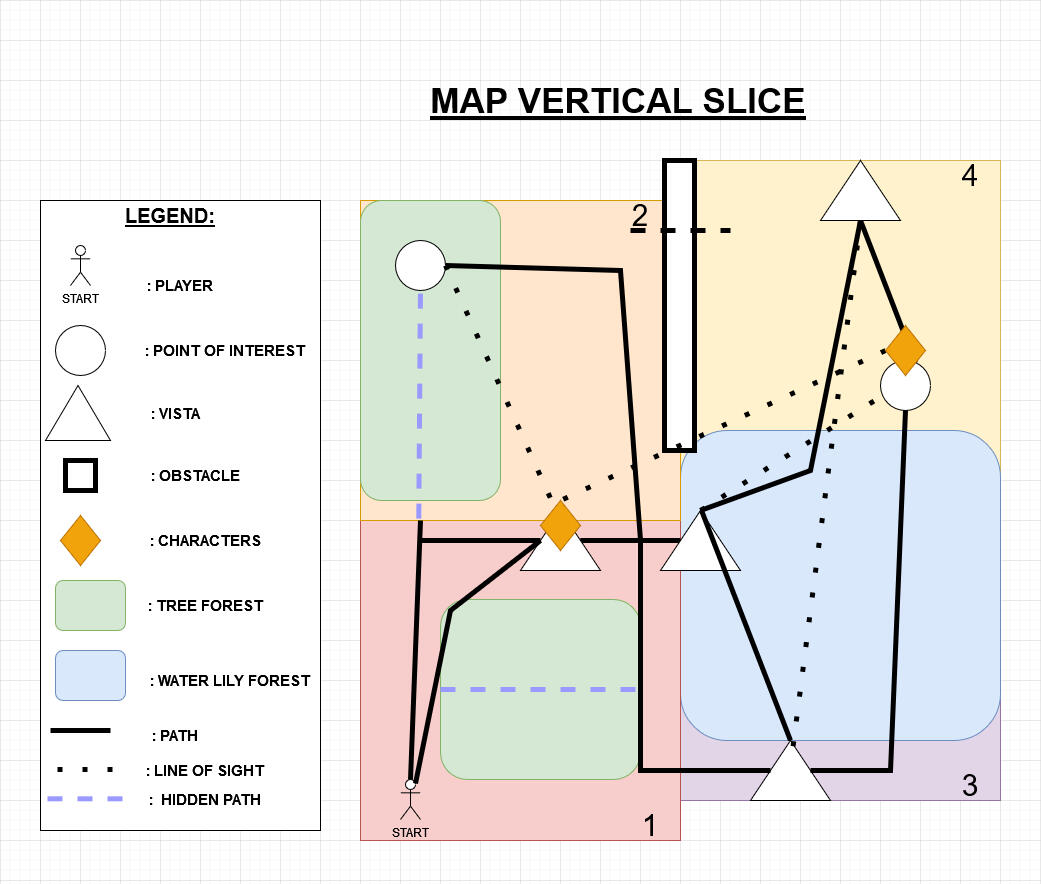
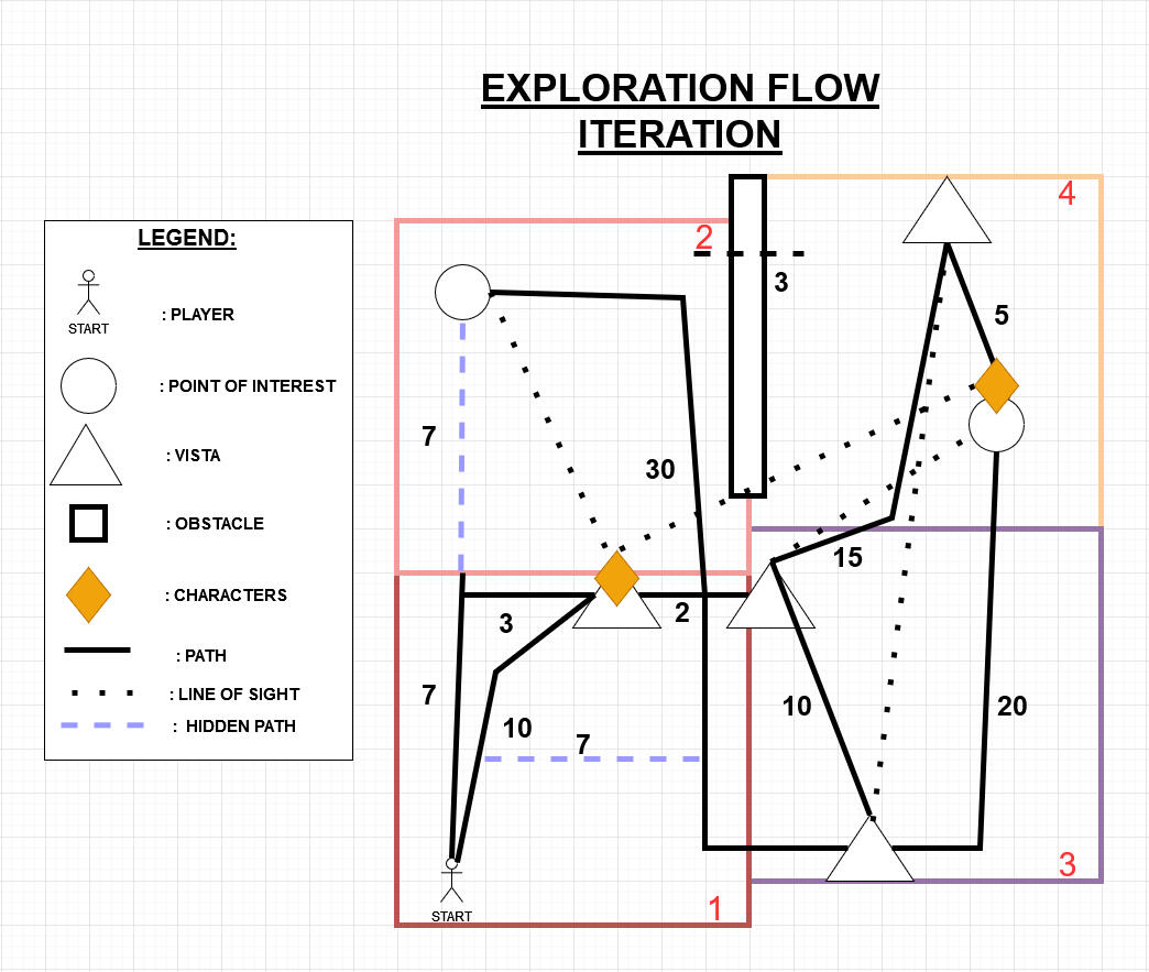
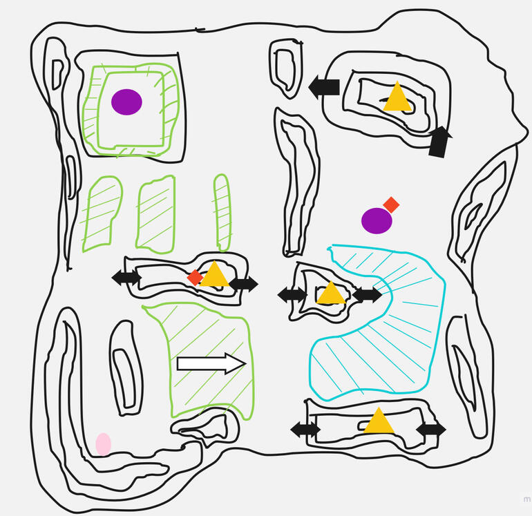
Documents to iterate on the vertical slice.
With a focus on line of sight and exploration flow.
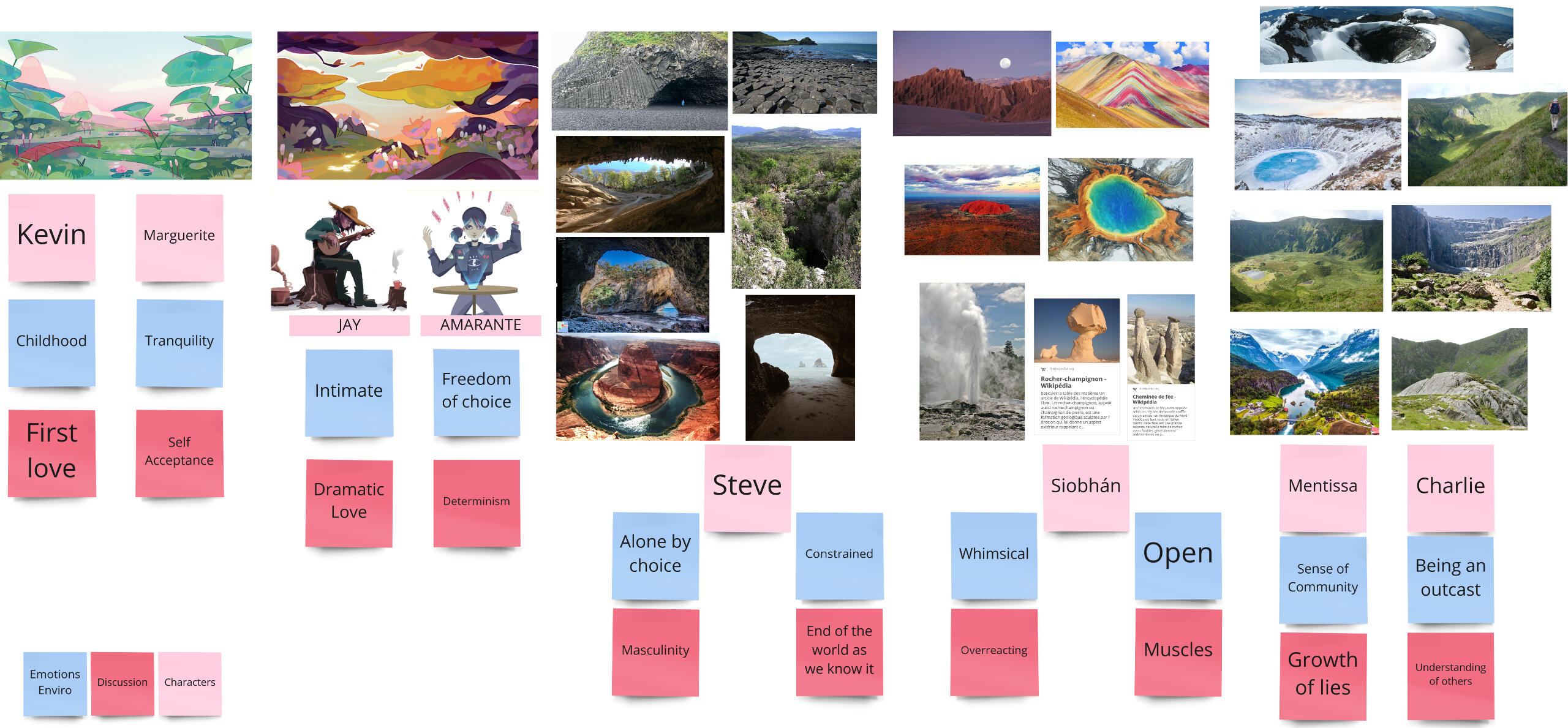
Biome Chart for the full game


Two concepts of biomes made by our concept artist that were turned into 4 different zones in the level design for the vertical slice.

In that zone, we wanted to give the players choices by having 3 different paths possible.
Some being more visible than the others and play with the concept of desire paths.
But still highlight a main path by using tea flowers that are collectibles
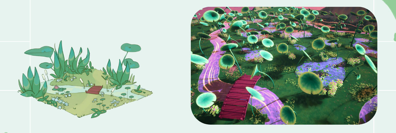
Playing with gigantism by using giant nenuphars that makes the players feel small and back to childhood
Reinforce the childlike fun of wandering around on the bicycle with bumps and puddles

Showcase Intimacy in two forms:
A covered area with a pond with the most intimacy flowers near it that lets the player wander around trees and fireflies
And one more open in a field that lets the player into the intimacy of Jay when they see him from a far playing the guitar in his thoughts

Called "Drama among the tranquility".
By using a single calm stream of water.
And a heart shaped pond where people can open their hearts or just feel their feelings.

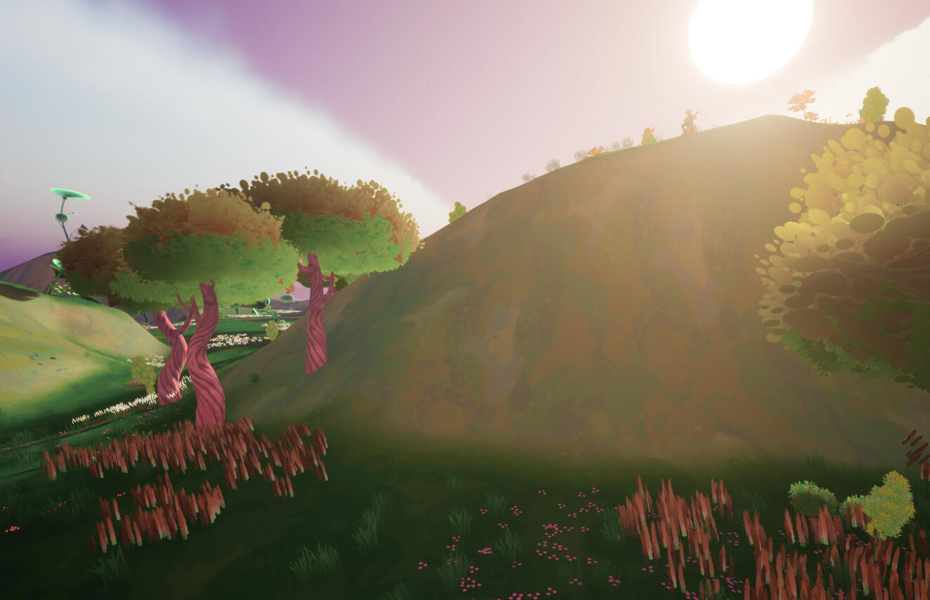
The level design was constructed around landmarks made to be visible from afar but also meant to be explored in different directions to enhance that open world aspect of going on a stroll on your bicycle.
An intention I had was also to avoid a too much guided exploration like going from point A to point B.
That's why, collectibles, point of interests and characters were placed more often on the path to a landmark to distract the players than on a landmark.
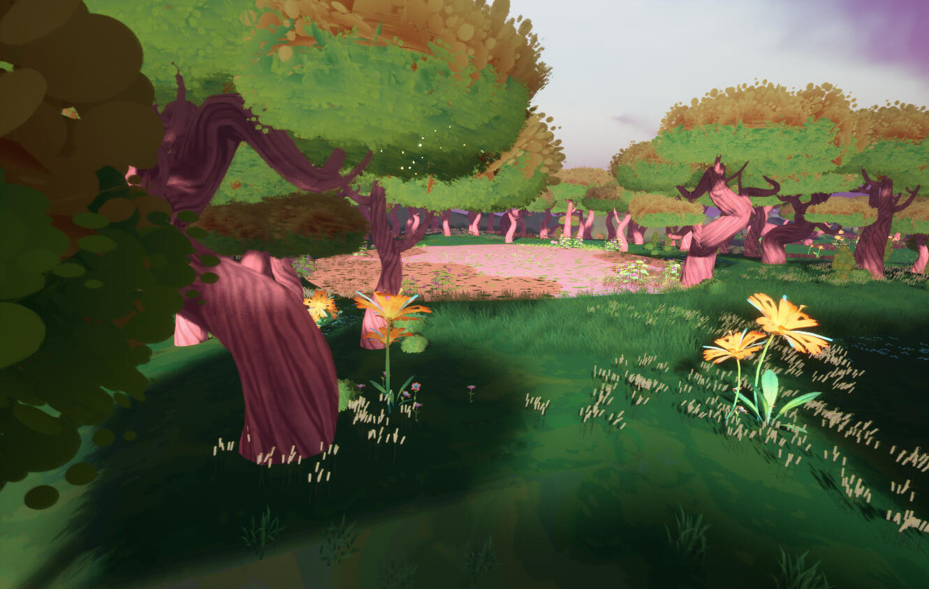

Another level design tool we used are Point of Interest such as a pond and a heart shaped lake that the characters can mention so it can be used when writing a dialog to guide the player towards a direction without giving them a quest.

Rational Level Design
I tried to break down each mechanics in blocks and numbers to be able to easily tweak the parameters to quickly prototype and blockout a level.
It's not set in stone but more indicative of an intention. Then in the engine, we can properly tweak and playtest.
These parameters can be easily used to adjust the difficulty curve of a level.
Each mechanic can be turned into a block to construct a level in 2D or in the engine to blockout and more easily design a level and its difficulty depending on how tight each jumps are.
Here's an illustration of an easy passage, that we can see from how much room there is to manoeuvre and make mistakes.
(it's more an illustration than an example of a level)
To support that intention, I wrote dialogues to convey different feelings and goals to the players. Then placed them in the level and implemented them with Yarn Spinner.
Each color is a type of dialogue that we put in a shadow.

By using that porthole mechanic, we designed five linear levels with rising intensity of weirdness and uncanniness.
Each colored circle is numbered with the dialogues in the google sheets.
Black ones are filler meant to give tension or be used as staging elements
Since it's am ambiance game, the focus was put into the staging by carefully choosing the dialogues to put in and also play with lights and the deconstruction of the train.
WIP on Far Cry 5 Level Editor
How do you live like this ?
Narrative Game on Bitsy in Solo
Break into someone's flat and learn about the life of the robbed one.
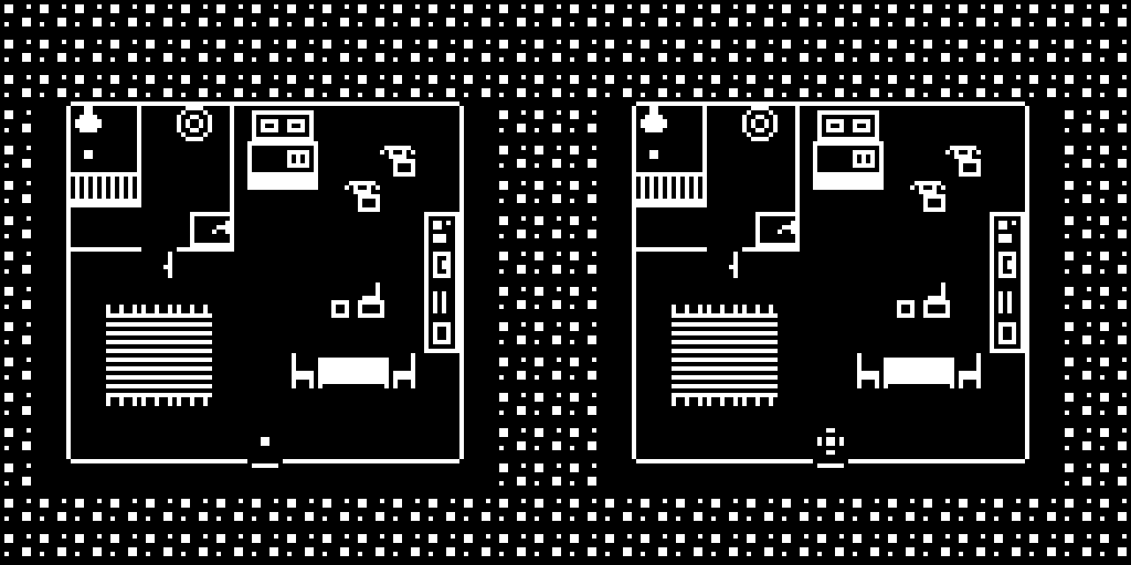
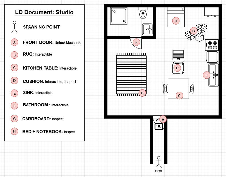
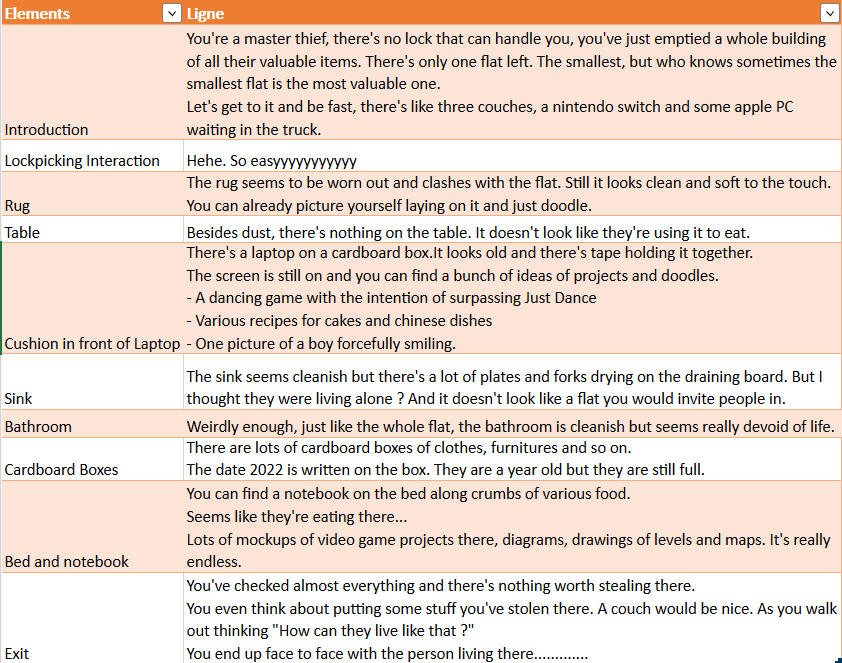
Work on telling a story through items and give personality to them.
Kill'N Clean it

Kill’n Clean It is a top down shooter with a funny and light set up, we control two characters with complementary and asymmetric skills.They are tasked with cleaning a house filled with alien and filthy blobs. The nature of the task, a simple spring cleaning and its origin, an invasive extraterrestrial race are poles apart from each other. It justifies an adequate opposite armament for our heroes. However, by their antagonistic nature, they become complementary in order to reach their goal.The game stands out by its symmetrical control of the characters which are moving with the center of the screen as orbit. They can move away from the center and toward the center while being able to spin around it.The complementarity of the characters and their symmetry is creating a nervous and fast experience.Kill’n Clean It offers a nervous and fun experience in which we exploit the duality of two complementary characters.Recommended to play with Xbox Controller.
Game Design
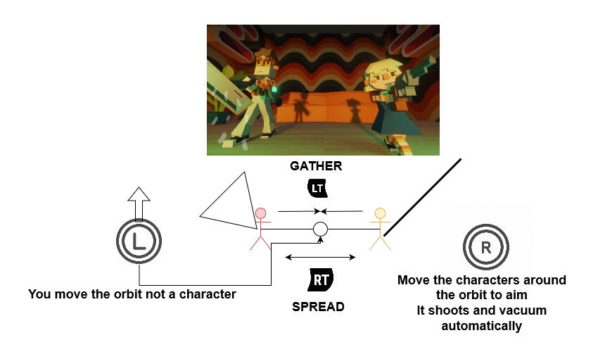
We got a melee character in orbit with a shooter and you move them as a tandem.
We wanted them to be complementary so we designed ennemies as blobs of different sizes needing the cooperation of the two characters to be killed or they would regenerate.
Level Design

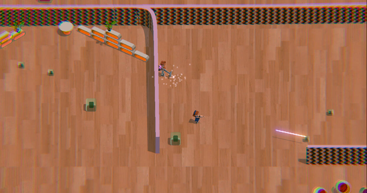

In terms of level design, I was inspired by games such as Hotline Miami, but it wasn't possible to recreate the small corridor and small area part of the game because the player is controlling two character with complementary and asymmetric skills.
Another issue was that we didn't agree on a metric, so everything was a bit too small or too big.
But it was interesting to try and create a level around two characters and how to induce stress to the player.
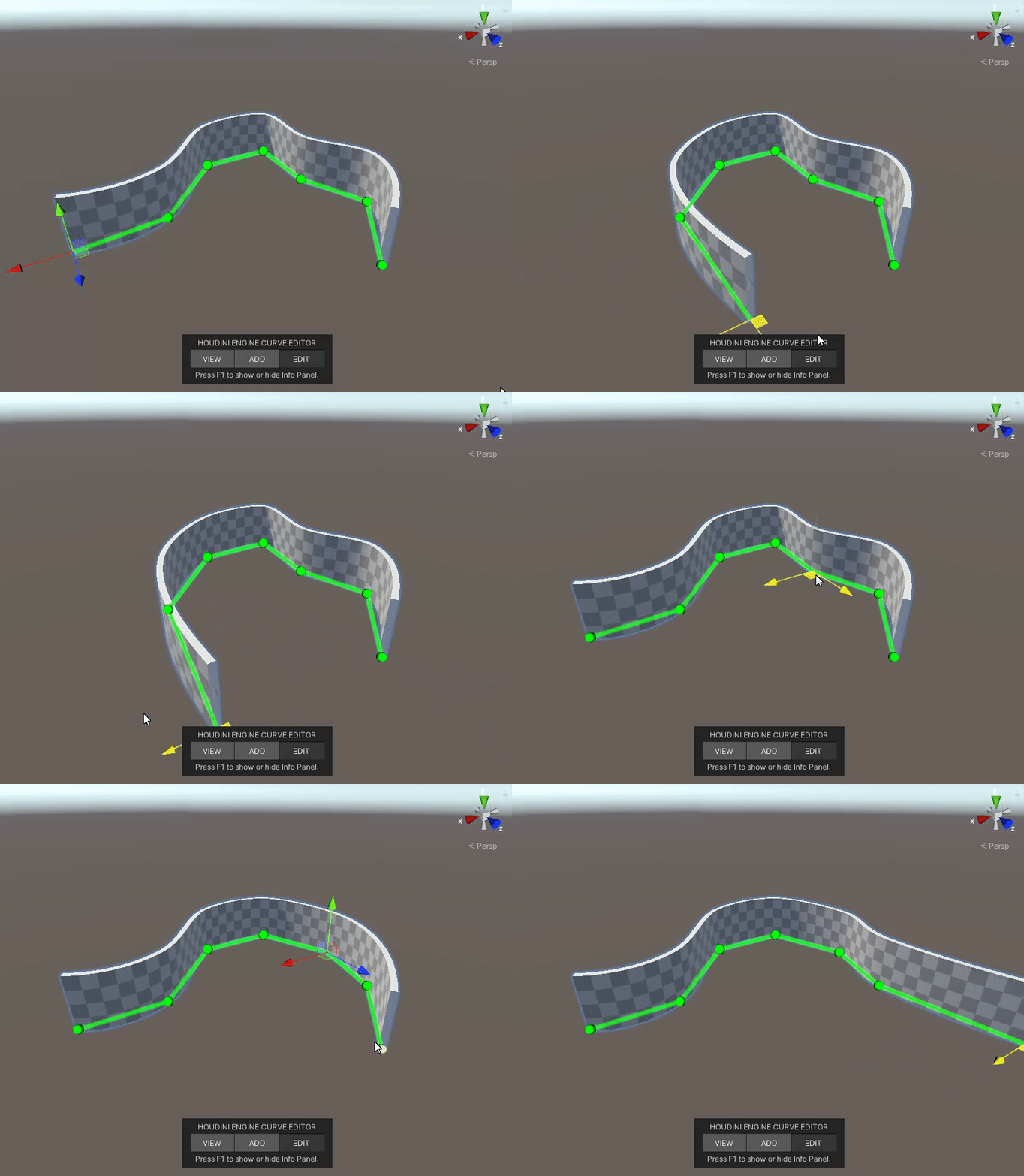
Also I worked in collaboration with a technical artist to make a tool on Houdini to make curvy walls on Unity for our characters to not be stuck in corners.
Game Design Documents
Untitled Roguelike
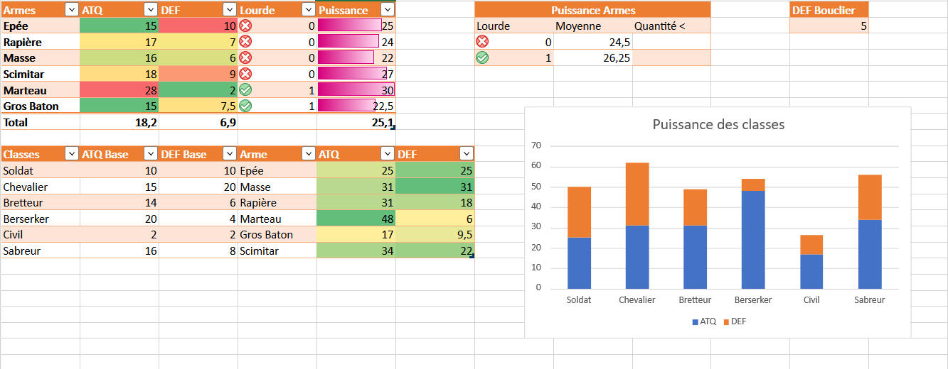
Narrative Design Documents
What's the tea
"Stressed by your life , you decide to take some “vacation” to visit your aunt for the first time. She's old and doesn't get out anymore She welcomes you and gift you a scrapbook and her old bike to go on your own little mundane adventure and document your journey.
You can fill it with everything you might find from tea leaves to gorgeous views and also the lives of the inhabitants.
So that at the end of each day, you will bring a breath of fresh air into her home with gossips and beautiful environnements"
What’s the tea is a relaxing exploration game on a teapot bicycle in which you collect teas, meet quirky inhabitants and ride through an island to live a journey to be remembered.
Our game being narrative driven, a lot of work including the level design and more were tied to the narrative design.
We've worked together with my duo Leo at the beginning of the conception on worldbuilding and brainstorming characters and subjects of discussions and such.


Collaboratively with the sound designer and game artists, I've established level design references and mood and characters/discussions tied to hose places.
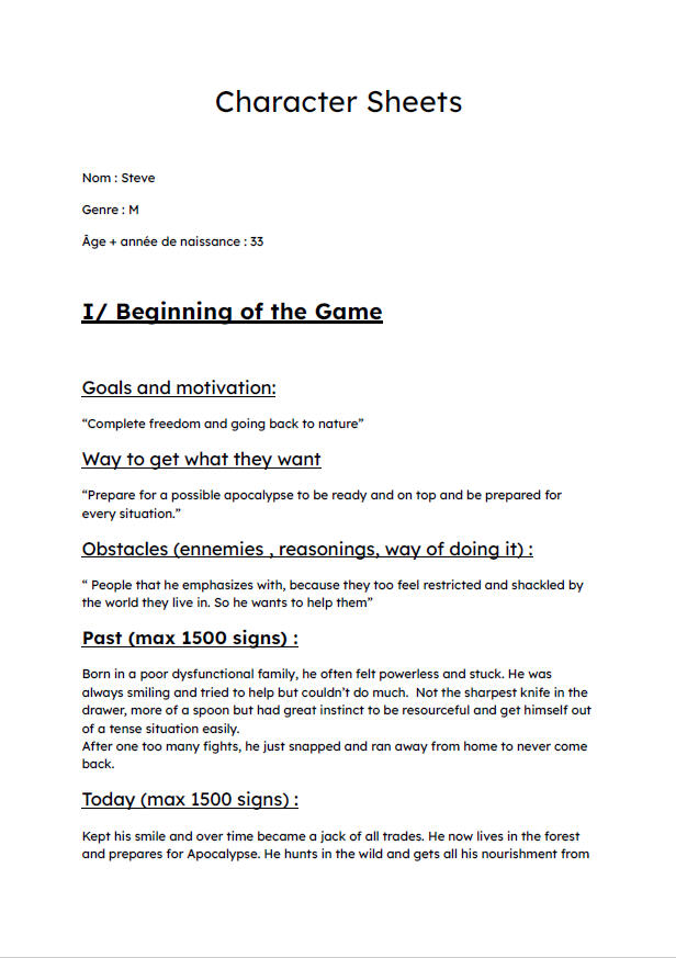
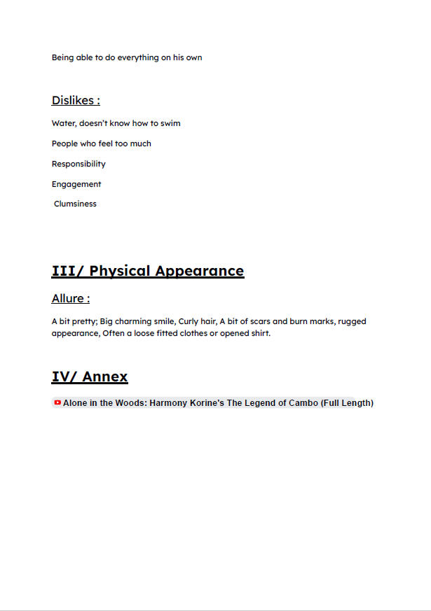
I also made characters sheets meant to be iterated during the production for Steve and our main character who is more of an avatar but needed to be fleshed out still.

Based on a first dialog system designed by Leo and myself. He iterated on it with a paper prototype to get feedbacks from me on it and do playtests with our UX/UR.

It works like a string of discussion


We start off with a subject of discussion that we can find while exploring or when talking with another character to start a conversation with a character.
To that, we add a tea to share a cup and chitchat. At the end of the dialog, we are rewarded with a subject complementing our first subject. That we can piece together to further complete.
We have different types of teas, most of the time they add flavors and nuances to dialogs but sometimes they create branching dialog.
My version of a string of discussion
Based on the "biome chart" I designed and the characters we imagined. I designed and written a narrative path from the gossip system made with Leo. It all begins with a found protein powder and end with new informations on the relationships between the inhabitants.
The protein powder also enables discussions on body image and masculinity.


A version was made on Twine but it doesn't really fit in with our intentions of having multiple short stories rather than a big one and also focus on the transmission and evolution of information and personal perspective.
What if I'm the train
What if I'm the train was made in 1 day for the GMTK Game Jam 2023 in solo, with the theme "Roles Reversed"
I decided to put the player more as a creator of situations for dialogues between characters instead of choosing the dialogues while knowing perfectly what they will lead to:
The player chooses characters and intersection for the train to go and creates situation for dialogues.
So how do we create situations for dialogues ?
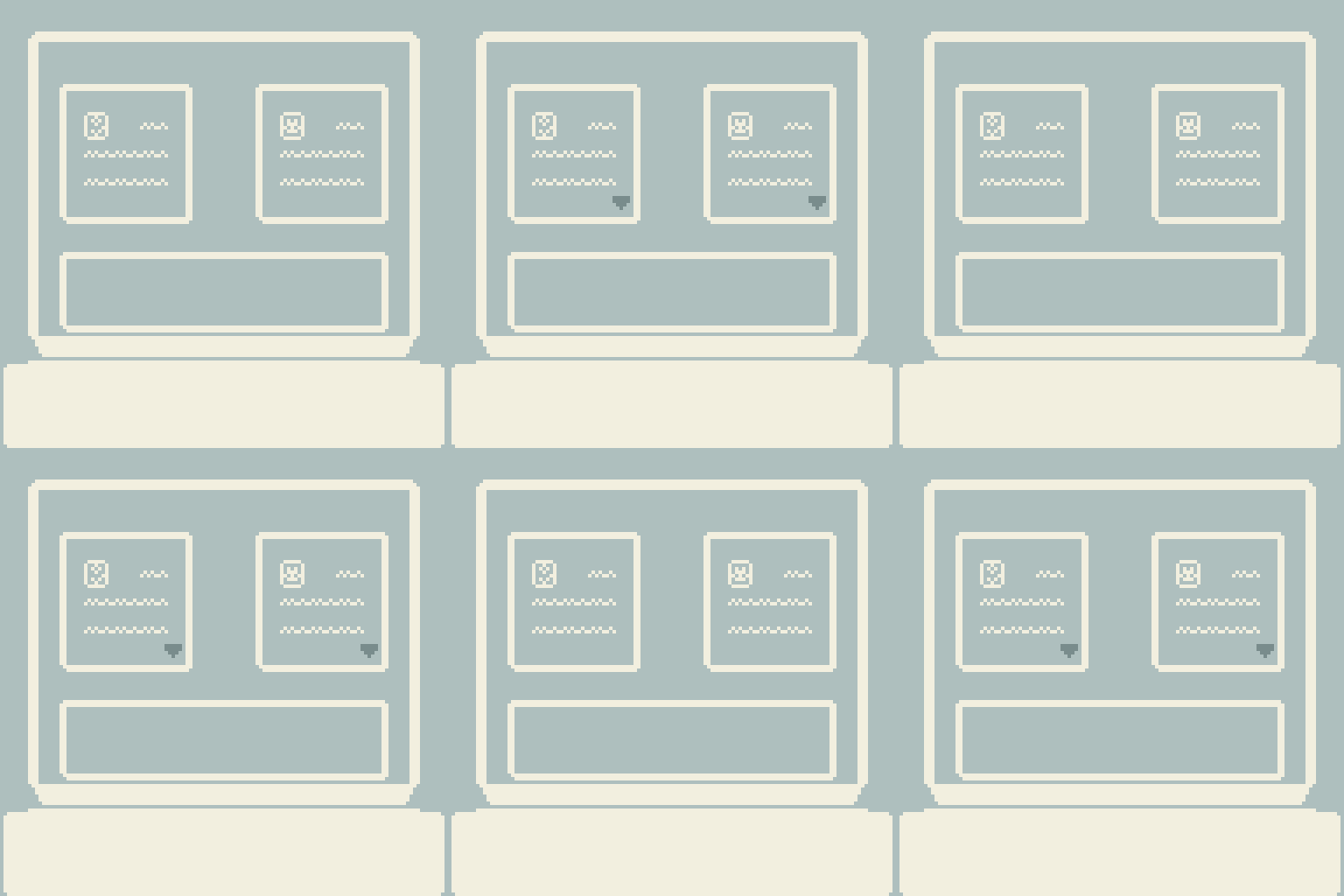
As I said we are a sort of train system deciding which passengers will sit together and which intersection the train will take.The passenger will have two characteristics which will have an impact on the dialogue you'll be getting at the end : The age and one character trait.
To get a dialogue you have to pick two passengers and then choose a direction for the train to go to which will act as a modifier.The narrative system is broken down in themes which can be up to three subjects and the subjects are divided in two dialogues possible. The final choice of dialogue is decided by the intersection taken.
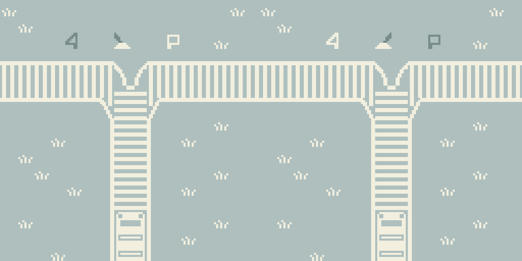
From the theme, we get three subjects possible, one is decided on by the traits of the characters.
Then the dialogue is determined by the direction taken.To focus on short stories, touch upon different subjects and point of views and not overcomplicate the system.
It has been decided to not add each new passengers on the train into the conversation.
It could also make the conversation grow stale instead a new theme will be decided upon.
However we could add variation by having more than two passengers talking or having subjects needing three traits and give the passengers two traits instead.
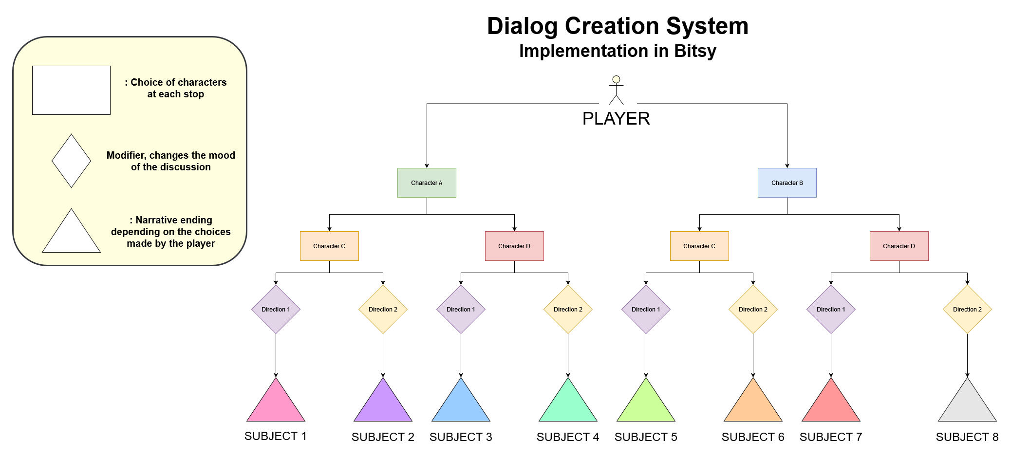
In the jam and given time, it was implemented this way on Bitsy.
Improvement Axis
Explicit more the traits of the characters in the writings to give a more explicit clue on which route is taken.
And what if we did it ?
And What If We Did It is a narrative-driven bitsy game with branching narration where a group of friends tries to turn their late-night “what if” dreams into reality.
You will act as a guide as they build a creative collective, navigate ambition, burnout.
You can find the script without modifiers here
To support that intention, I wrote dialogues to convey different feelings and goals to the players. Then placed them in the level and implemented them with Yarn Spinner.
Each color is a type of dialogue that we put in a shadow.
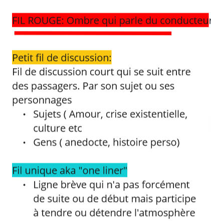

By using that porthole mechanic, we designed five linear levels with rising intensity of weirdness and uncanniness.
Each colored circle is numbered with the dialogues in the google sheets.
Black ones are filler meant to give tension or be used as staging elements
Since it's am ambiance game, the focus was put into the staging by carefully choosing the dialogues to put in and also play with lights and the deconstruction of the train.
How do you live like this ?
Narrative Game on Bitsy in Solo
Break into someone's flat and learn about the life of the robbed one.


Work on telling a story through items and give personality to them.
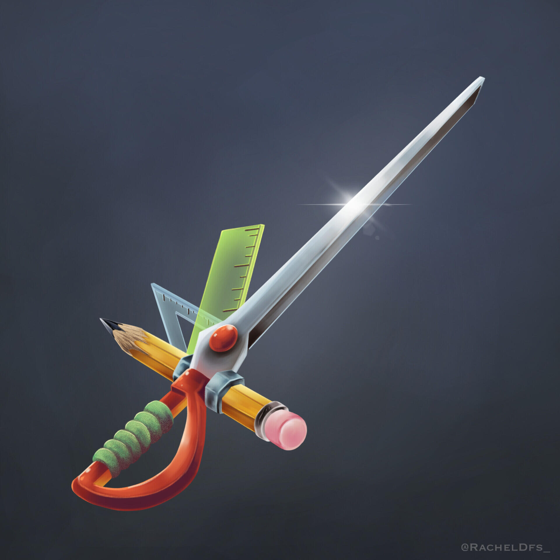
Made of chewing gum and loooooots of school furniture, desperation seems to be the only thing holding it all together.
This surprisingly sharp sword will terrorize all the school bullies who used to bother you and also we're doing upcycling.
Think of the planets kids !
Indiepocalypse 43
Blueprints
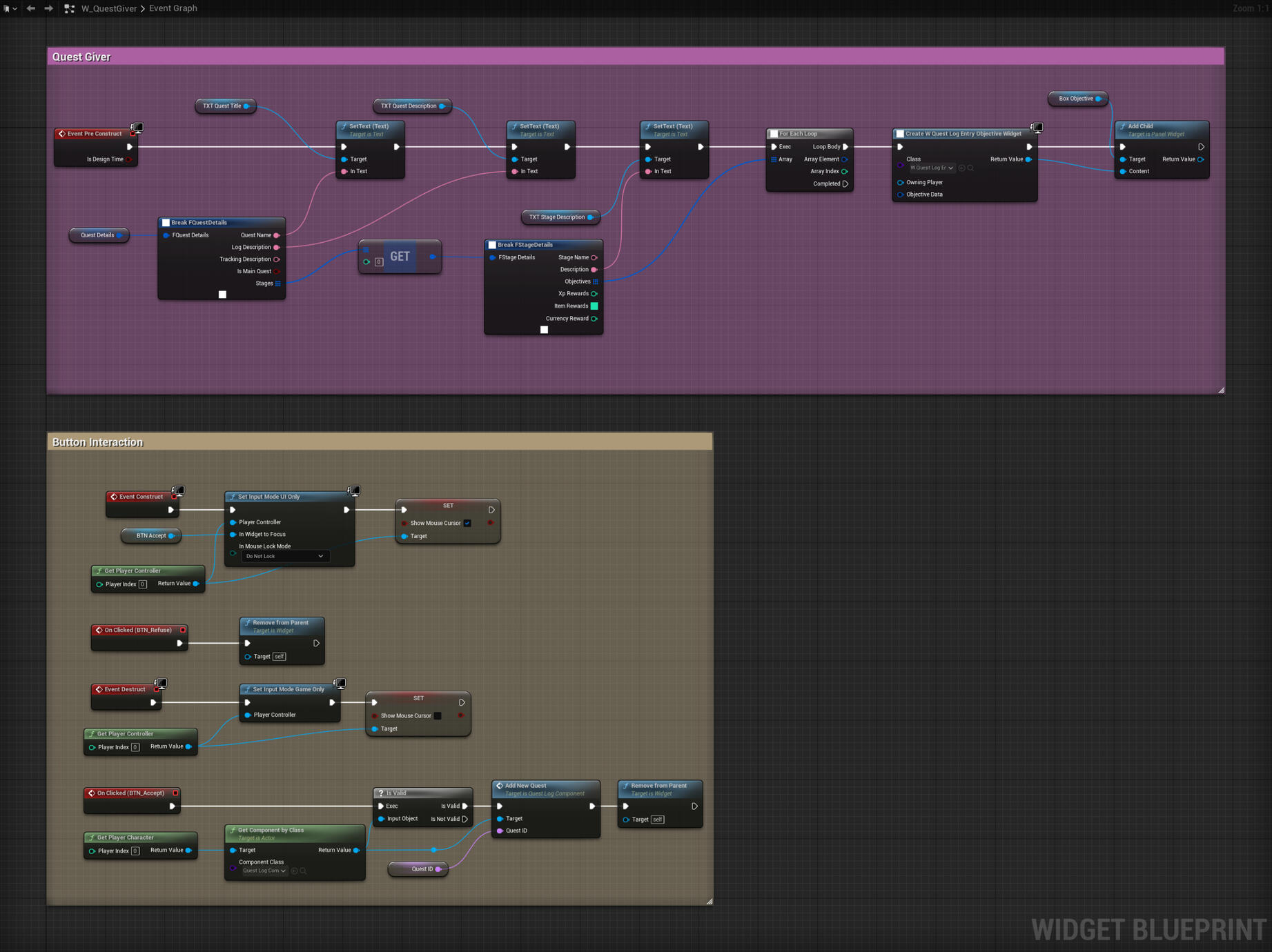
Quest System using Data Table WIP
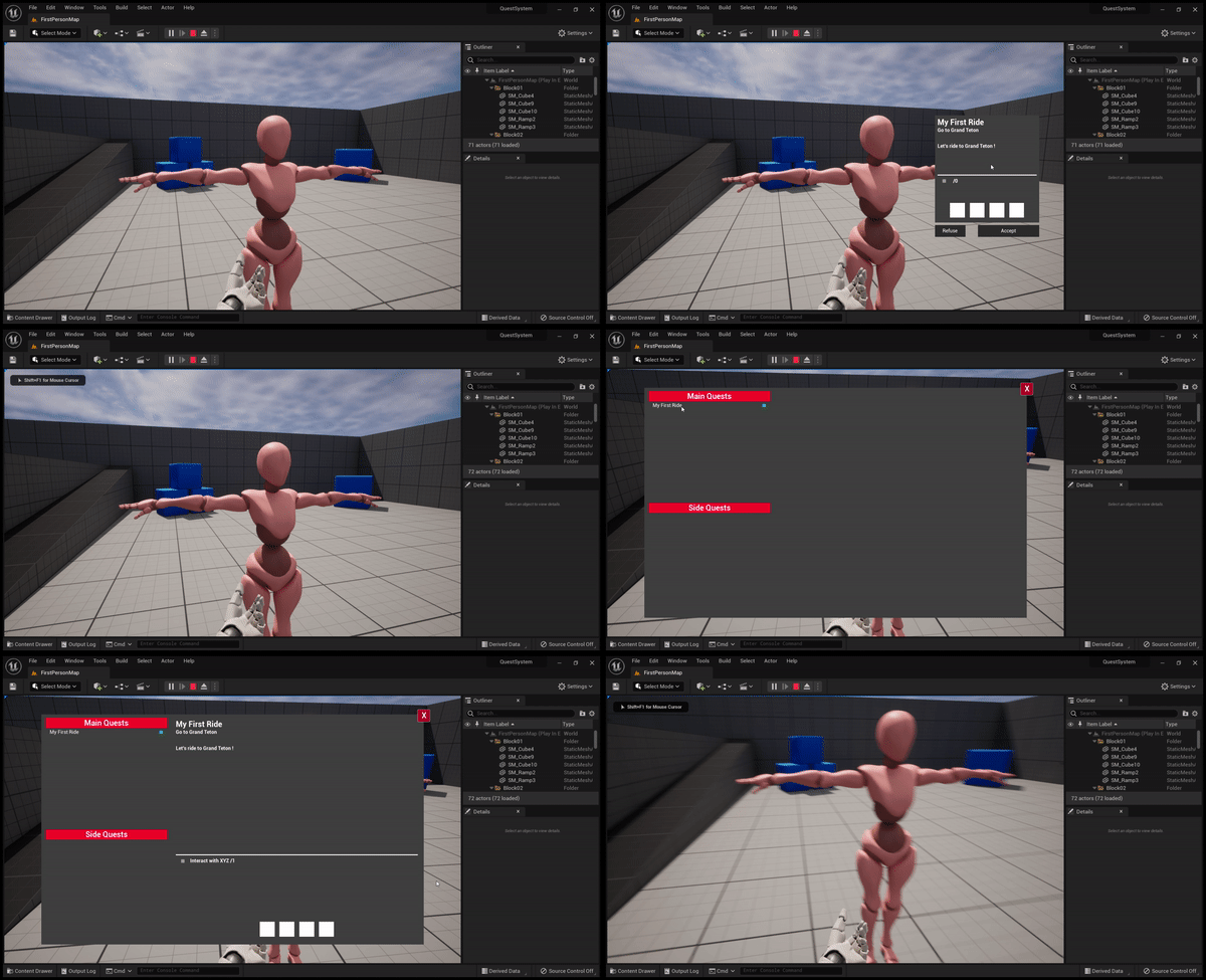
First Attempt to create a Quest System using Data Table
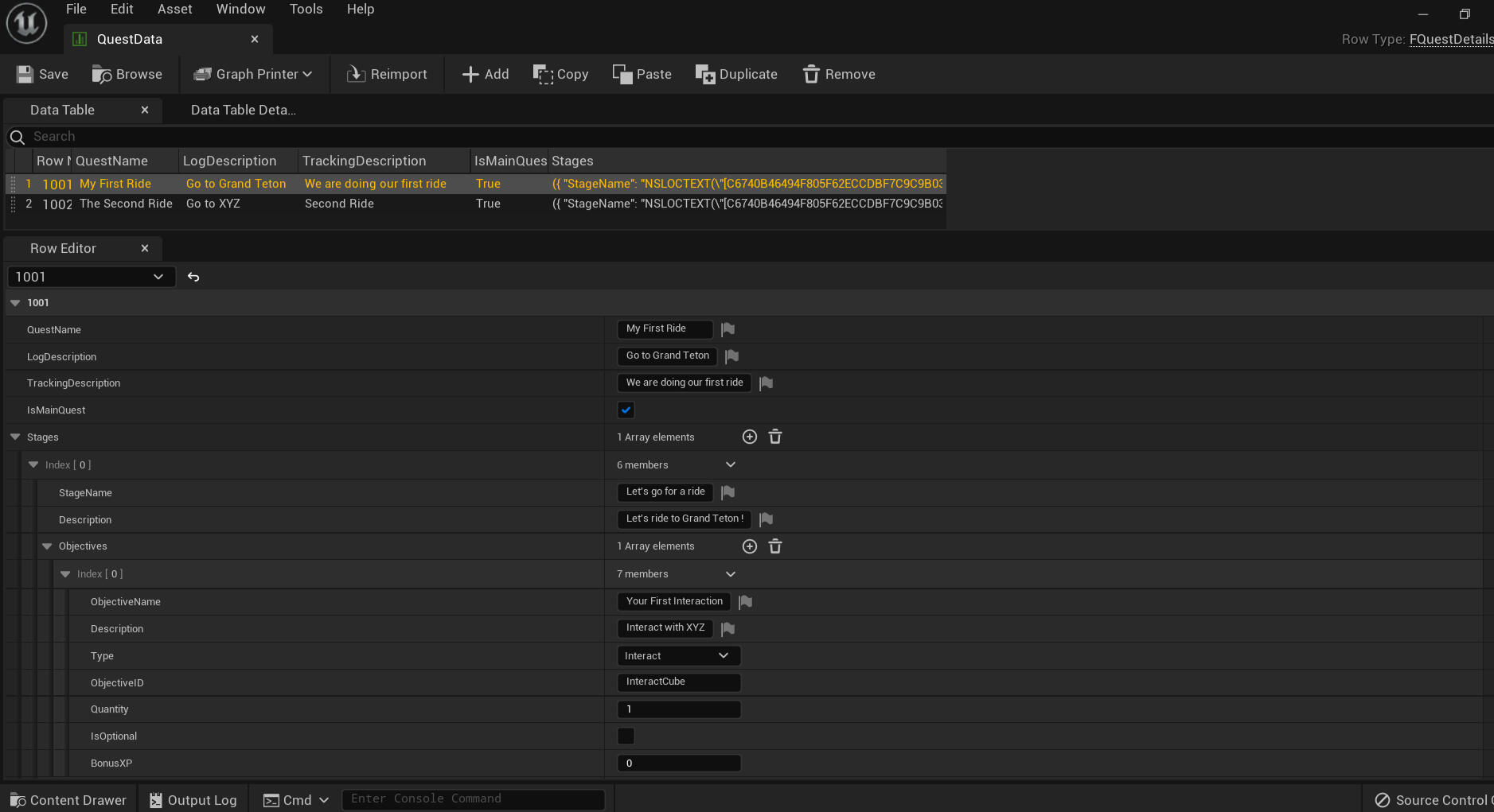
Here you can use "Add" to add a quest and then fill the different cases (quest name, objective, description etc) for it to appear on your screen using the blueprints below.

Sims like Interaction System
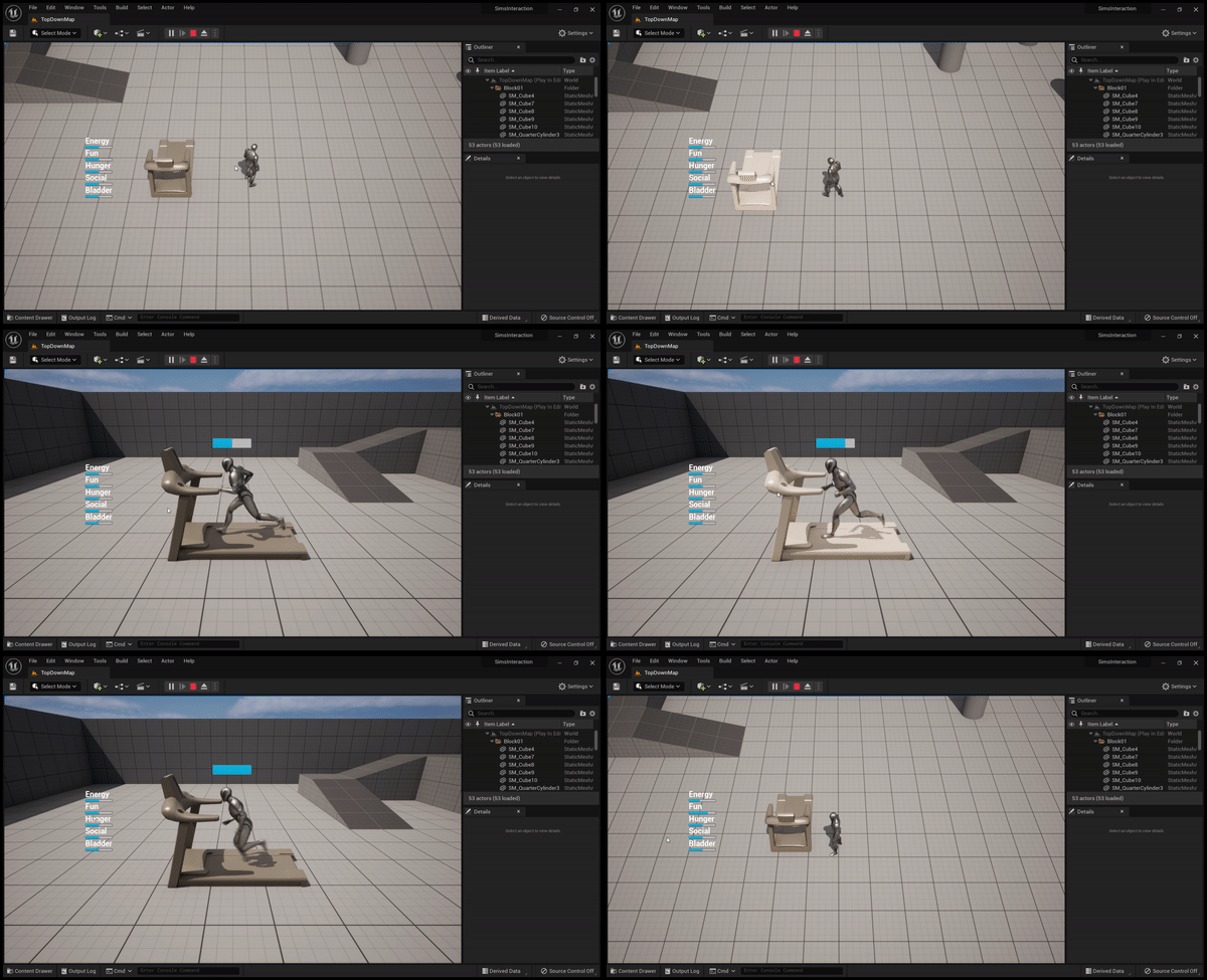
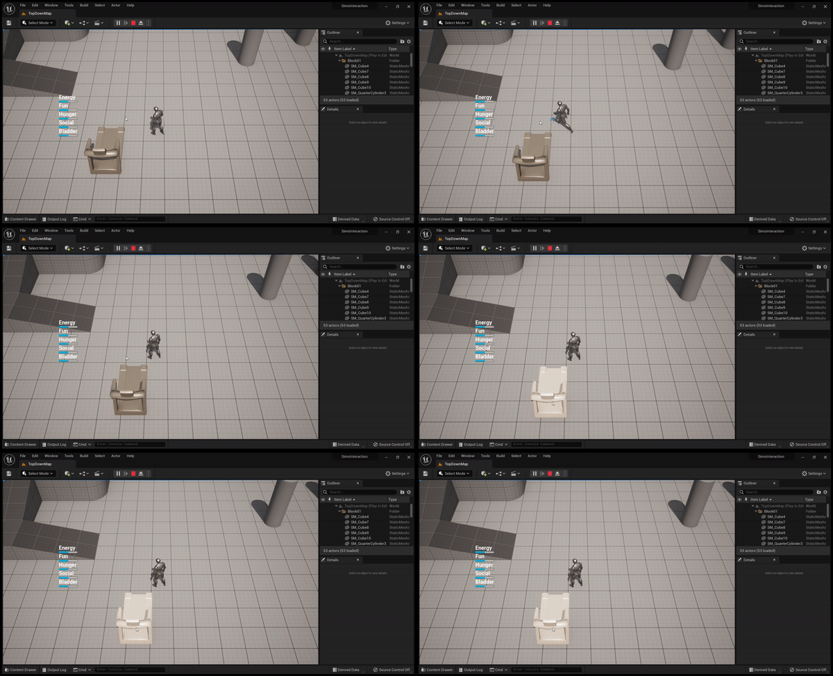
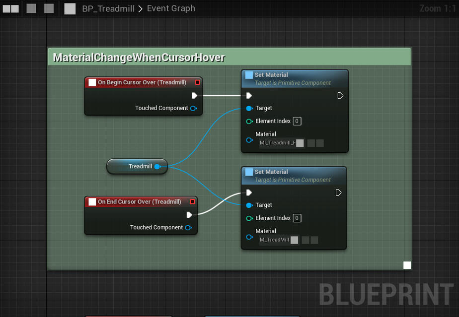
Blueprint to highlight the treadill when the cursor is over it.

Blueprints to show the stats UI.
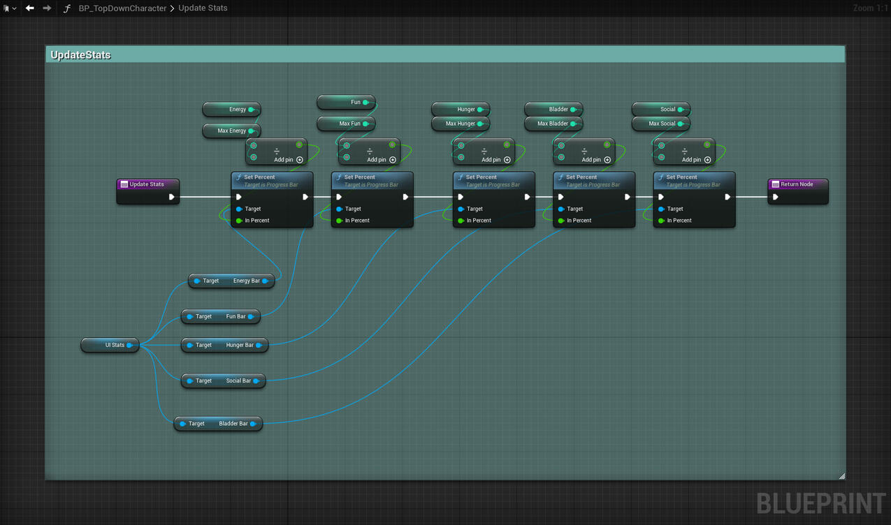
Blueprints to update the stats.
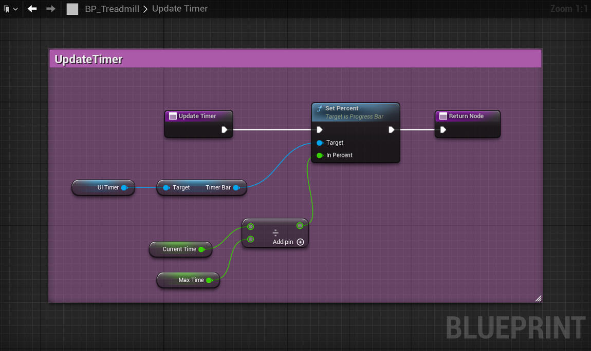
Blueprints to update the timer bar

Blueprint of the Sims-like Interaction System (a bit messy but does the job).
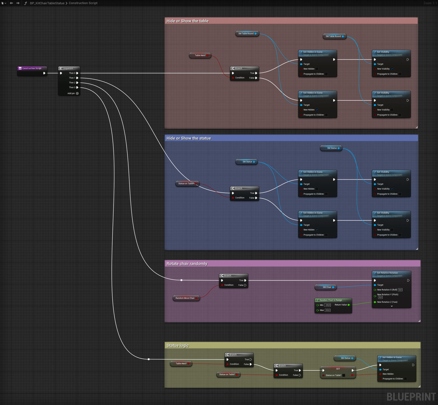
Kit Blueprint Test
I wanted to test an idea to quickly assemble a kit and change it however wanted but it's not the most optimal one. But efficient on time and can be expaned to all kind of meshes.
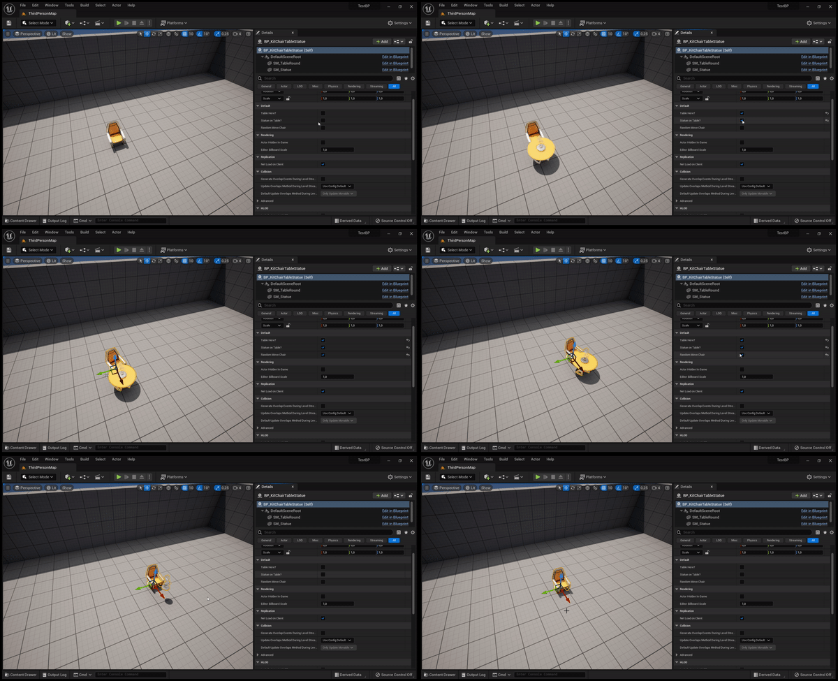
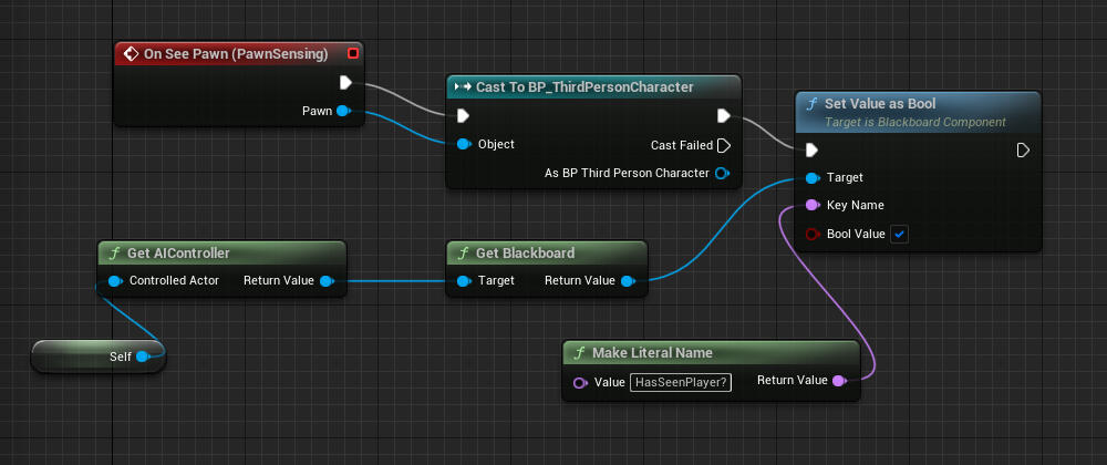
AI System
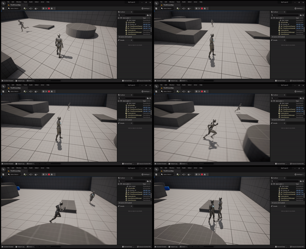
Basic AI without Behavior Tree
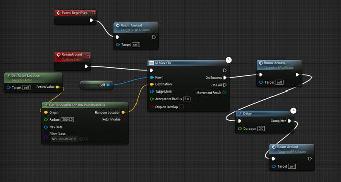
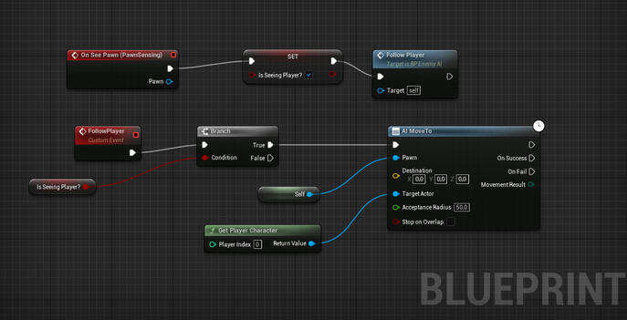
Basic AI with Behavior Tree
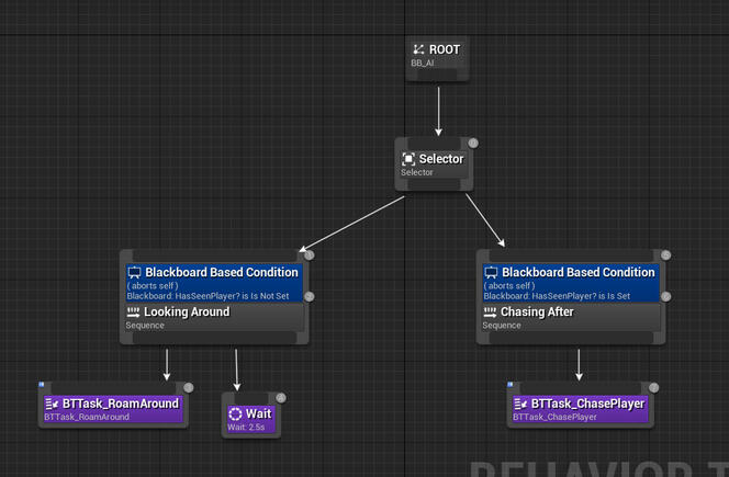
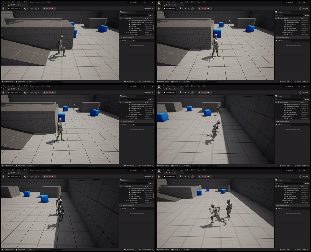
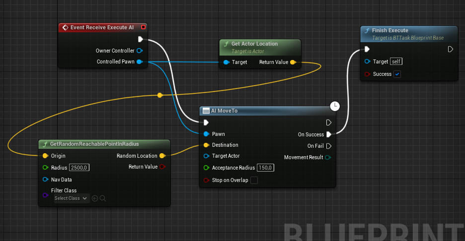
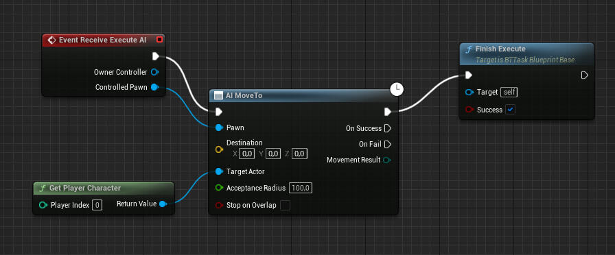
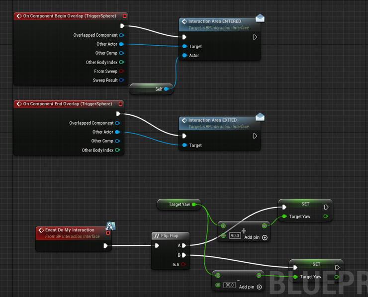
Basic Interaction
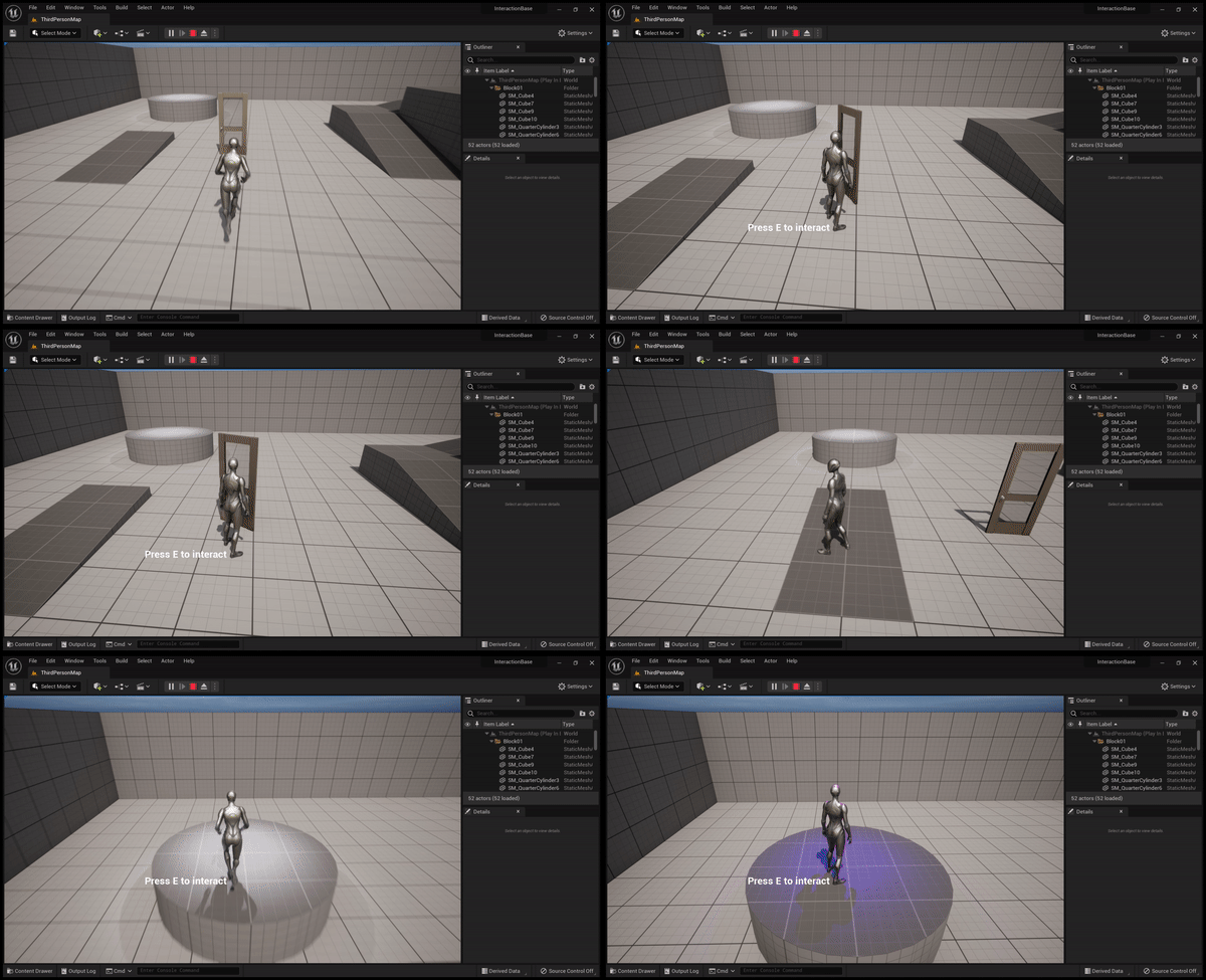
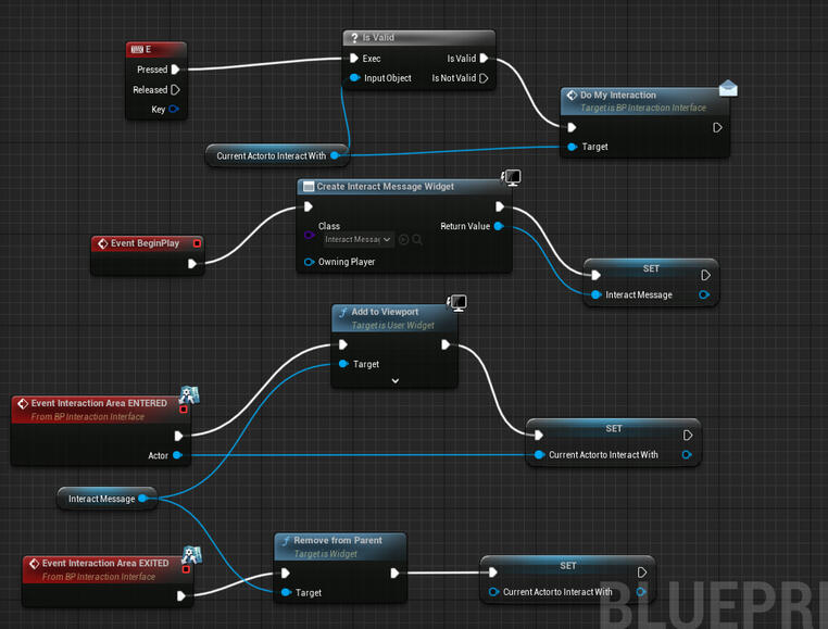
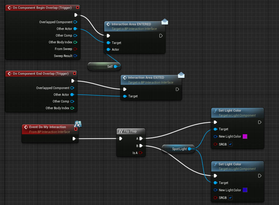
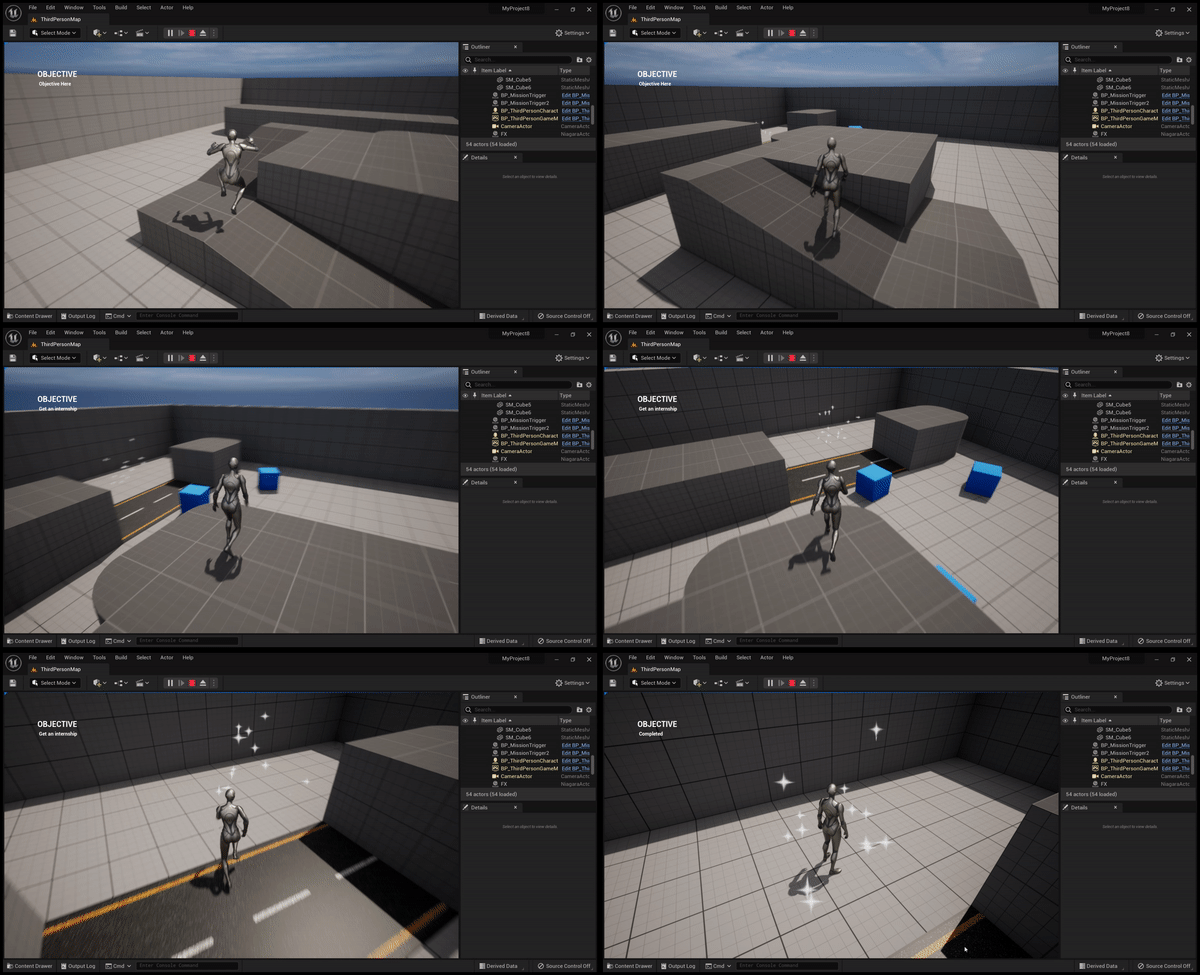
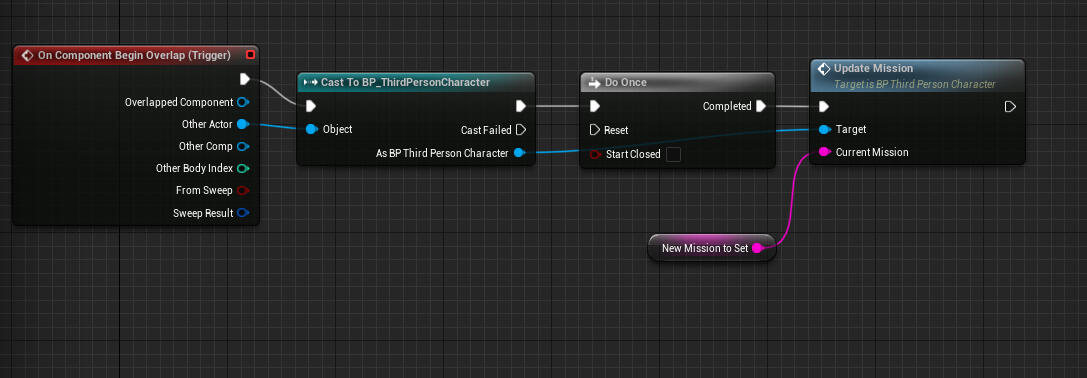
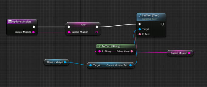
Mission System
XP and LVL System
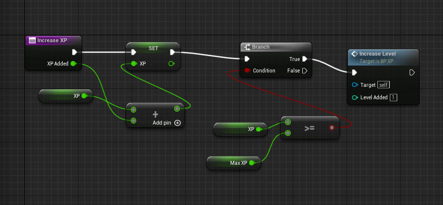
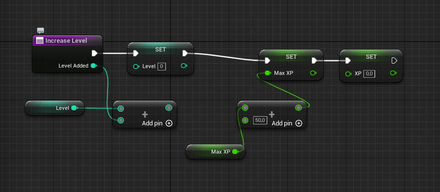
Scripting C# WIP
2 months
Unity
Solo project
Le temps d'une photo is a student project developed in two months during my first year at CNAM-ENJMIN.1 month dedicated to conception without thinking of how to prototype and 1 months of iteration and prototyping.
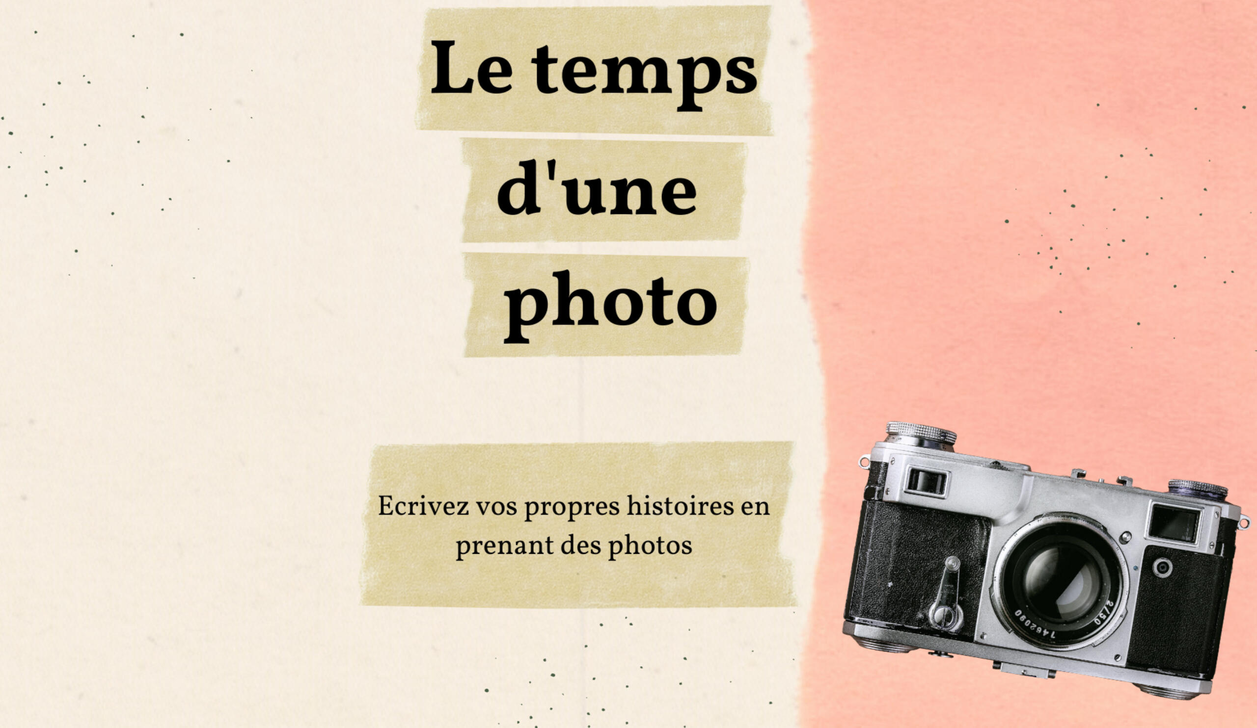
Le temps d'une photoConception
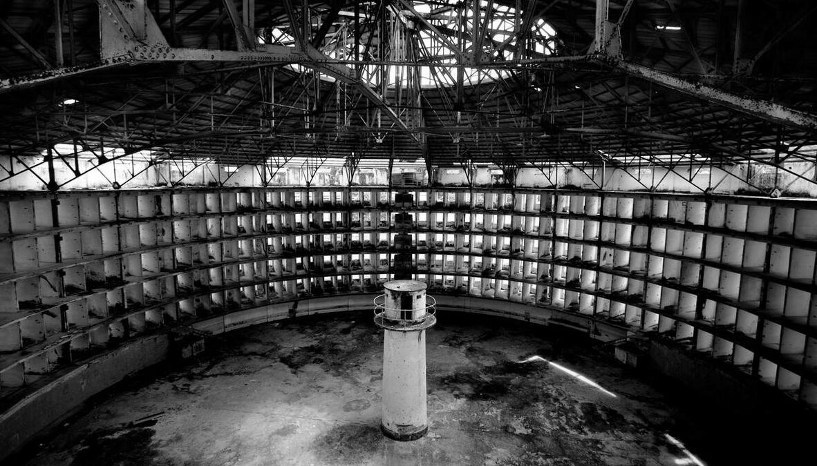
I was inspired by the panopticon of Foucault used in carceral architecture.
Originally, it is used for guards to have a constant eye on the prisoners without them knowing. That feeling of being observed without knowing would induce a change in the behavior of the prisoners and they would act as they are expected to.I wanted to invert it and turn it into an uplifting and wholesome feature by using photography.
Taking a picture is capturing a moment. But in ways, we're also creating these moments, we're taking poses and putting on a scene for the picture because it's something that we wish to keep and share.By inverting the panopticon, I had for intention to give the reins to the players to create positive visions of queer people of colour in video games and create their own representations.
Le temps d'une photo is a narrative sandbox using systems to create emergent storytelling.
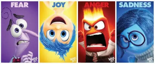
With an emotion system: Fear, Joy, Anger, Sadness. The player will be put into a small neighborhood where everyone knows each other and all have their own routines and would go through their days with different emotions.
The player will be able to capture a character's emotion, dive into their feelings then and broadcast it in the whole neighborhood to induce change in the behavior of every npc.
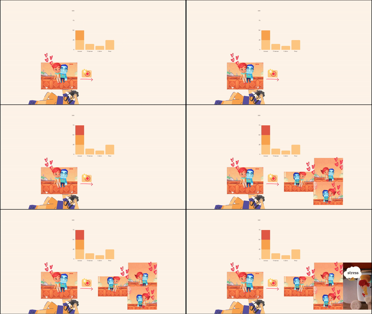
Here's an example of an interaction, we capture a couple in love, so there is more love in the air and other couples are forming. But some people might be stressed and sad from that atmosphere.
Thus you will have other emotions and characters to explore and influence to create your desired stories.
Goals for the prototype
My goals for the exercise was:- Convey intentions through mechanics and game design- Carry out a project from the idea to a prototype- Be more at ease on Unity
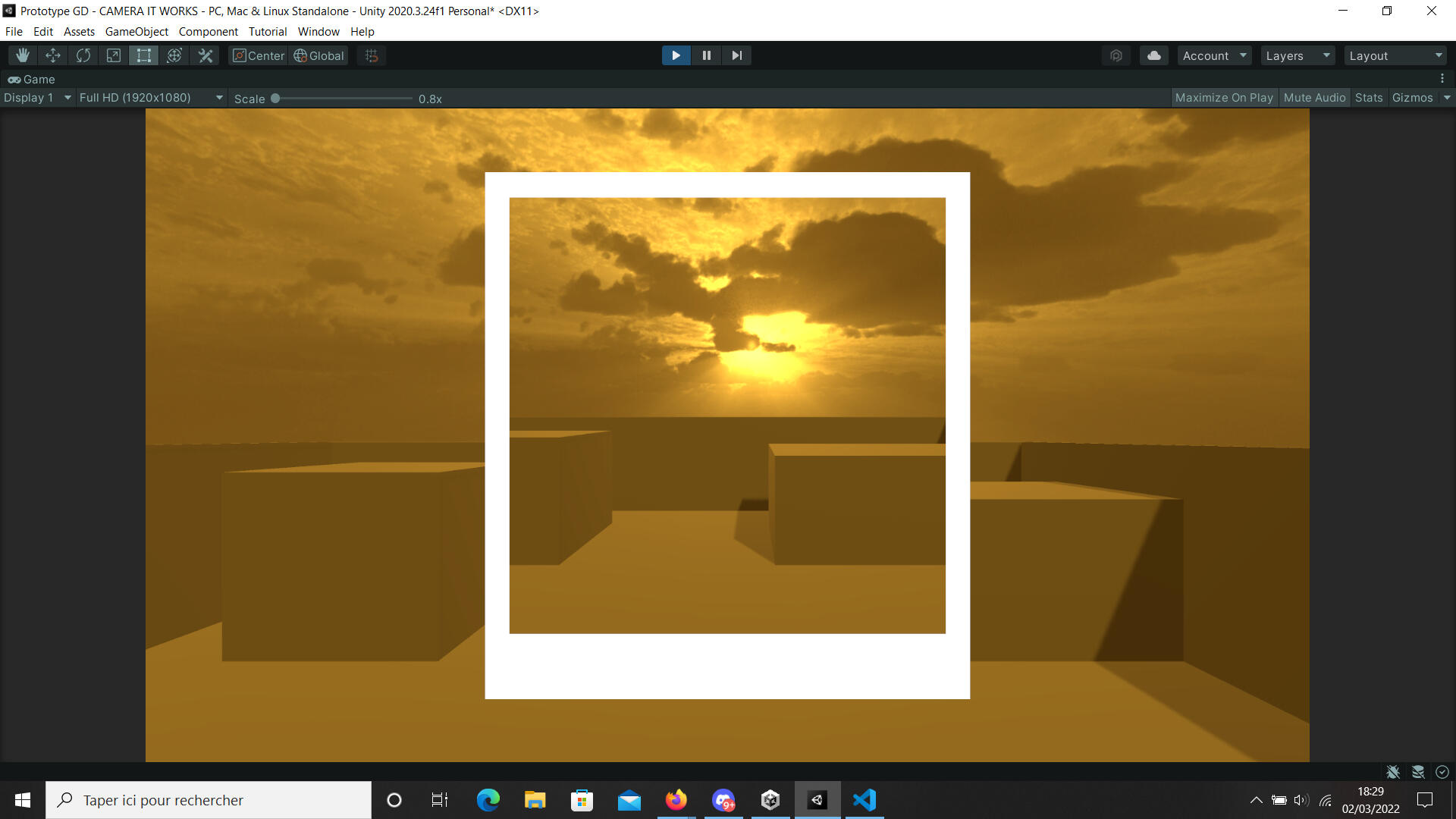
I began the prototype by doing the take a picture feature and then I iterated on the controller and did some quick level art to dress the level.

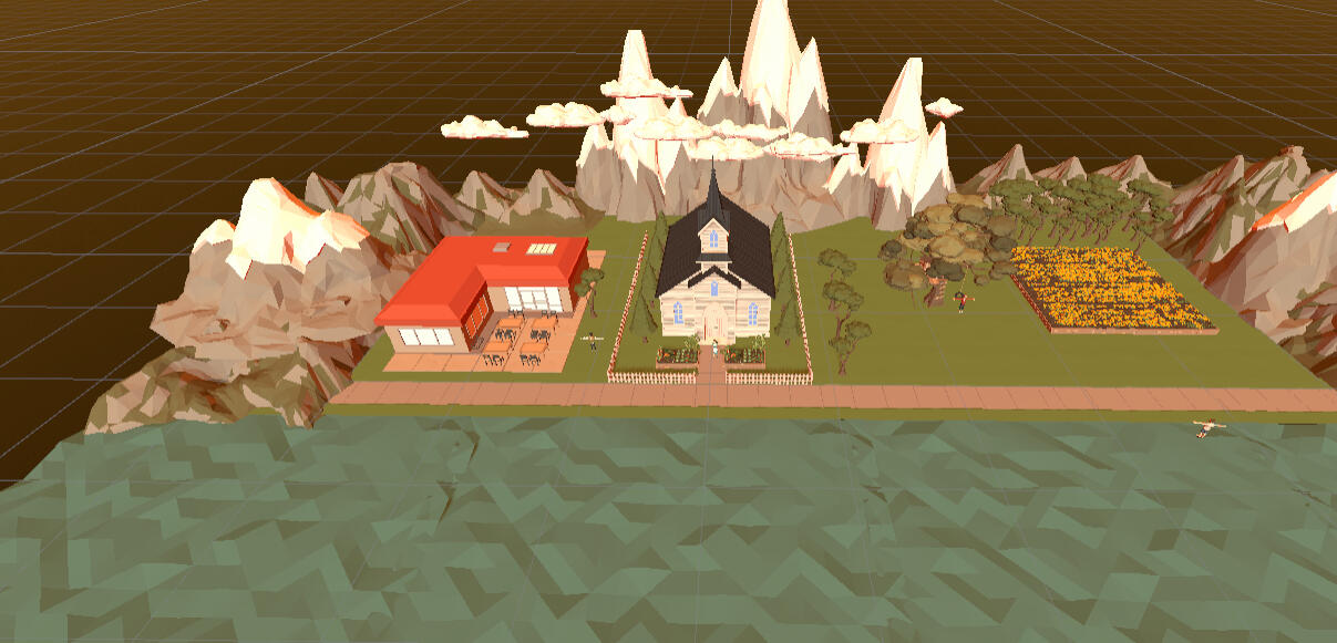
By the end, I coded some quick things to recognize emotions and to get an insight on the characters when taking a picture of them. It would be enough to do a proof of concept.
Coding a narrative system tied to the panopticon aspect would have been too complex considering the timeframe.

Paper Prototype
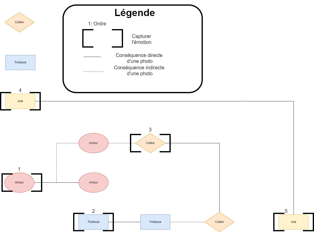
One example of a narrative path
Picture lostA quick paper prototype was made to test the gameplay.
Pitching
Jams, Prototypes and other experimental projects
Jams, Prototypes and other experimental projects
Love on the Floor
Love on the floor is a vacuum dating simulation between players made in 5 days during a workshop.
Live your vacuum dating fantasy in a cliché school settings where hearts are pounding hard.
Bump into a another player as you move around the class and answer the same to a speed dating question.
After 3 correct answers. Congratulations you're a couple !
Conception
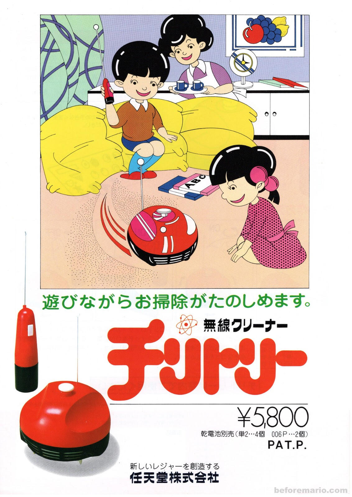
At the beginning of the workshop on metaverse.
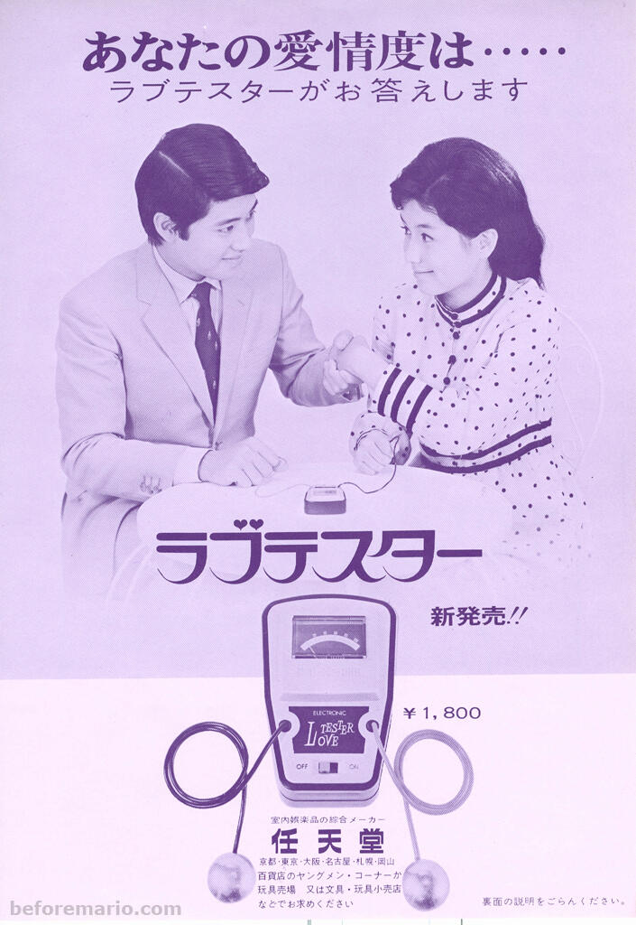
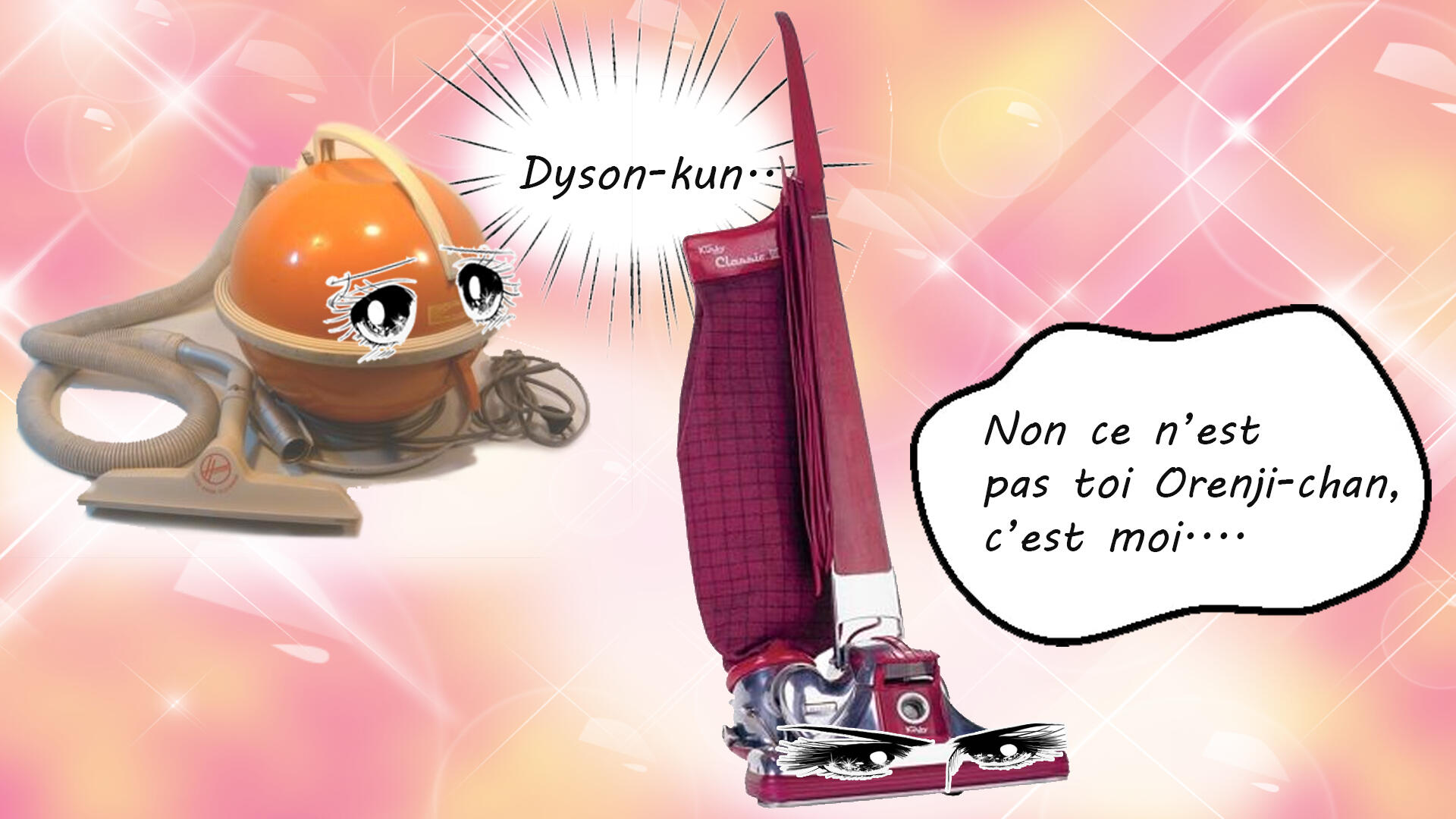
I was given the word : Nintendo Chiritori: a vacuum controlled by remote made by Nintendo so I looked up objects that Nintendo made before making video gamesand ended up finding a Love Meter.So I came up with this weird idea of a vacuum dating sim between players mixing the two objects to attract like-minded people.
Here's what we came up with !
Design
Quick Mockup to set the mood
In Love on the floor you can live your vacuum dating fantasy with other players. To do so, bump into a another player as you move around the class and answer the same to a speed dating question.
After 3 correct answers. Congratulations you're a couple !
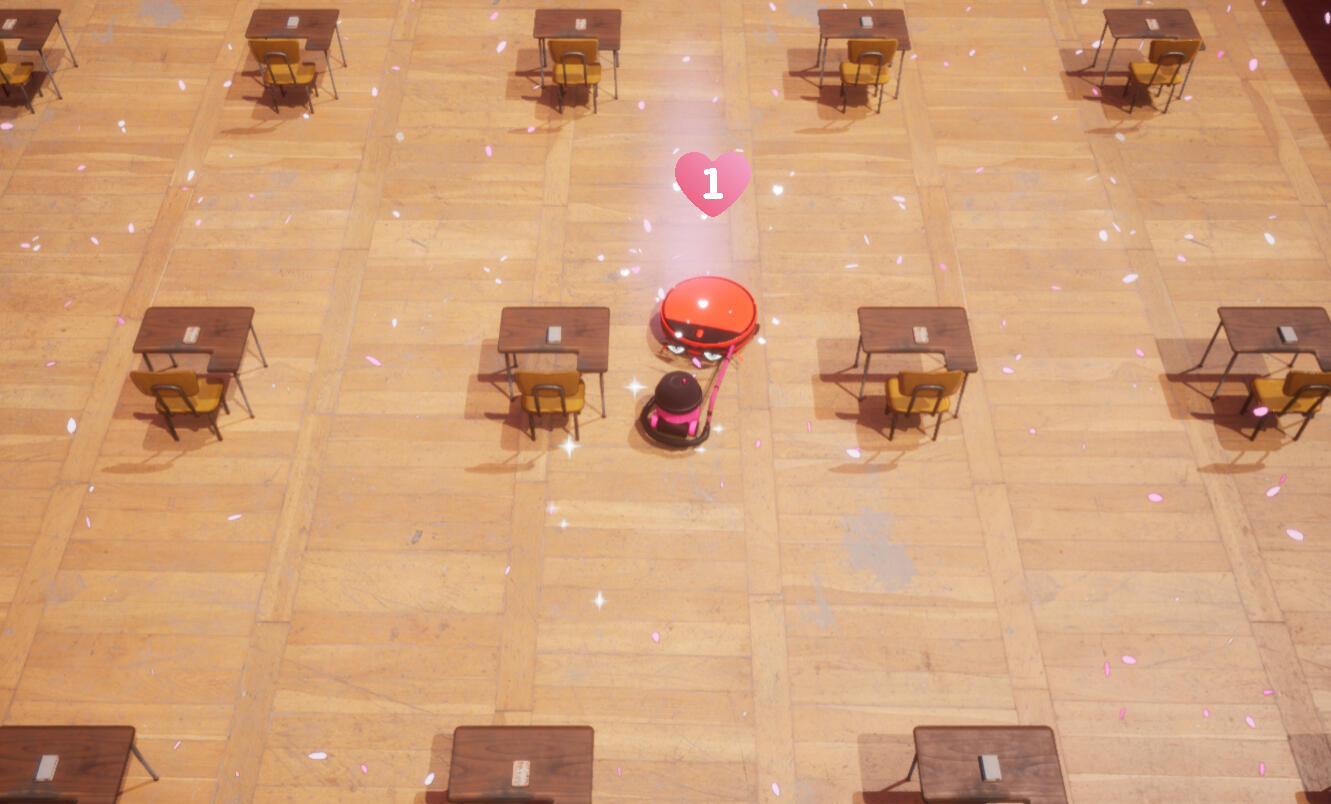
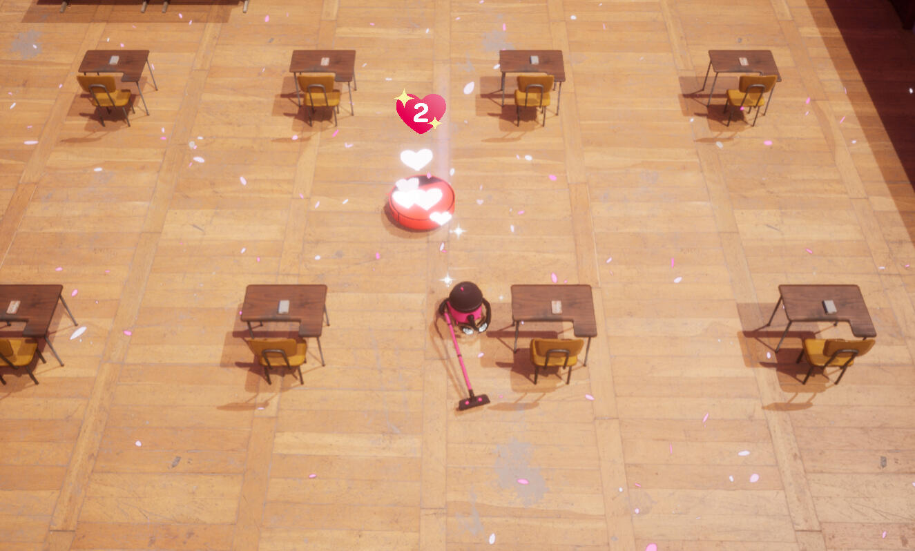
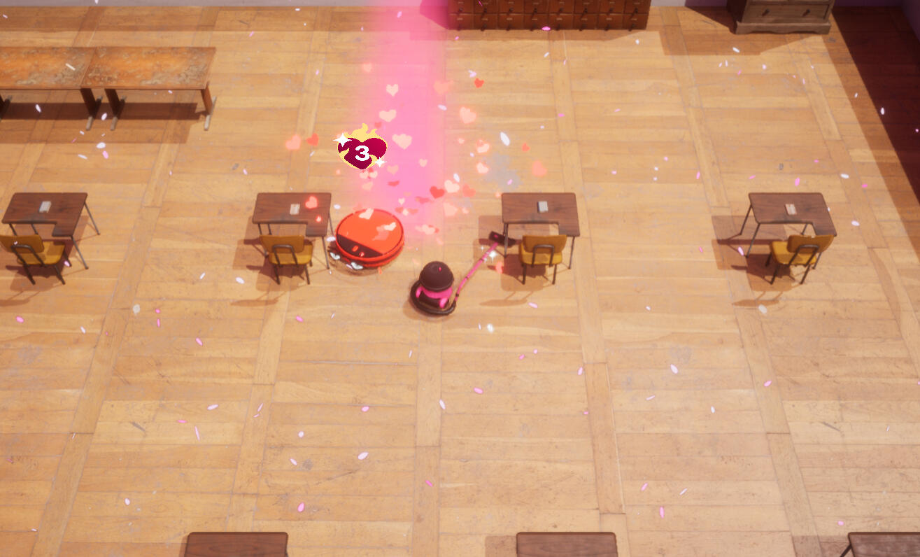
In Game Relationship Evolution
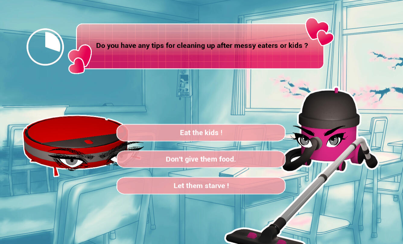
In Game Speed Dating Phase
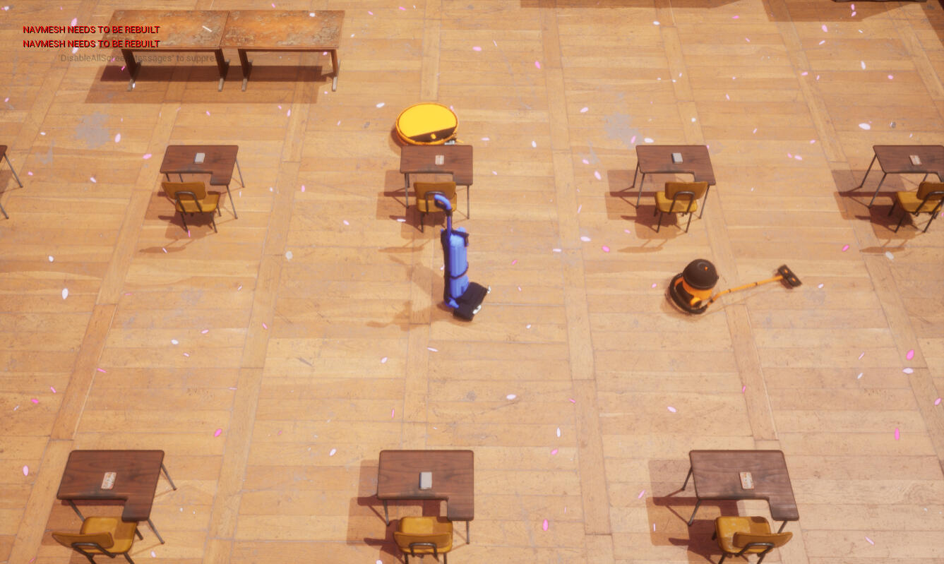
The Classroom
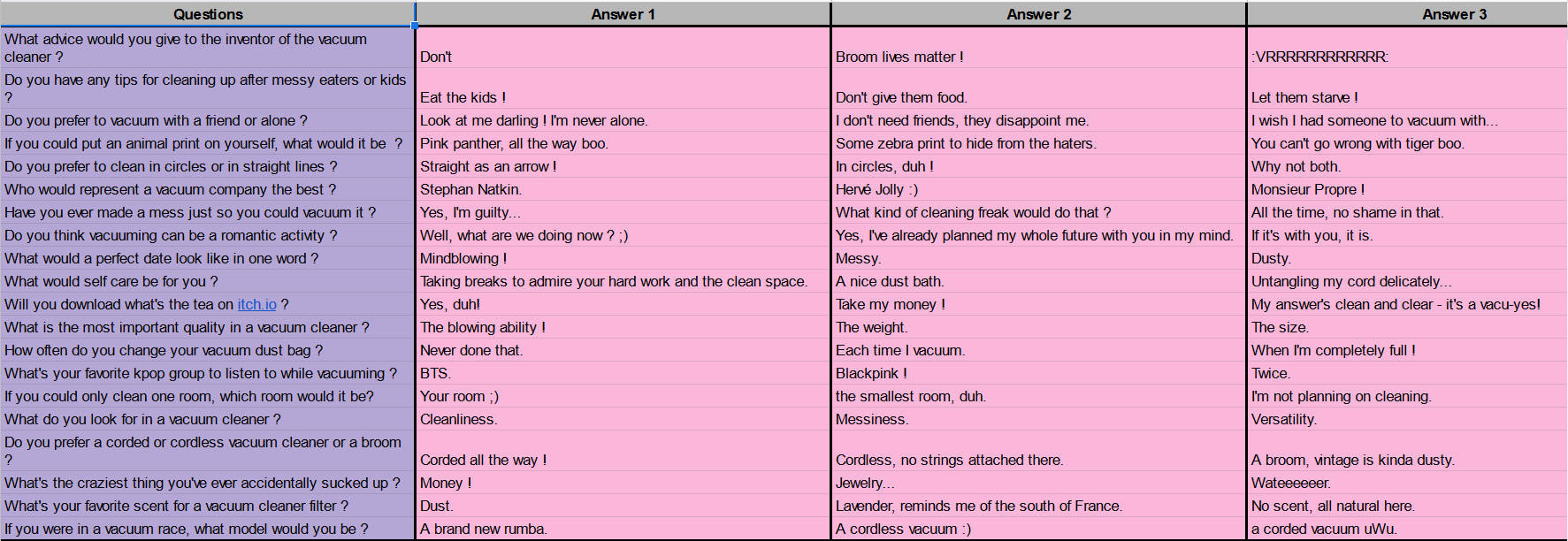
Inspired by compatibility test in party games and such. I decided that it was the most fitting way to do dating between players.
I then wrote "funny" questions taking in account user experience by making them less than 13 words and giving 6s for the players to answer while still having the speed dating aspect.
2 days
Unity, Git
Team of 9
Kill'n Clean it is a student project developed in two days during my first year at CNAM-ENJMIN for the Global Game Jam 2022.

Pitch
Kill’n Clean It is a top down shooter with a funny and light set up, we control two characters with complementary and asymmetric skills.They are tasked with cleaning a house filled with alien and filthy blobs. The nature of the task, a simple spring cleaning and its origin, an invasive extraterrestrial race are poles apart from each other. It justifies an adequate opposite armament for our heroes. However, by their antagonistic nature, they become complementary in order to reach their goal.The game stands out by its symmetrical control of the characters which are moving with the center of the screen as orbit. They can move away from the center and toward the center while being able to spin around it.The complementarity of the characters and their symmetry is creating a nervous and fast experience.Kill’n Clean It offers a nervous and fun experience in which we exploit the duality of two complementary characters.Recommended to play with Xbox Controller.
Game Design

We got a melee character in orbit with a shooter and you move them as a tandem.
Level Design
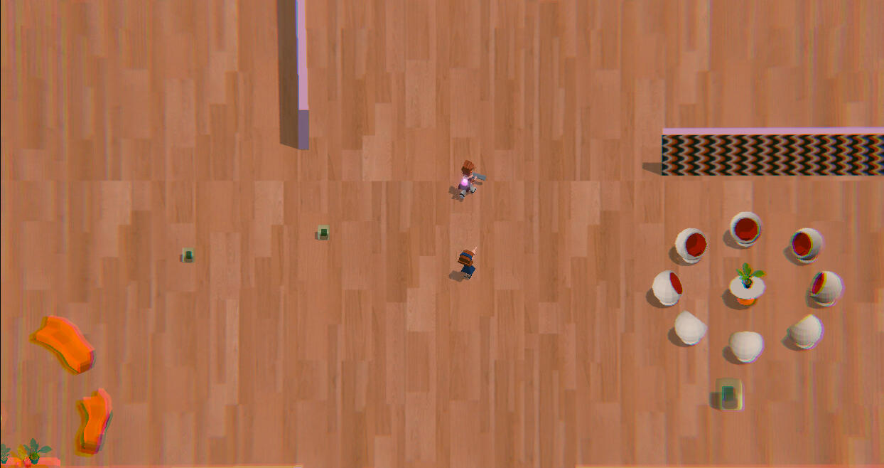

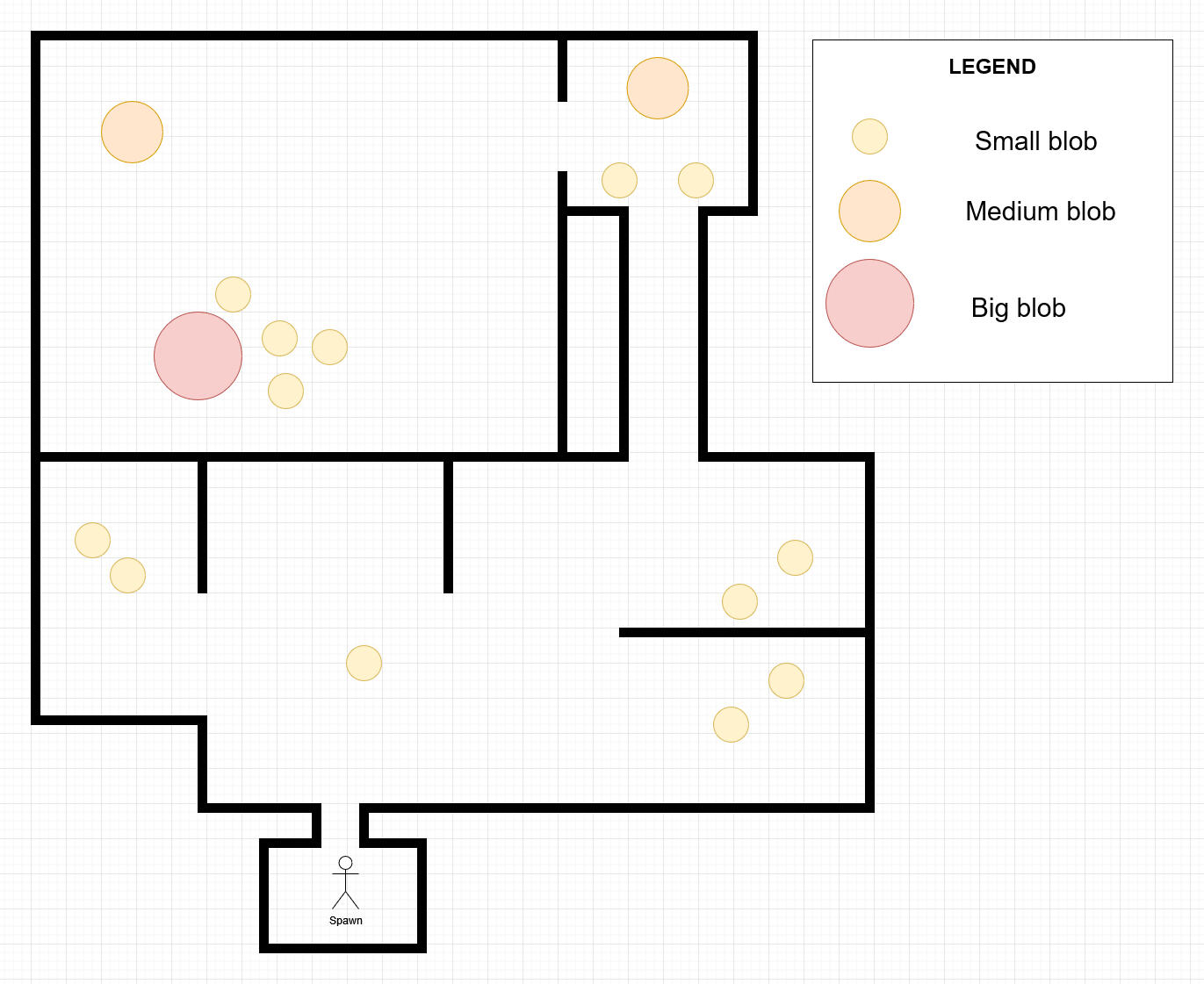
In terms of level design, I was inspired by games such as Hotline Miami, but it wasn't possible to recreate the small corridor and small area part of the game because the player is controlling two character with complementary and asymmetric skills.
Another issue was that we didn't agree on a metric, so everything was a bit too small or too big.
But it was interesting to try and create a level around two characters and how to induce stress to the player.

Also I worked in collaboration with a technical artist to make a tool on Houdini to make curvy walls on Unity.
1 months
Unity, Git
Team of 13
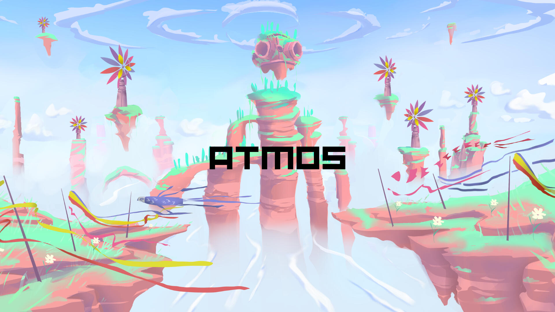
Experimental Stage for It Is Now. Design of three interactive installations for children with diverses handicaps in hospital.
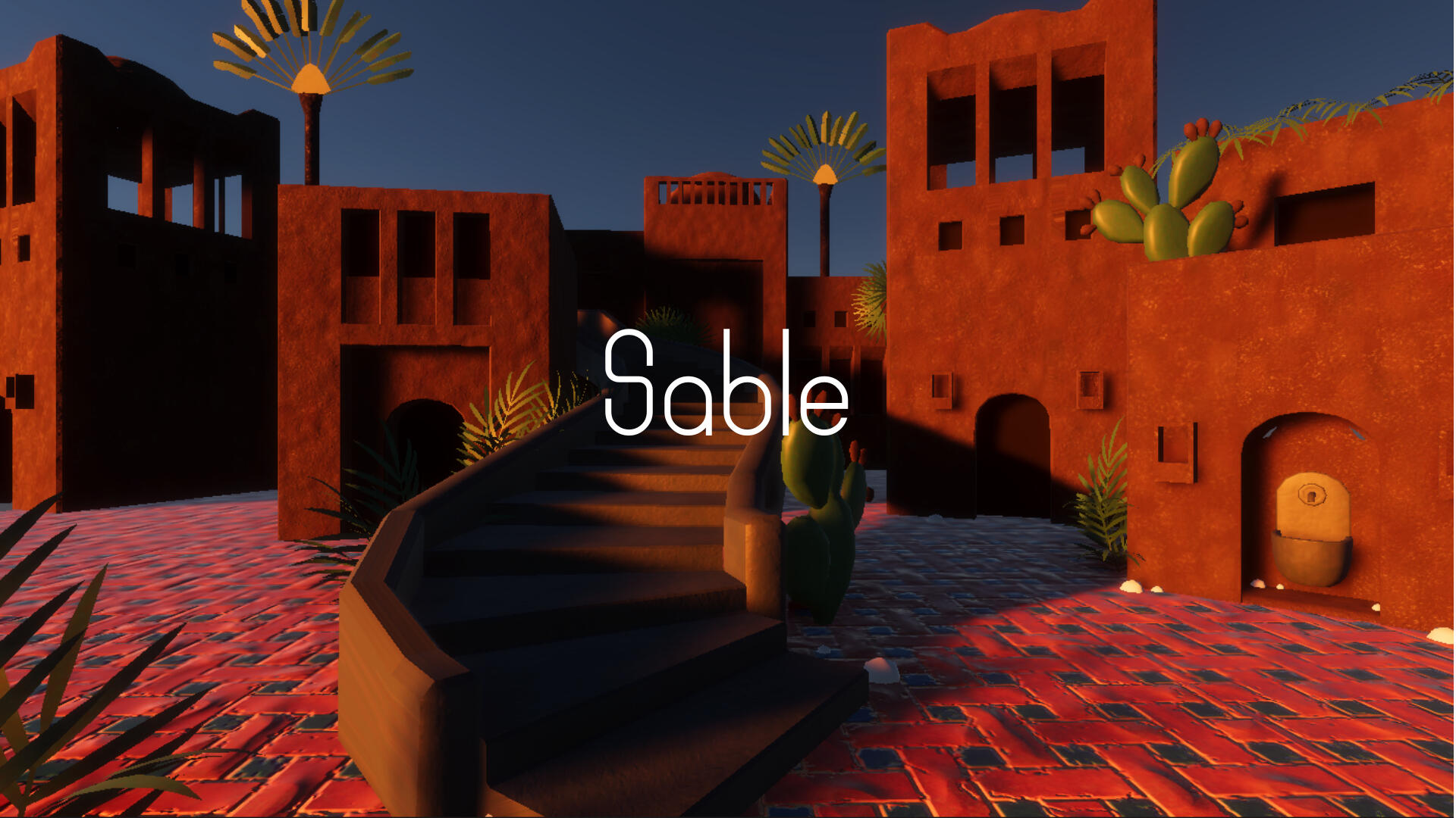
Lava Dream as Lead Designer/Sable as a duet with another designer/Atmos as a consultant.
Lava Dream was selected to be exhibited in 2023 in various hospitals.

Game Design
Lava Dream
Installation
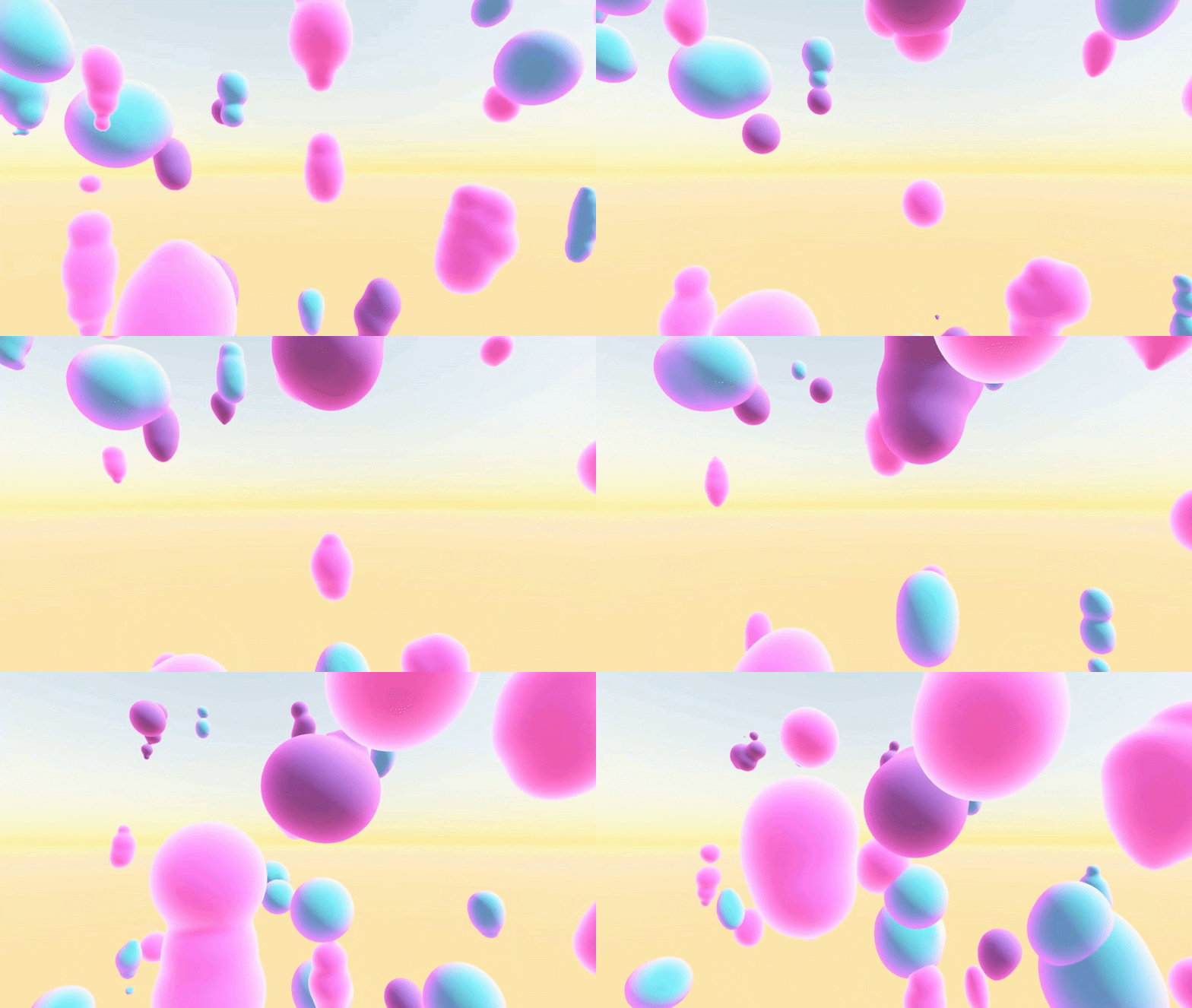
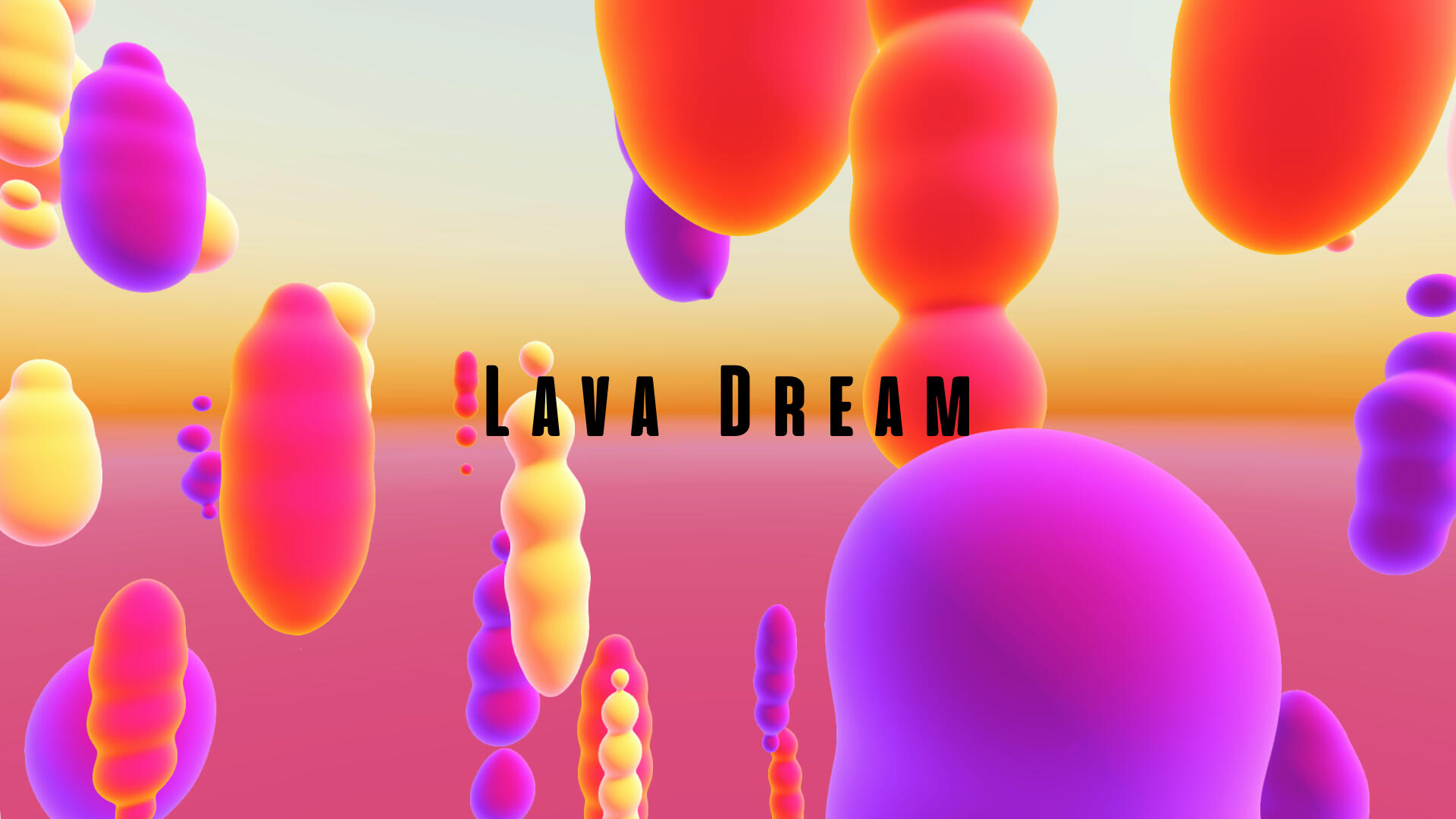
Lava Dream is an interactive installation in situ in which users are invited to interact with a panel of screens in an interaction zone captured by a kinect.
By using movements, they will be able to attract and influence abstracts forms and visuals between the screens similar to lava lamps.
Intentions

The installation rely on three pillars:
- Meditative, by using abstract and continuous visuals meant to captivate the users
- An amplification aspect by amplifying and ricocheting movements to transcribe the importance of small movements for people with handicap
- Accessibility to make that installation medidative for everyone.
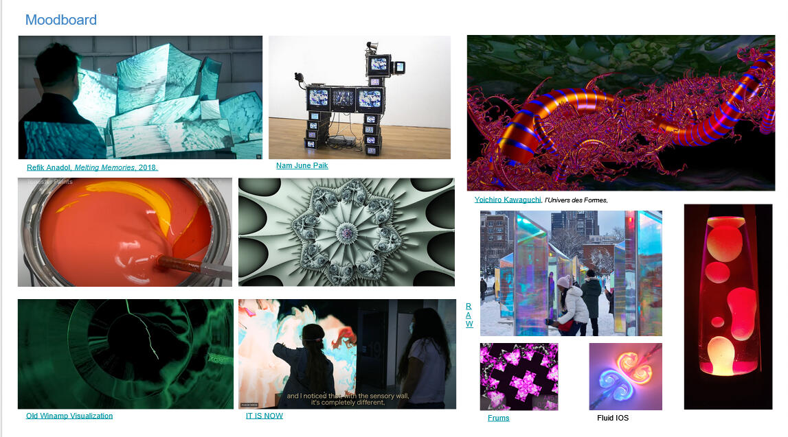
Benchmark

Interaction


I decided to break the medium apart to mess with forms and abstract and make them interact with each other by using gestures.
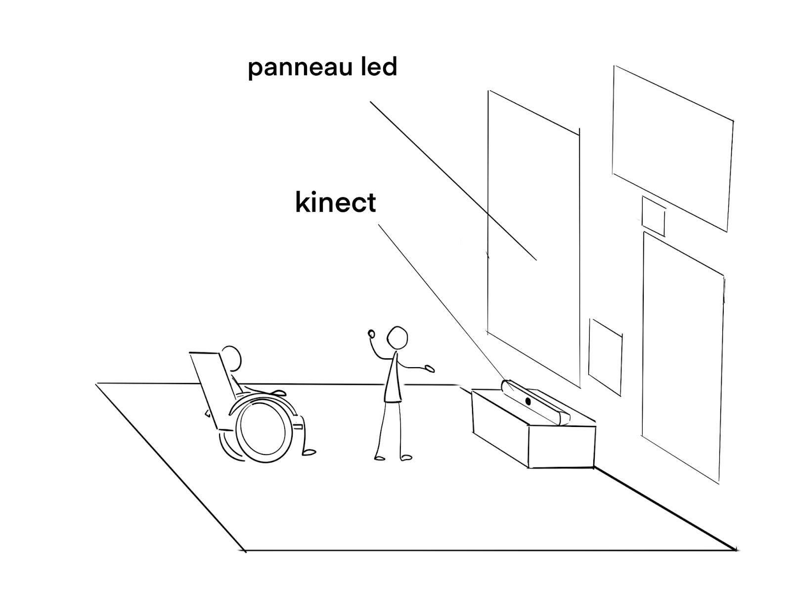
By using small gestures and that phenomenon of amplification and ricocheting like on water. It will be possible to reach distant areas unreachable by the silhouette only, it's even more important for people in wheelchair.
A real size paper prototype of 3 meters was made to establish the correct distance of the user and the placement of the kinect but also to project early works to see how they look.
2 weeks
Unity, Git
Team of 9
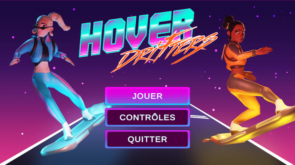
Hover Drifters is a student project developed in two weeks during my first year at CNAM-ENJMIN.
Pitch
Game Design

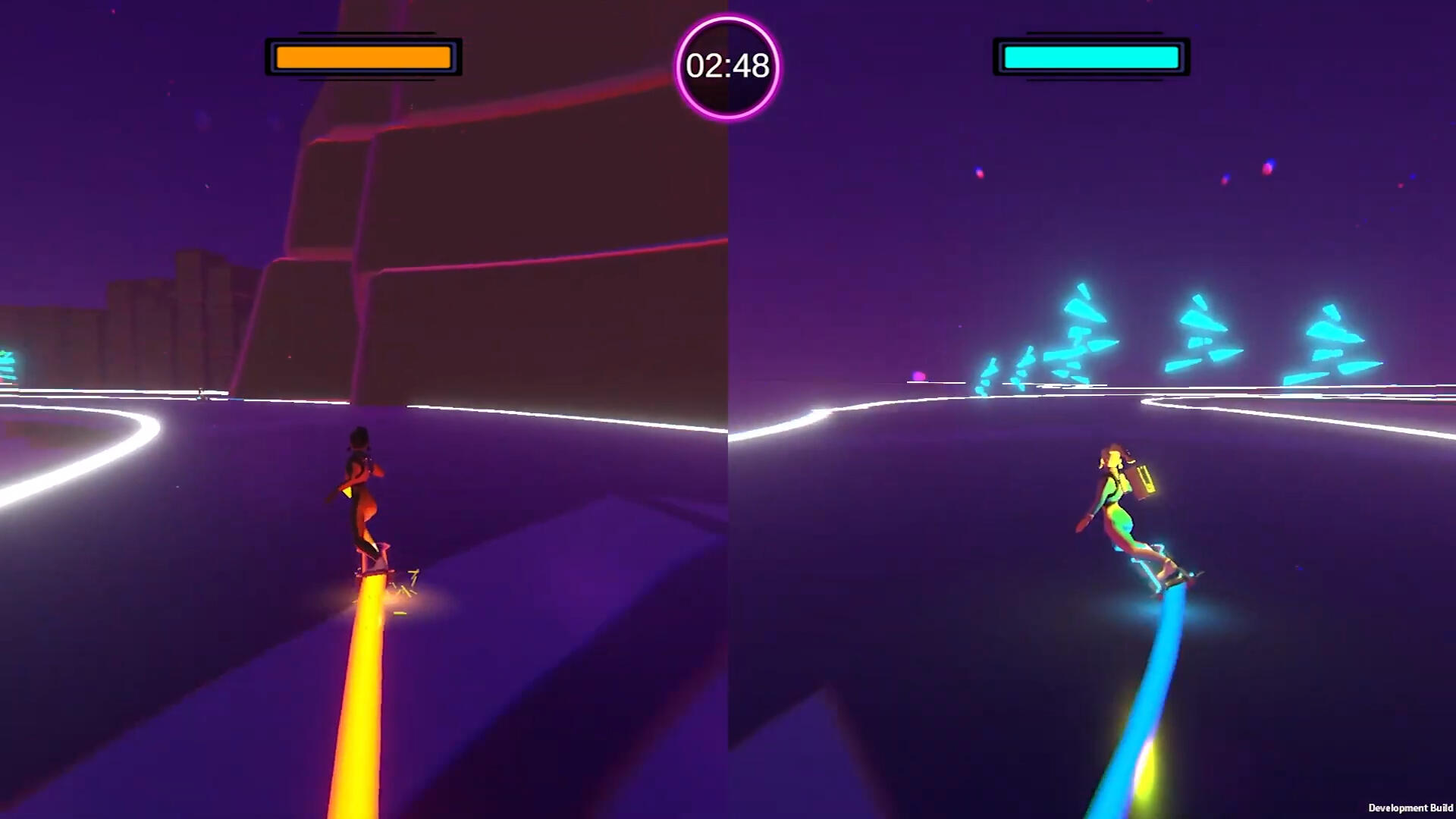

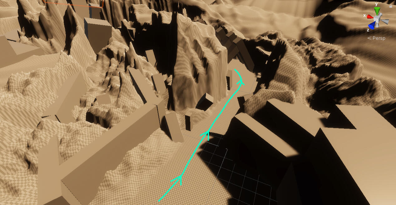
Hover Drifters is a third-person racing game mixing frantic pursuit and objective capture.In order to Win the game, you have to :- Collect the package before your opponent.- If your opponent takes it before you, Charge them to take the package back.- Finish the race before the time runs out.It meant that in the level design, I had to think about areas where the players could take a risk and take cut to take over the package or even ambush and hide if the player behind has the package. It was an interesting but needed more time for iteration.
Step by step
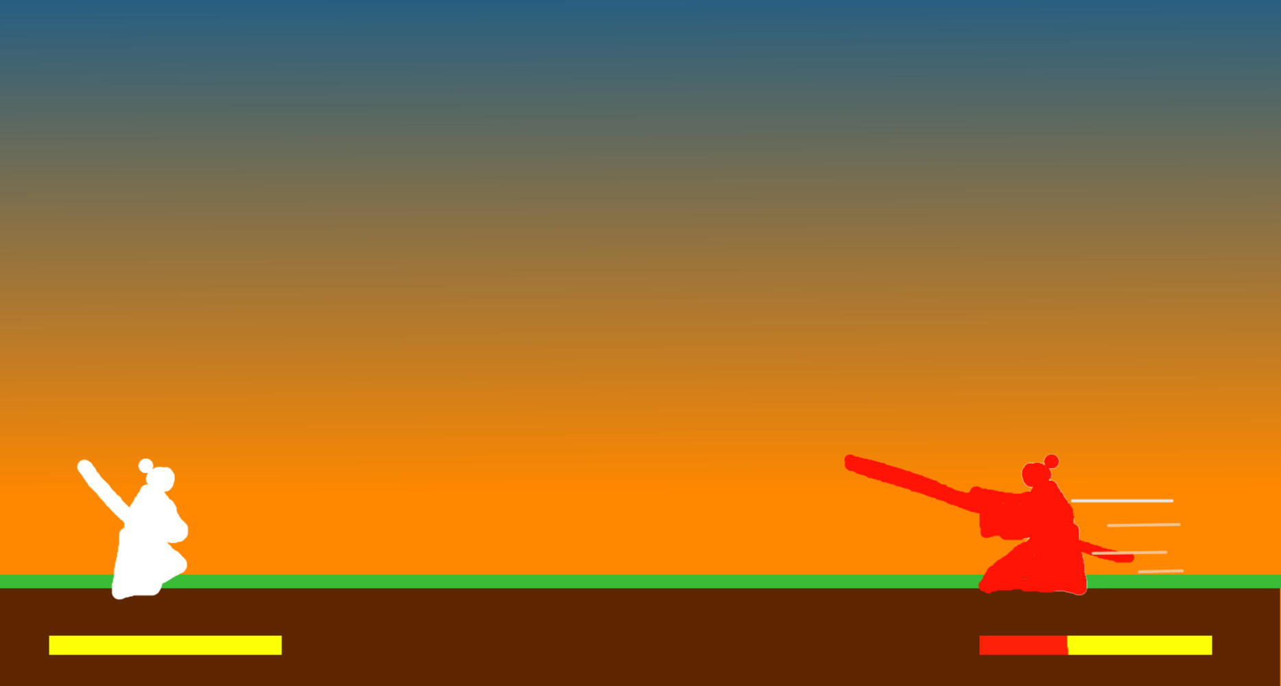
Step by step is a versus fighting game in 3D sideview for two players.
Both players are samurai who will fight turn by turn.
One after the other, they will have to get close to their opponent to strike an unique and final strike. However they will have to be careful to not get in the reach of the other's sword.
With a team of 6 the goal of the project was to test Unreal 5 and experiment with the blueprints for a day with other novices on the engine in programmation, art and sound.
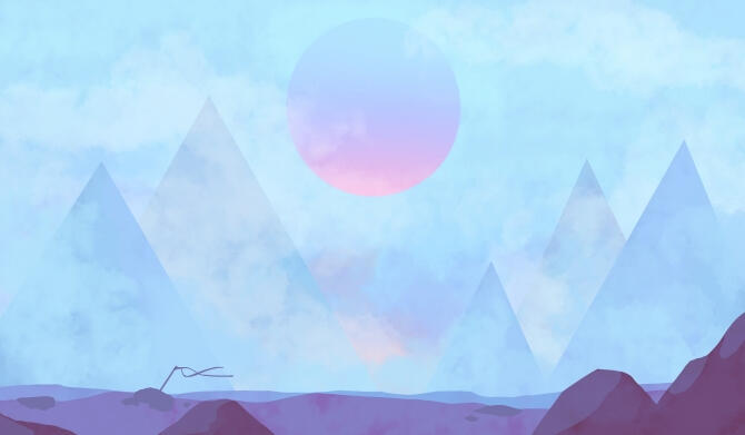

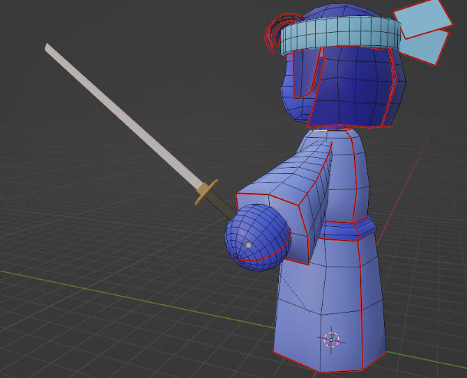
In this project, I was in charge of:- Iterative work on the 3C and our core mechanic.
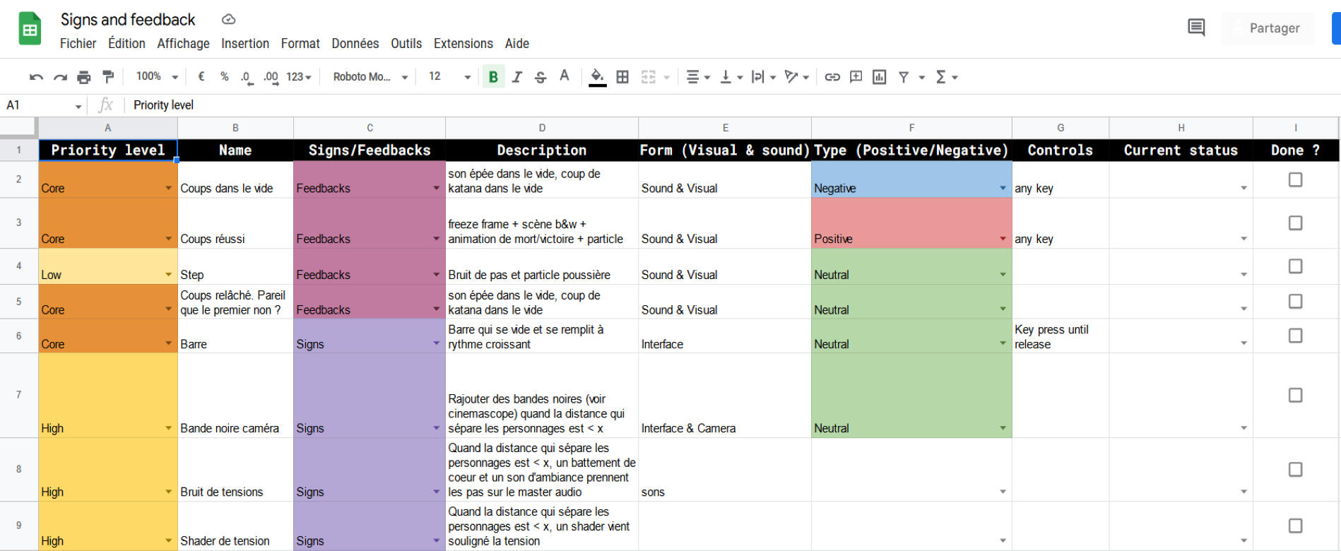
- Establishing the signs and feedbacks and their priority for our game.
- Define the userflow.To ensure a smooth communication with the team, we've established a Game Design Document with my duo and I made Google Sheet to define the signs and feedbacks.
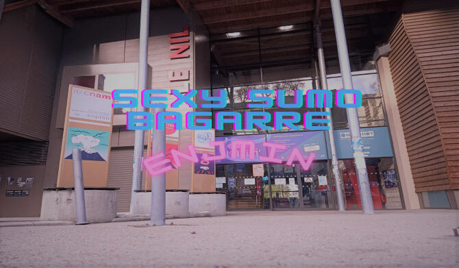
Sexy Sumo Bagarre ENJMIN
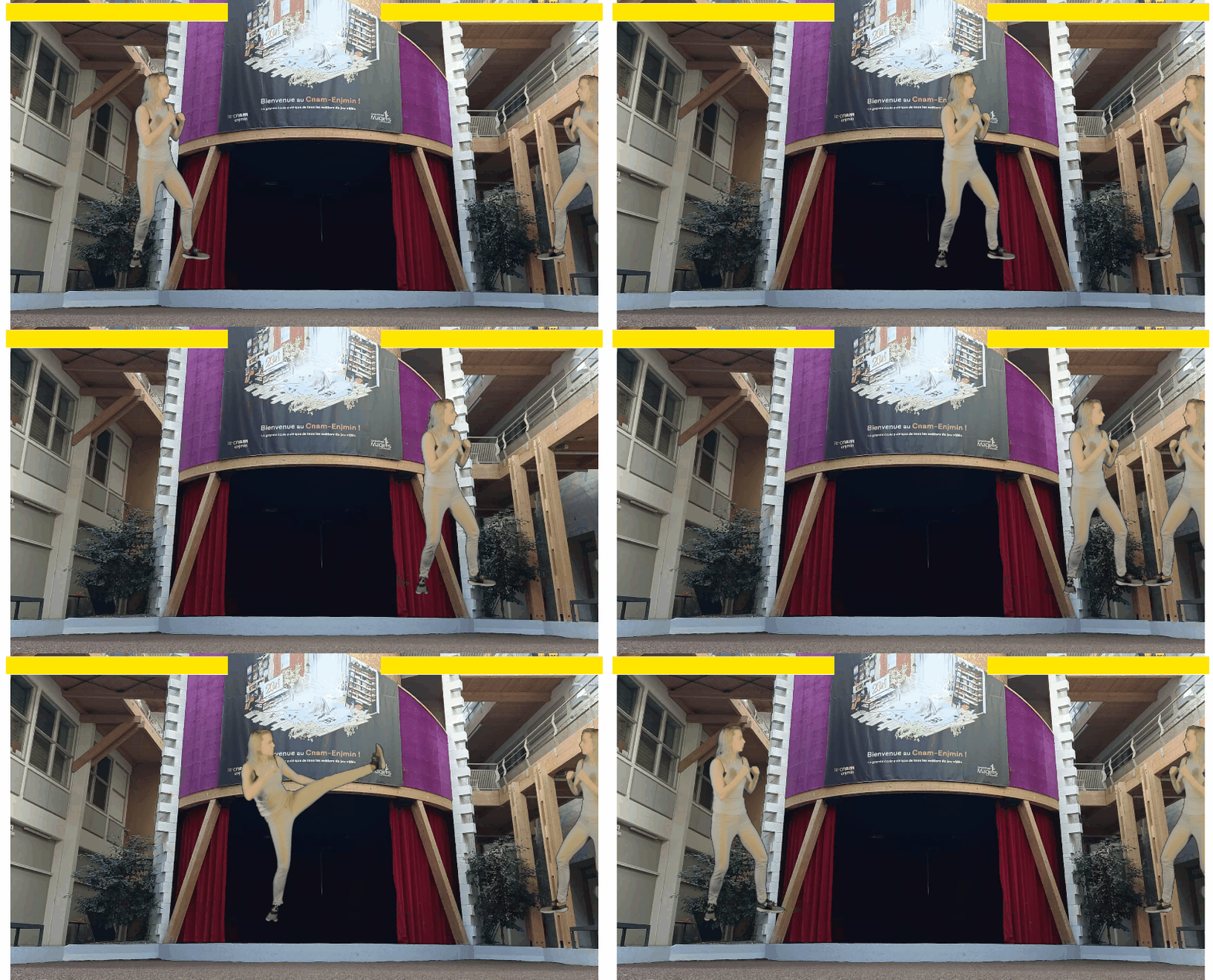
Inspired by Mortal Kombat I but also our love FMV, during a 48 hour game jam, with a team 6 people we decided work collaboratively to recreate it with students as fighters with our school as a playground.I was in charge of:
- Recording and directing students to have cool and fun moves.
- Establish a schedule to record 10 students in an afternoon.
- Cut and edit the recordings to have 5 frames for each moves.
- Consulting on Game Design.
Game feel of Hurt me Plenty
School Assignement on Game Feel
Solo Projects
Art
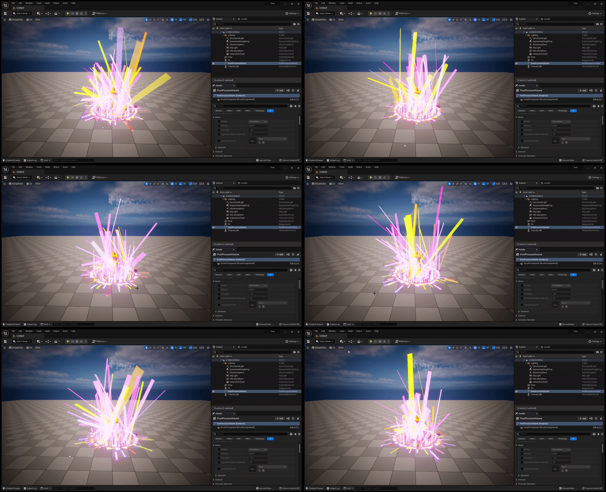
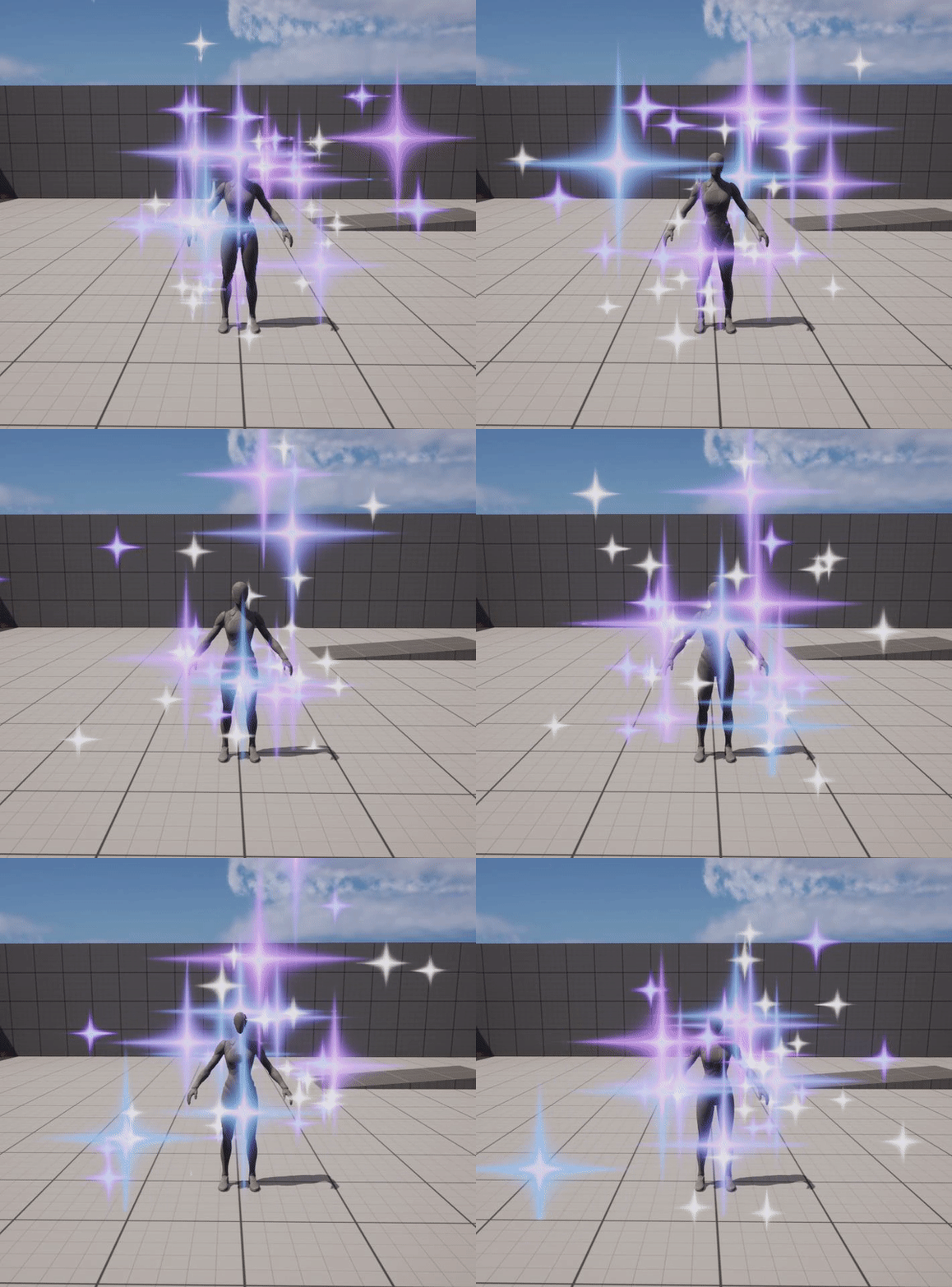
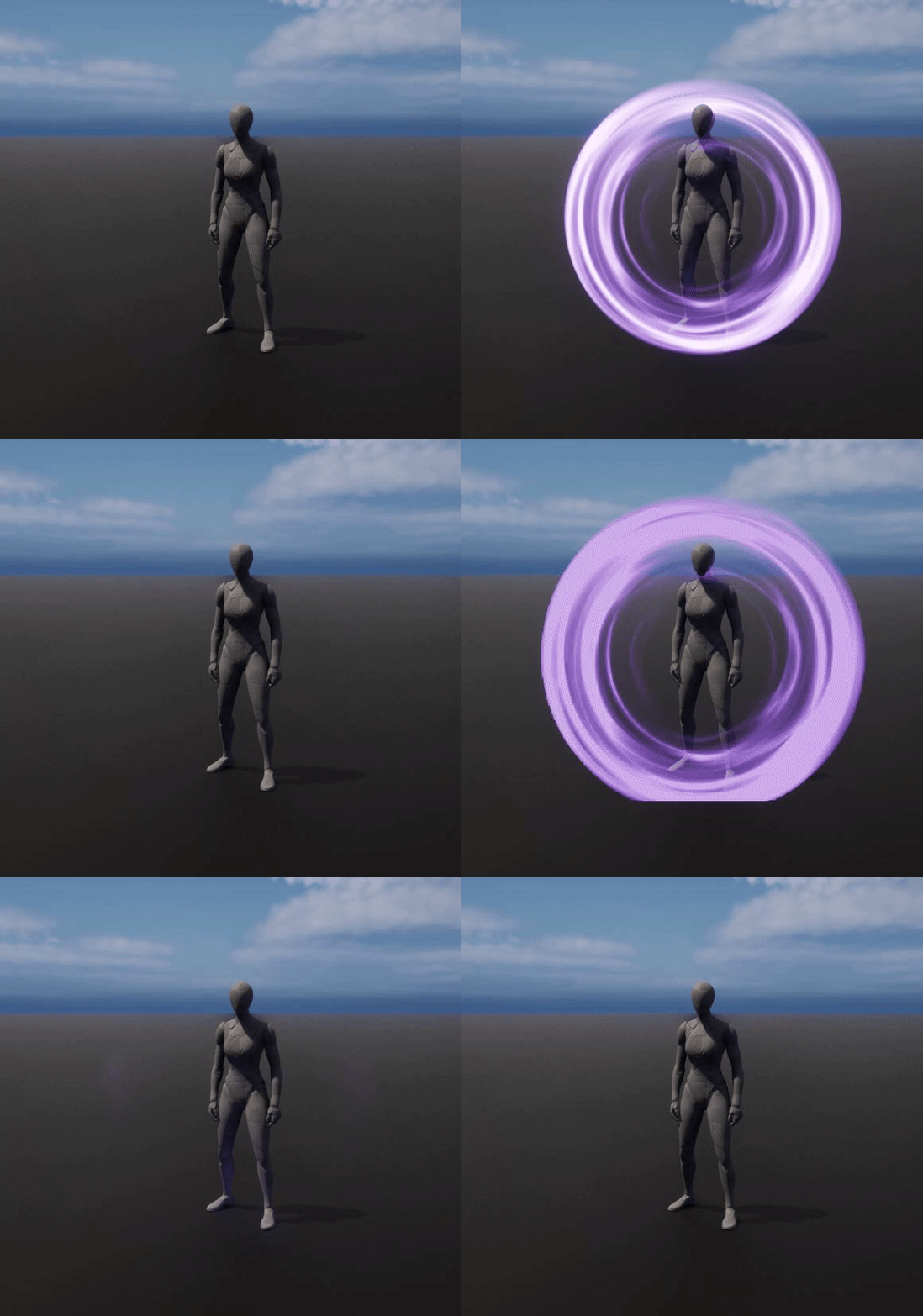
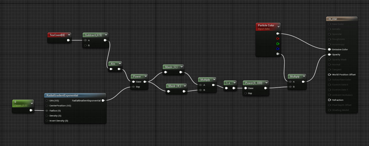
I like to experiment on Unreal and testing things by doing some basic VFX.
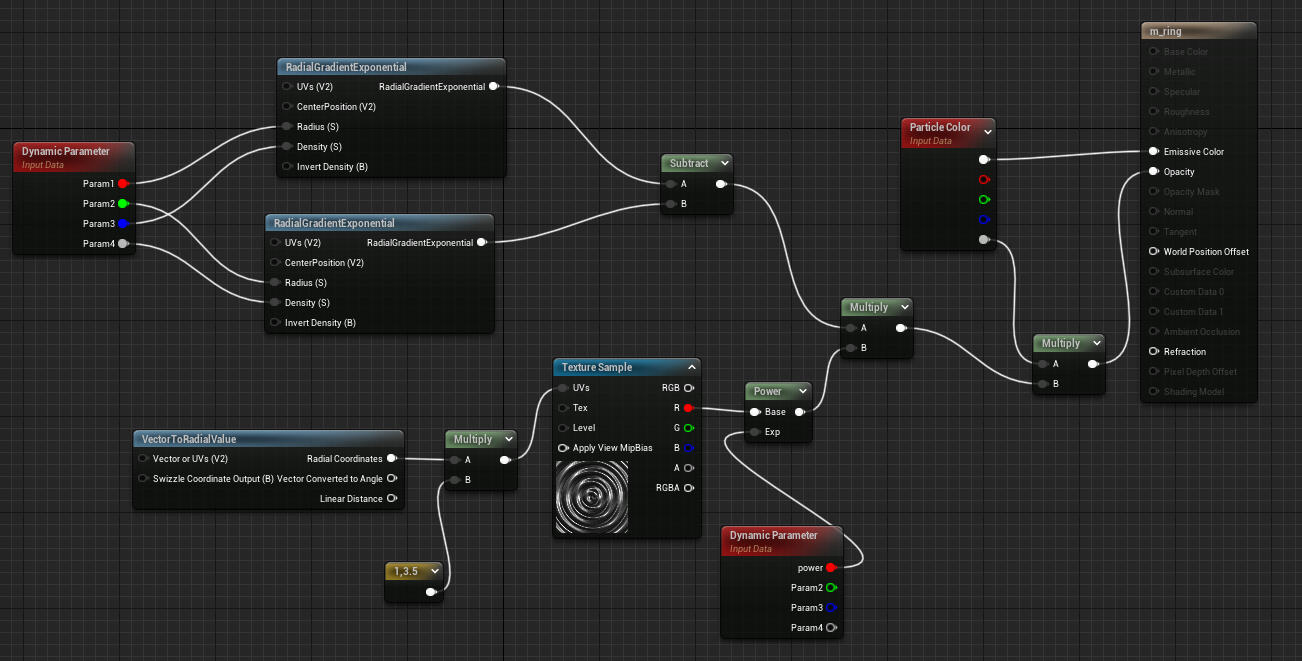
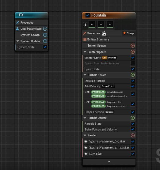
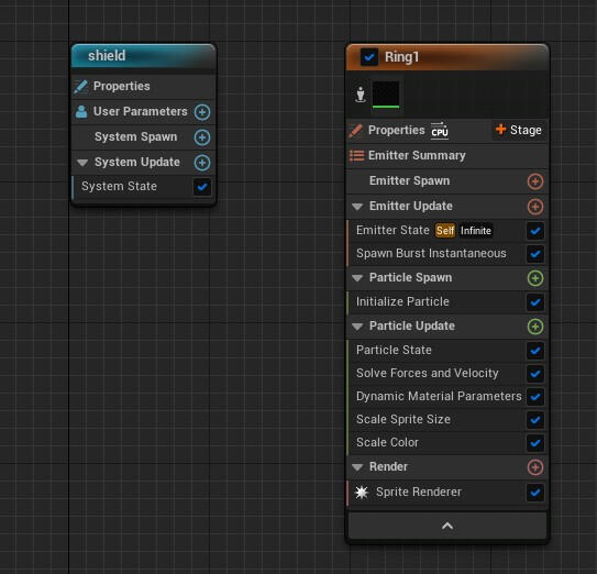
Quick low poly props for a jam

Dylhan Phong
Game Designer
Bonjour je suis Dylhan !Je suis en deuxième année de Master en Game Design au __CNAM-ENJMIN__ à Angoulême, France.Guidé par une approche centré utilisateur et accessibilité, je cherche à trouver comment lier les interactions aux intentions et la narration aux travers de mécaniques porteuses de sens peu importe le bagage vidéoludique du joueur. J'aime réfléchir à des moyens de raconter des histoires par délà les mots au travers du gameplay, du worldbuilding et des mécaniquesJ'aime rassembler des gens autour d'une idée originale ou même anodine afin de travailler dessus en tant qu'équipe sur un aspect high level puis itérer dessus continuellement en testant différentes features.J'ai une licence en Histoire ce qui m'a permis de travailler dans les archives et j'ai pu notamment avoir des workshops sur le processus créatif en place pour la création d'un musée à Oslo. Grâce à ça, j'ai pu acquérir des compétences de design d'espace et dans l'espace, des compétences de résolution de problèmes et de travail d'équipe, ainsi qu'une envie de toujours apprendre plus.Je parle couramment Français et Anglais et j'ai des notions en Espagnol, Norvégien et Cantonais.Si mon profil vous intéresse, n'hésitez pas à me contacter, j'adorerais échange sur le game design avec vous.
Jeux & Projets Intéractifs
What's the tea
Game Designer & Level Designer
2022 - 4 mois| Unreal | Equipe de 9
Le temps d'une photo
Game Designer & System Designer
2022 - 2 jours | Unity | Projet Solo
Kill'N Clean It
Game Designer
2022 - 2 jours | Unity | Equipe de 9
Jams, Prototypes et autres projets expérimentaux
3 mois
Unity, Git, Notion
Equipe de 6
Filling Fighting est un projet étudiant développé en 3 mois pendant ma première année au CNAM-ENJMIN.
Pitch
Jeu en 1 contre 1 où vous participez à un match de Sepak Takraw, un sport mêlant volley et foot !Le hic ? Les balles sont des aliments et vous êtes tous·tes les deux une pâte à bao coincée dans un panier !Il va falloir utiliser votre tête mais surtout vos grosses jambes musclés pour envoyer de la nourriture sur le terrain adverse **pour le faire glisser et le garnir... avant qu'il ne le fasse ! **
Game Design

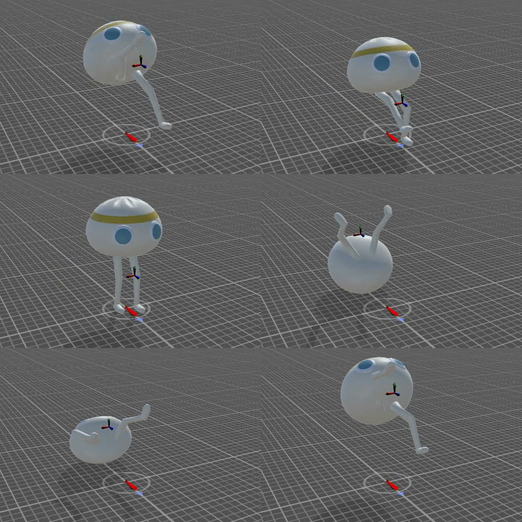
L'objectif en tant que bao est de ne pas se faire manger et ne pas être garni. Pour gagner le match, vous allez devoir écraser de la nourriture sur le terrain adverse afin de faire glisser votre adversaire en remplissant une jauge de glisse puis le garnir. Après l'avoir garni 3 fois, vous gagnez la partie.
Benchmark
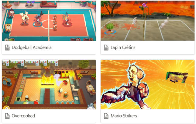
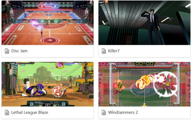
Premier benchmark gameplay pour nourrir les réflexions de l'équipe et personnelle.


Benchmark de volleyball et football dans les jeux vidéo, leurs règles et leurs 3C.
Travail pour référencer des mouvements de Sepak Takraw, plus tard utilisé en référence pour une session de mocap avec un pratiquant d'art martiaux.
Accessibilité

Un pillier d'experience du jeu est l'accessibilié, il était alors nécessaire que le jeu soit jouable par une majorité des joueurs avec seulement un bouton et un joystick et qu'on puisse remapper ses controls partout.En termes de gameplay, cela signifie que chaque action comme sauter, smasher serait sur un seul bouton. Pour que ça marche, il a alors fallu précisément jauger la distance entre le joueur et la balle pour que le bao soit saute ou smashe.Beaucoup d'itérations ont été faites pour trouver le bon mélange entre un versus fighting et un jeu accessible.
Rational Design/ Rational Level Design
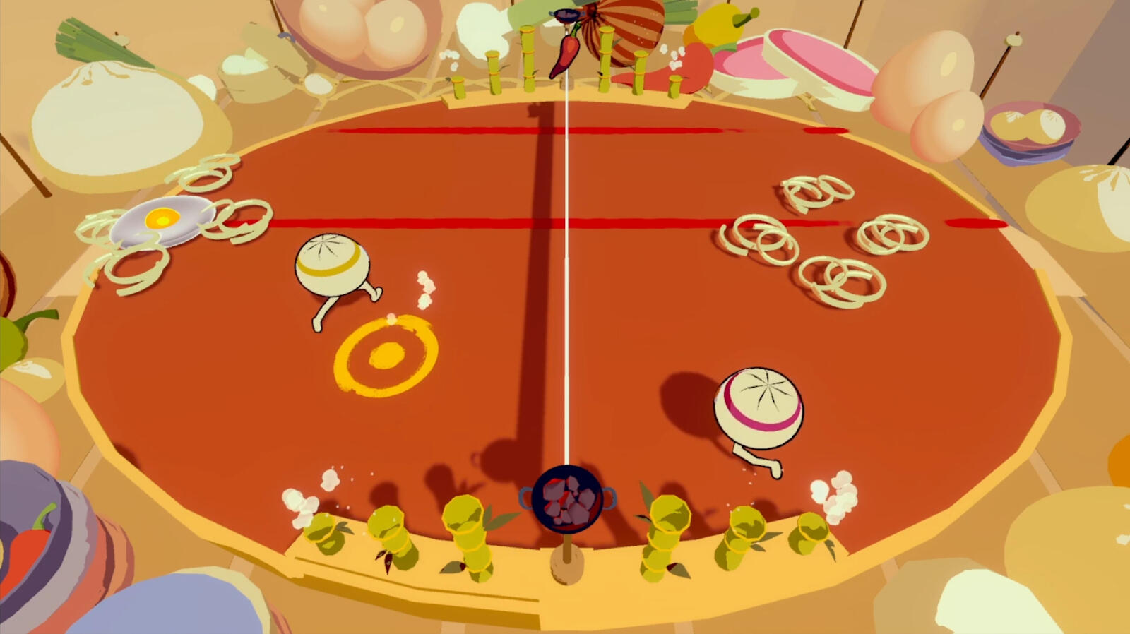

Filling Fighting étant un jeu de versus reposant sur les réflexes et des contrôles précis, il était nécessaire que le level design et la vitesse du bao et de la balle le prenne en compte.
Du milieu du terrain, le bao doit pouvoir atteindre chaque côté du terrain en 1s.
Là où la balle atterit est décidé en ayant des zones plus ou moins atteignables selon la position du smasheur et du stick directionnelle.
Pour bien estimer les distances, un script a été fait pour que le bao se dirige dans la direction désiré pendant 1s et mesure la distance parcourue. Avec cette information, le level a été construit pour prendre en compte ces metrics.
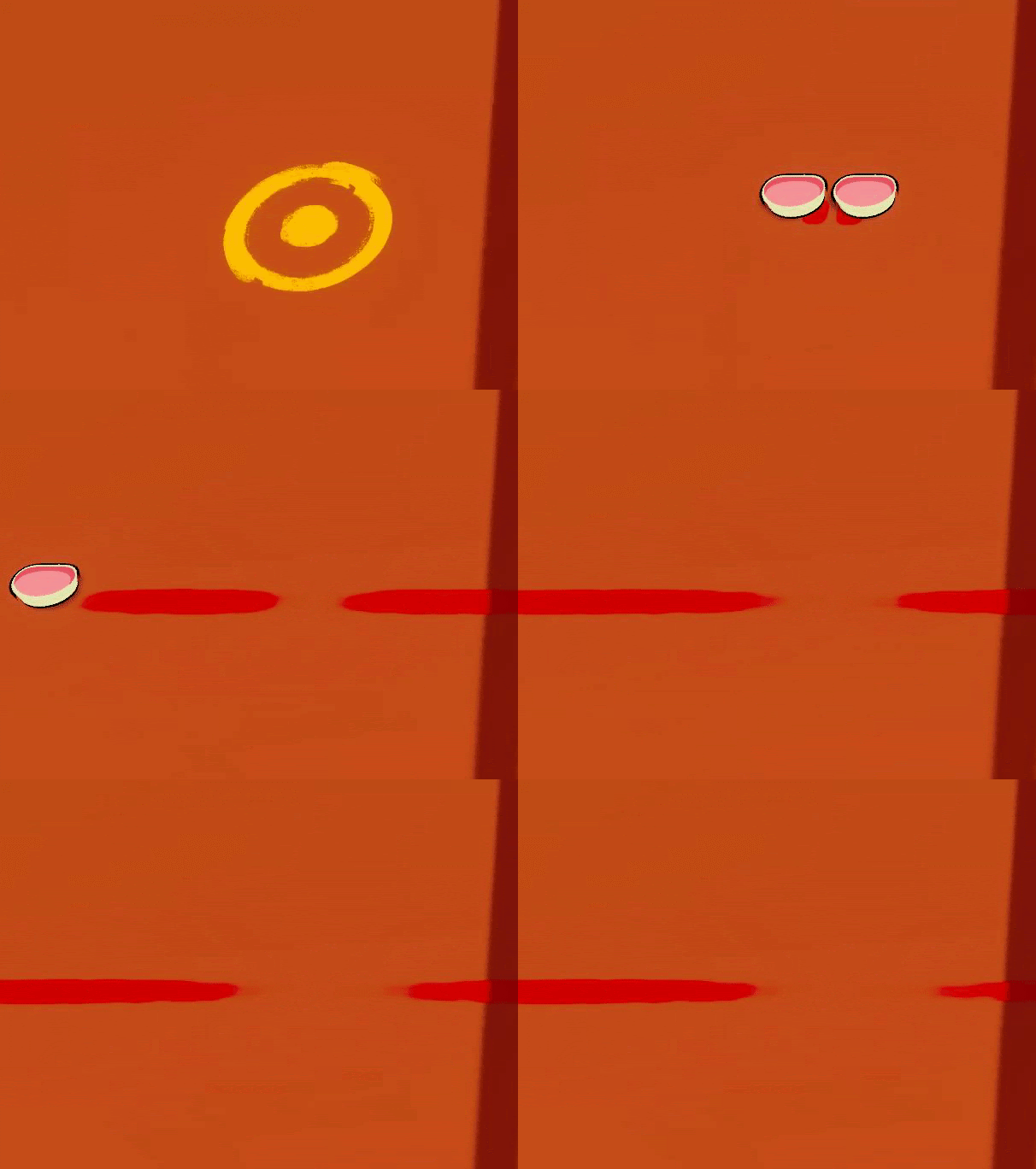
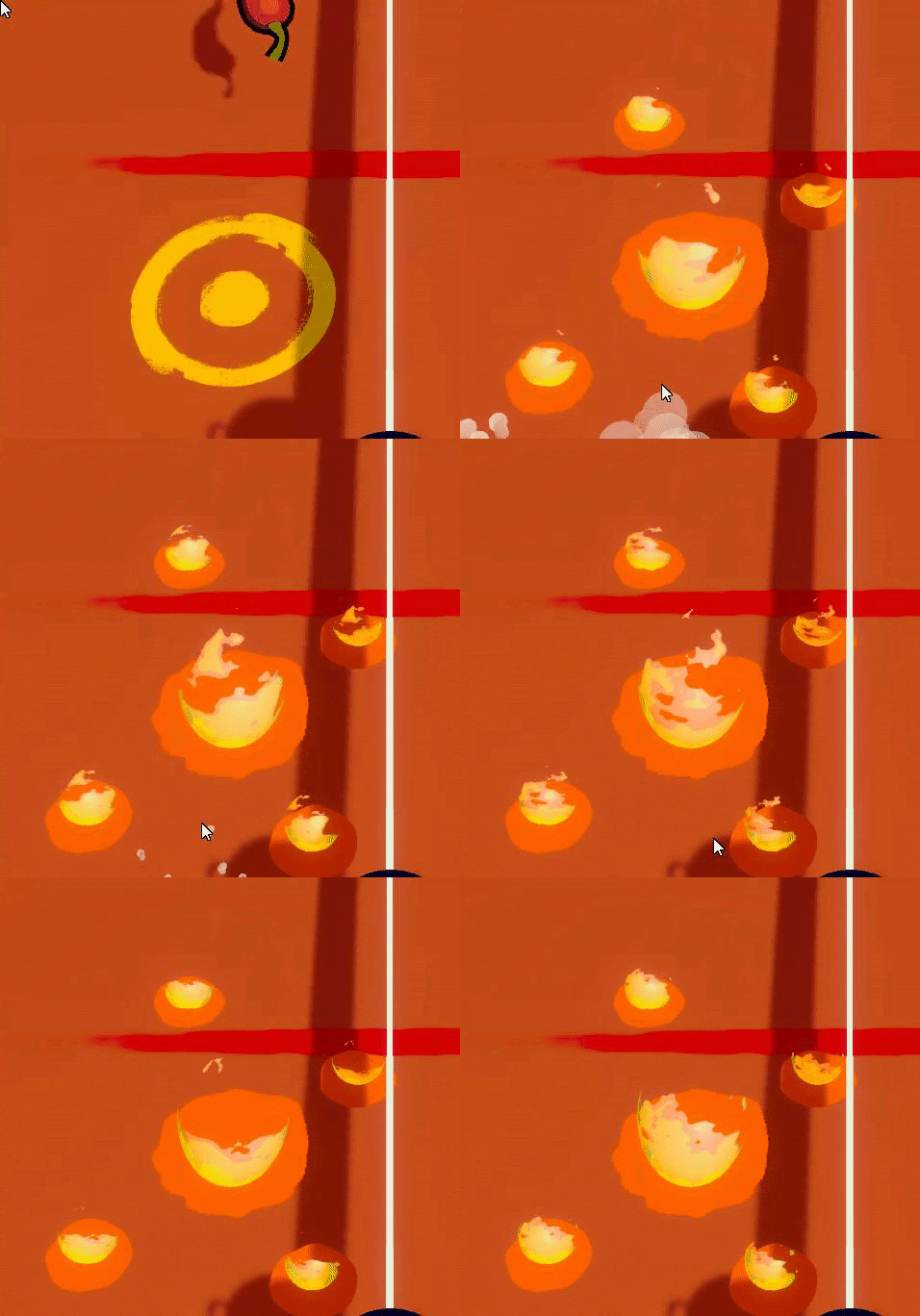
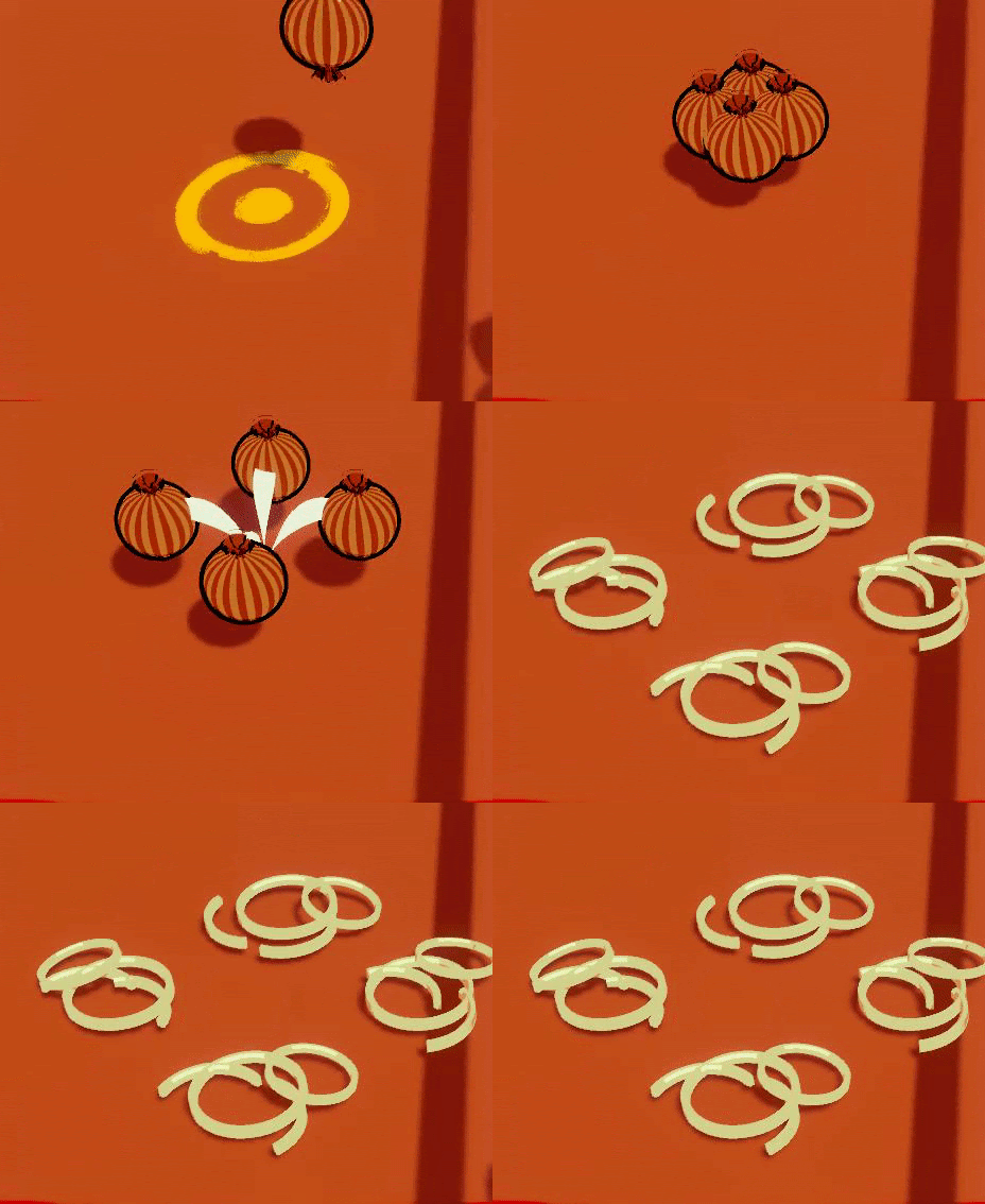
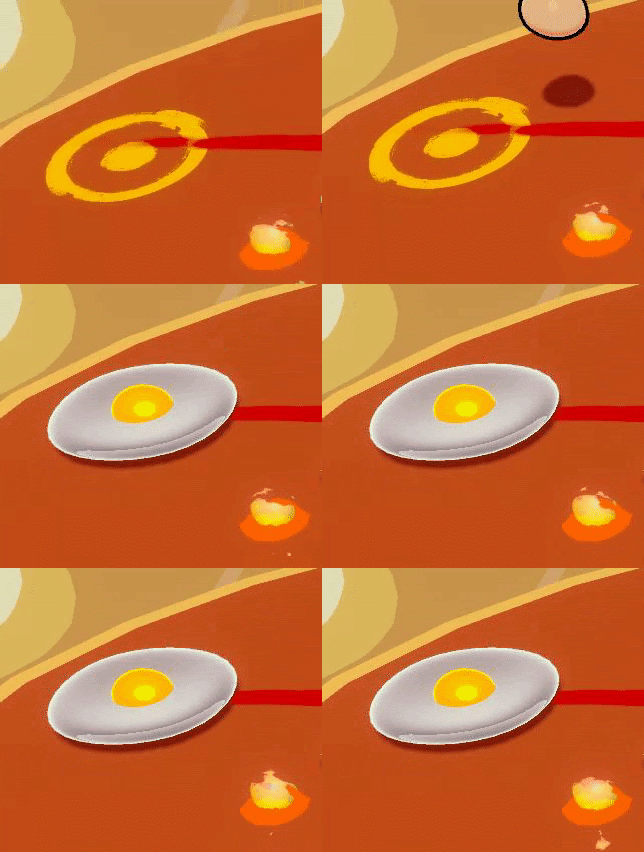
Pour créer du chaos dans ces contrôles précis, j'ai ajouté 4 aliments différents avec un taux d'apparition différent. Chaque aliment prend une forme différente une fois le sol touché afin de perturber l'adversaire.
Plus de temps auraient pu être dédié à cet aspect systemique mais des choix ont dû être fait dans la production.
2 semaines
Unity, Git
Equipe de 9
Hover Drifters est un projet étudiant développé en deux semaines durant ma première année au CNAM-ENJMIN.

Pitch
Game Design
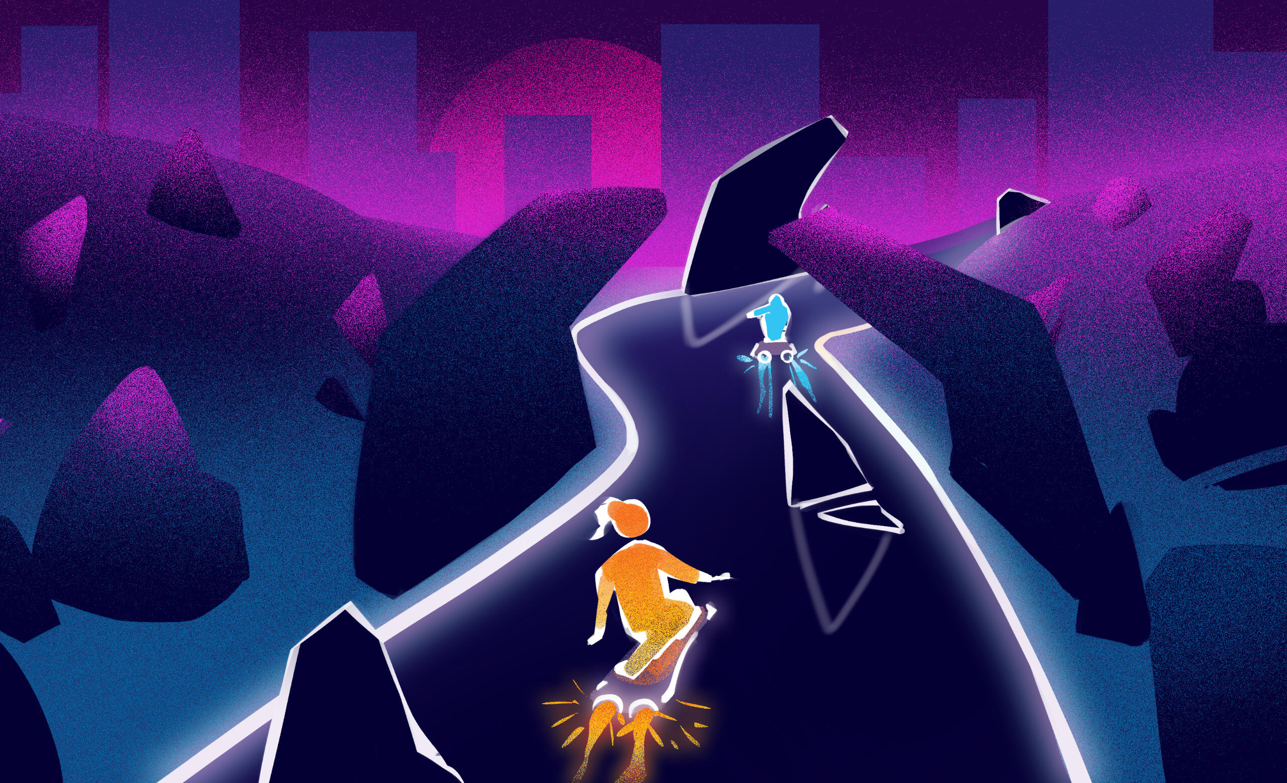

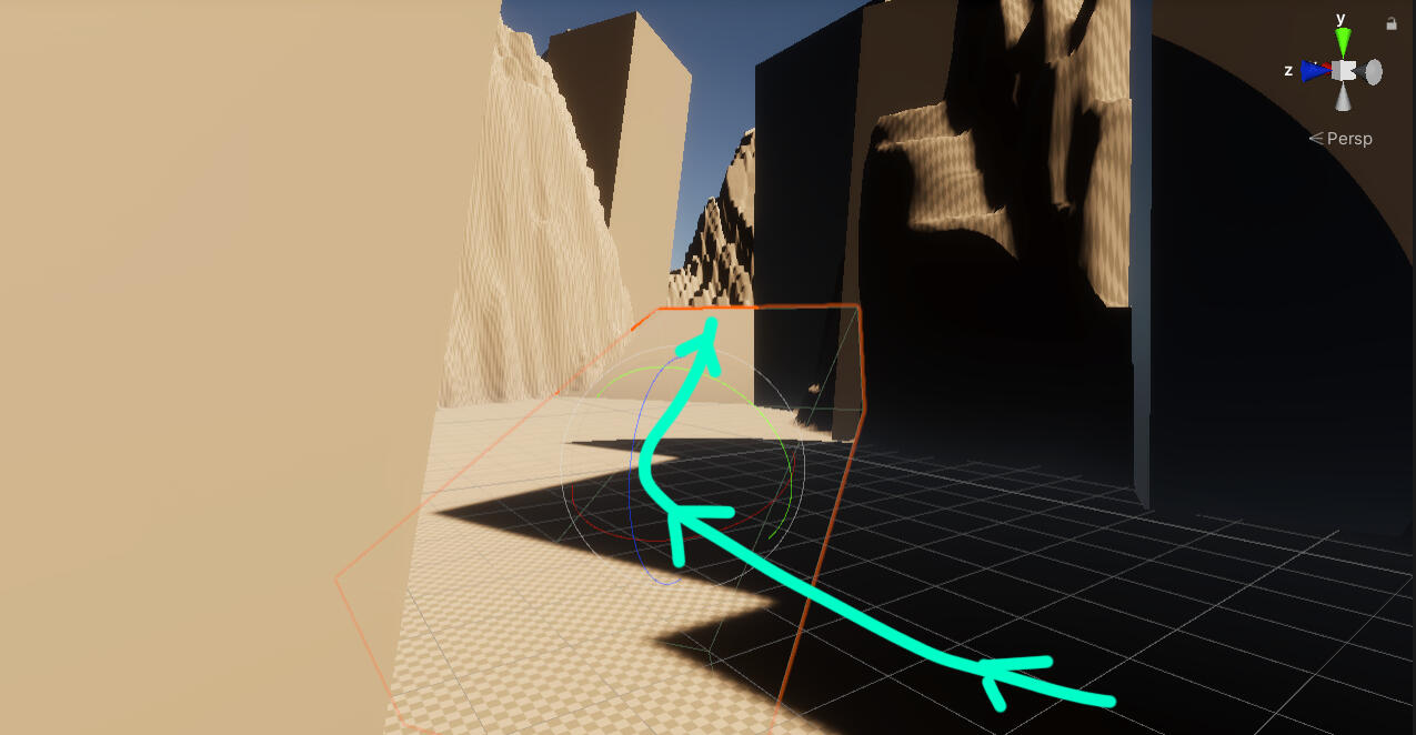

Hover Drifters est un jeu à la troisième personne de course mélangeant poursuite effrené et capture d'objectifPour gagner la partie, tu dois:- Récuperer le paquet avant son adversaireSi ton adversaire prend le paquet avant toi, fonce lui dessus avec ton boost pour récuperer le paquet.- Finis la course avec le paquet avant le temps imparti.Pour le level design, il a fallu réfléchir à des zones où les joueurs peuvent prendre des risques et prendre des raccourcirs pour récupérer le paquet ou même se cacher et embusquer l'ennemi si l'adversaire derrière a le paquet. C'était une idée intéressant mais qui avait besoin d'un temps de maturation plus long.
2 jours
Unity, Git
Equipe de 9
Kill'n Clean est un projet étudiant développé en deux jours pendant ma première année au CNAM-ENJMIN pour la Global Game Jam 2022.
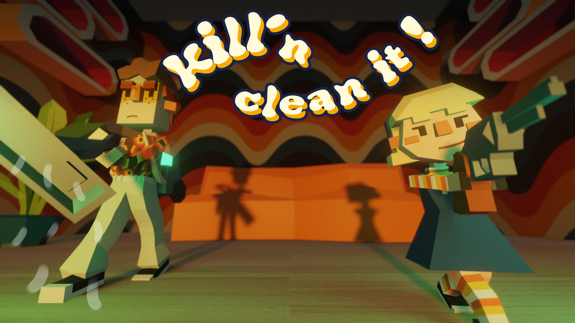
Pitch
Kill’n Clean It est est un top down down shooter au setup drôle et léger qui nous fait contrôler deux personnages aux capacités complémentaires et asymétriques.Leur tâche commune est de nettoyer une maison remplis de blob alien et crasseux. La nature de la tâche (simple nettoyage de printemps) et sa provenance (une race extraterrestre envahissante) semblent aux antipodes l’une de l’autre, ce qui justifie un “armement” aussi opposé pour nos héros. Néanmoins, ces équipements, par leurs nature antagonique, se retrouvent complémentaires dans l’accomplissement de leur objectif commun.Le jeu se démarque par le contrôle symétrique des personnages qui se déplace avec le centre de l’écran duquel iels peuvent s’éloigner, se rapprocher et autour duquel iels peuvent tourner. La complémentarité des personnages et cette symétrie poussent donc à une expérience rapide et nerveuse.Des visuels aux feedback fort & juicy créer alors une expérience challengeante et propice à un sentiment de flow. Kill’n Clean It offre une expérience nerveuse et sympathique en exploitant la dualité de deux personnages complémentaires.Recommandé de jouer avec une manette Xbox.


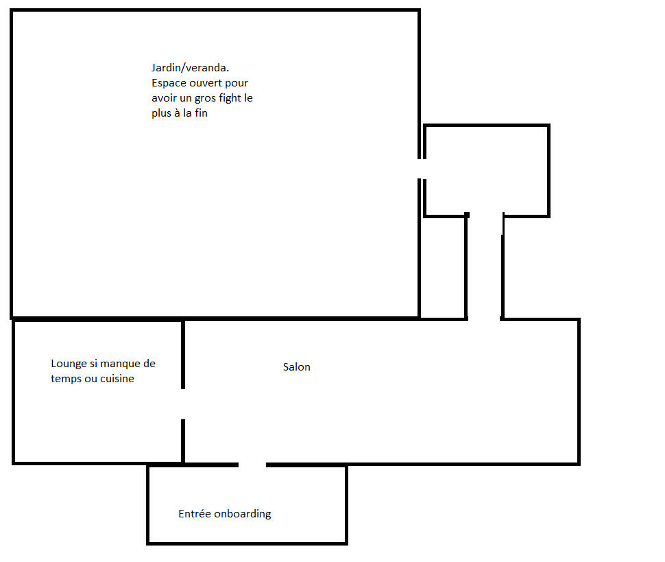
Pour le level design, jai été inspiré par Hotline Miami entre autres. Mais il était difficile de recréer ces petits couloirs et cet aspect nerveux dû au fait que l'on contrôle deux personnages.
Un problème rencontré lors de cette jam et que l'on ne s'était pas mis d'accord sur des metrics et tout était soit trop grand soit trop petit.
Cependant c'était intéressant de créer un level autour de deux personnages un à distance l'autre au corps à corps et se demander comment créer du stress chez les joueurs.
1 mois
Unity, Git
Equipe de 13
Stage Experimental pour It Is Now.
Design de trois installations interactives pour des enfants polyhandicapés en hôpitaux. Lava Dream en Lead Designer/Sable en duo avec un autre designer/Atmos en consultant.
Lava Dream a été sélectionné pour être exposé en 2023 dans plusieurs hôpitaux.

Game Design


Lava Dream
Installation

Lava Dream est une installation interactive in situ dans laquelle les utilisateur·ice·s sont invités à interagir avec un dispositif constitué d’écrans , dans une zone d’interaction captée par une kinect.
Par des mouvements, iels sont capables d’attirer et influencer des formes et visuels abstraits similaires à des lampes à lave.
Intentions
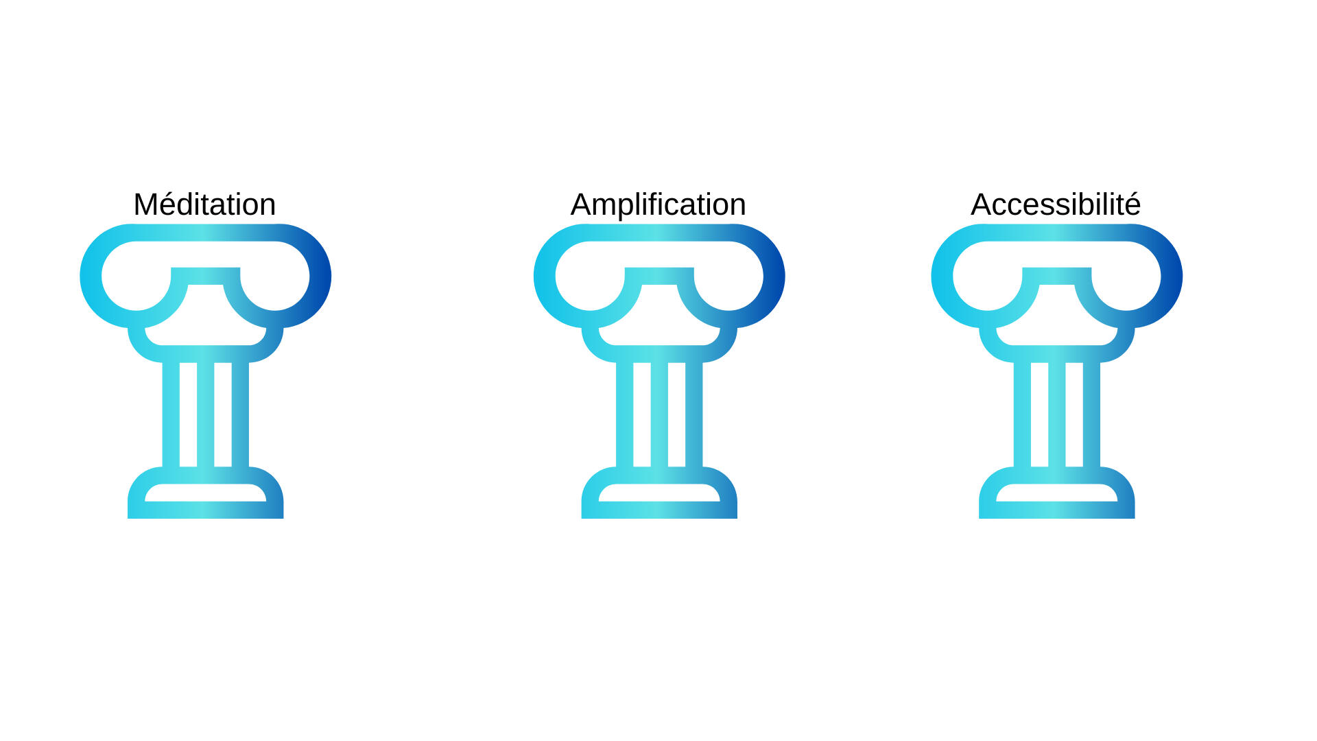
L’installation repose sur trois piliers: Le méditatif, traduit par des visuels abstraits et continus cherchant à captiver les utilisateur·ice·s; L’amplification et la répercussion de mouvements pour retranscrire l’importance de ces gestes chez les personnes à mobilité réduite; l’accessibilité afin d’avoir comme optique de rendre cette installation méditative pour tous·tes.
Benchmark
Interaction
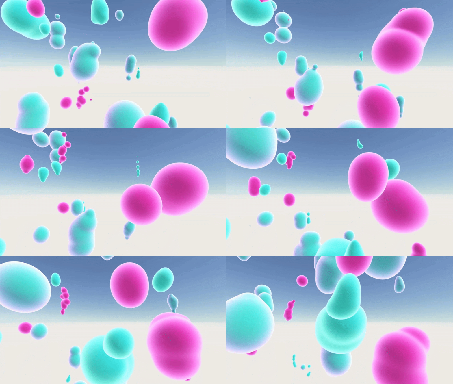
J'ai décidé d'éclater le médium des panneaux afin de bousculer ces formes et visuels abstraits et les faire se mélanger et s’altérer entre elles par des gestes.
Par des petits gestes, et ce phénomène d’amplification et d’onde comme sur l’eau, il est possible d’atteindre des espaces éloignés inatteignables par la simple silhouette, d’autant plus lorsque l’on est en fauteuil roulant par exemple.
Un prototype papier de 3 mètres sur 3 mètres pour établir une distance entre l'utilisateur et l'écran et le placement de la kinect.
Jams, Prototypes et autres projets expérimentaux
Le temps d'une photo

Le temps d'une photo est un projet solo pour un cours.
L'objectif était de penser à un concept sans prendre en compte sa faisabilité puis en faire le prototype seul.
Inspiré par le panoptique de Foucault utilisé dans l'architecture carcérale, j'ai souhaité l'inverser et en faire une feature wholesome.
À l'origine, c'était utilisé par les gardes de prison pour avoir une vue constante sur les prisonniers sans qu'ils le sachent. Par ce sentiment d'être épié constamment, les prisonniers changerait leur comportement pour celui qu'on attend d'eux.
Dans Le temps d'une photo, vous êtes dans une petite ville sandbox avec plusieurs personnages vivant tous leurs vies et routines passant par toutes sortes d'emotion de la peur à l'amour à la tristesse et à la colère.À l'aide de votre caméra, capturez une emotion et partager là dans toute la vie pour induire des changements dans le comportement de chaque personnage.Par exemple, si l'émotion de l'amour est capturé, les personnages auront alors plus de chance de tomber amoureux ou de flirter et de créer des interactions autour de l'amour tandis que d'autres pourraient ressentir de la tristesse face à cette ambiance d'amour.
L'intention qui a porté le projet était de trouver d'autres façons de raconter des histoires, autre que par l'écrit. On peut parler de narration systémique en utilisant ce concept de capture d'émotion et de son partage par la photo.Mais le coeur du projet, c'était vraiment de créer des représentations d'amour et de vie et de personnes différentes pour mettre en lumière le manque de personnes de couleur et de personnes queer dans les productions actuelles.
C'est pour cela qu'il a été important pour moi de donner les rênes aux joueurs et les laissser créer leurs propres representations et histoires en prenant des photos.

J'ai commencé le prototypage par la feature de photo puis j'ai itéré sur le controller et fait un level art rapide pour habiller le level.
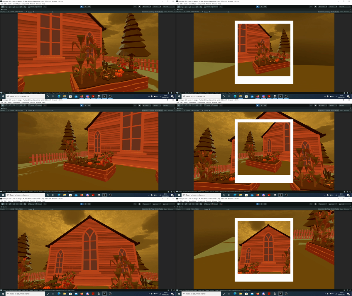

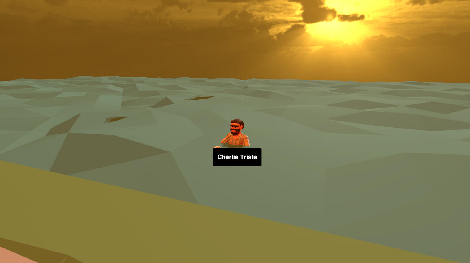

À la fin, j'ai codé rapidement une feature pour reconnaître les émotions des personnages et avoir un feedback narratif lorsque l'on prend une photo.
Travailler sur un système narratif lié au panoptique serait intéressant mais trop complexe compte tenu de l'exercice.
Step by step

Step by step est un jeu de versus fighting en 3D sideview pour deux joueurs.
Les deux joueurs incarnent chacun un samouraï qui devront s’affronter dans un combat au tour par tour. L’un après l’autre, iels devront s’approcher de l’adversaire pour l’amener à portée de leurs épées. Les deux joueurs devront néanmoins faire attention à ne pas eux-même se mettre à portée de leurs adversaires.
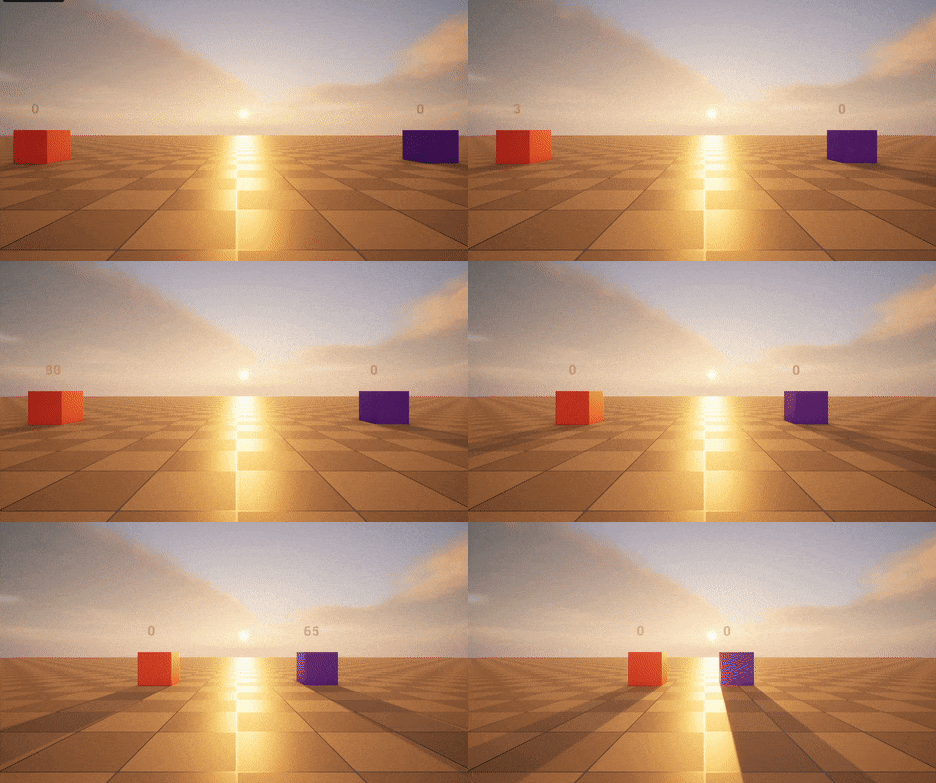
L'objectif de ce projet est de tester Unreal 5 et expérimenter avec les blueprints pendant une journée en collaboration avec des novices sur le moteur en graphisme, programmation et son.

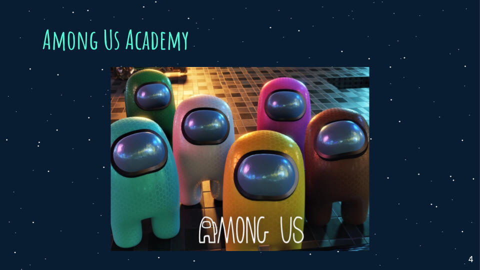
AAA Exercise on Among US
Constraints: 13 Game Designers, 1 week and only two meeting with the full team allowed.
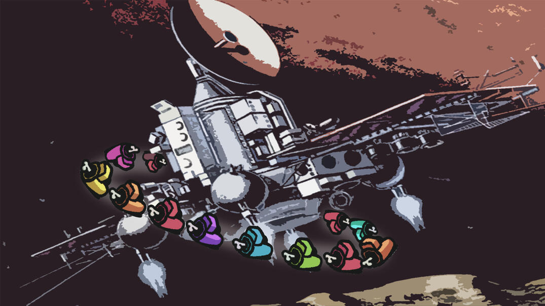
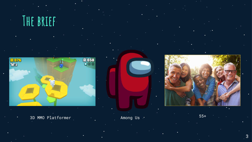
For the exercise, we were given a brief:
3D MMO Platformer with Among Us as a base for 55+ years old.
I was in charge with my partner of the side content and we worked closely with the progression system team to design engaging social multiplayer system.
I especially worked on the fame ladder aspect and the polycule and house (clan) social feature.
Here's our Game Concept Document and our Presentation
